How to Create a Responsive Sidebar Menu with Tooltip Using HTML, CSS & JavaScript
Responsive Sidebar Menu is one of the most useful design patterns for modern websites. In this tutorial, you’ll learn step by step how to create a sidebar navigation CSS design with tooltips. This JavaScript sidebar menu tutorial also shows you how to make the sidebar menu responsive for any device.
You can also check out more practical examples on our Code Projects
One of the most effective ways to design a navigation system is by using a sidebar menu. Sidebars are compact, professional, and stay visible along the screen, which makes them very user-friendly.
Today, we’re going to design a modern responsive sidebar menu with tooltips, and we’ll build it step by step using HTML, CSS, and a little bit of JavaScript.
- Expand/Collapse functionality
- Tooltips when the sidebar is collapsed
- A search box inside the sidebar
- Profile section with user details
- Mobile-friendly responsive design
We’ll go step by step, explain the code in detail, and make sure you understand every part of the process.
You can also watch the complete video tutorial here: Responsive Sidebar Menu with Tooltip
Why Build a Sidebar Menu?
Before we dive into the code, let’s understand why a sidebar navigation CSS + JavaScript approach is better than traditional top navigation in many cases:
- Space-saving design: Sidebars stay fixed on one side, leaving enough room for content.
- Better UX: Users can quickly access links without scrolling to the top.
- Responsive behavior: They adapt well to both desktops and mobile devices.
- Tooltip support: Even in collapsed mode, users know what each icon represents.
- Modern look: Perfect for dashboards, admin panels, and professional websites.
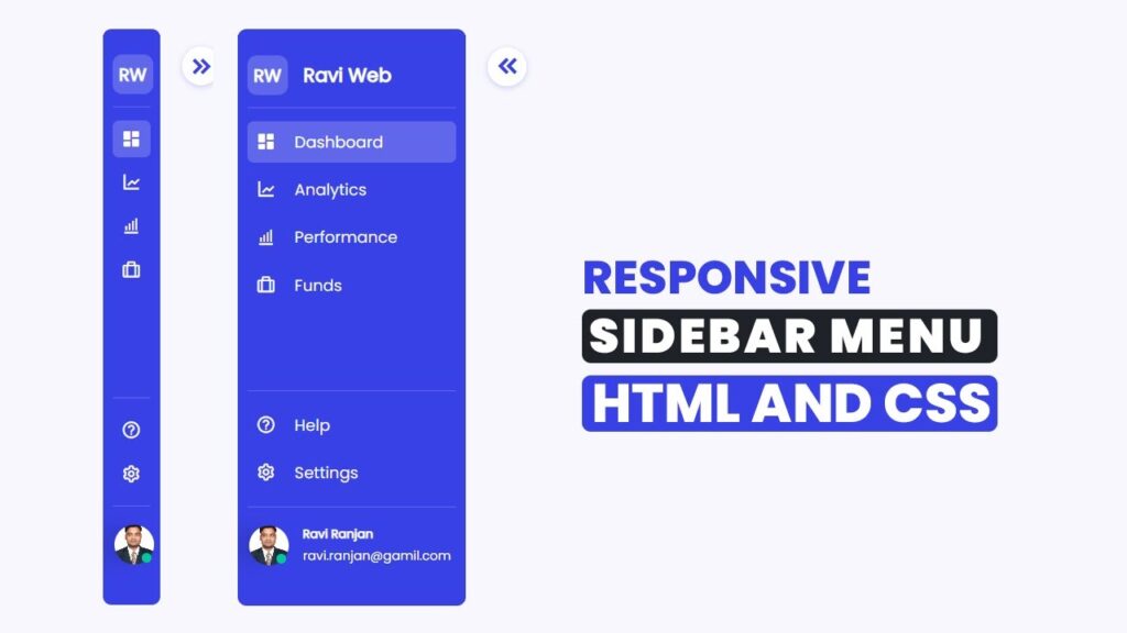
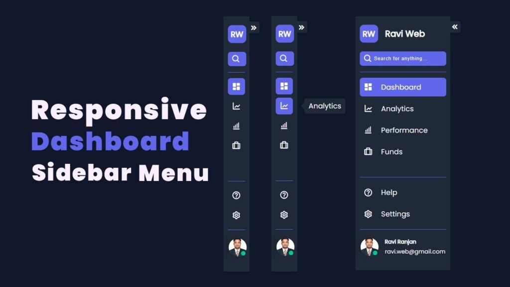
Final Output Preview
- A dark-themed sidebar menu with a logo and expand button at the top.
- The sidebar will also feature an integrated search box for quick access to content.
- Each navigation item includes an icon along with a tooltip for better clarity, especially when the sidebar is collapsed.
- A bottom section with Help, Settings, and Profile.
- A fully functional expand/collapse feature using JavaScript.
HTML Code:
<!DOCTYPE html>
<html lang="en">

<head>
    <meta charset="UTF-8">
    <meta name="viewport" content="width=device-width, initial-scale=1.0">
    <title>Responsive Sidebar menu with tooltip using html css and js</title>
    <!-- ======Boxicons===== -->
    <link href="https://unpkg.com/boxicons@2.1.4/css/boxicons.min.css" rel="stylesheet">
    <!-- ======Google Font===== -->
    <link href="https://fonts.googleapis.com/css2?family=Poppins&display=swap" rel="stylesheet">

    <link rel="stylesheet" href="style.css">
</head>

<body>
    <div class="wrapper-body">
        <div class="sidebar-wrapper">
            <!-- ===Header Top==== -->
            <div class="sidebar-top">
                <a href="#" class="logo-wrapper">
                    <span class="logo">RW</span>
                    <h2 class="hide">Ravi Web</h2>
                </a>

                <div class="expand-btn">
                    <i class="bx bxs-chevrons-left"></i>
                </div>

                <div class="search-wrapper">
                    <i class="bx bx-search"></i>
                    <input type="search" placeholder="Search for anything...">
                </div>

            </div>
            <!-- ===Header Eng==== -->

            <!-- ====Sidebar-link Start==== -->

            <div class="sidebar-link">
                <ul>
                    <li>
                        <a href="#" class="active tooltip">
                            <i class="bx bxs-dashboard"></i>
                            <span class="link hide">Dashboard</span>
                            <span class="tooltip-content">Dashboard</span>
                        </a>
                    </li>

                    <li>
                        <a href="#" class=" tooltip">
                            <i class="bx bx-line-chart"></i>
                            <span class="link hide">Analytics</span>
                            <span class="tooltip-content">Analytics</span>
                        </a>
                    </li>

                    <li>
                        <a href="#" class="tooltip">
                            <i class="bx bx-bar-chart-alt"></i>
                            <span class="link hide">Performance</span>
                            <span class="tooltip-content">Performance</span>
                        </a>
                    </li>

                    <li>
                        <a href="#" class=" tooltip">
                            <i class="bx bx-briefcase-alt"></i>
                            <span class="link hide">Founds</span>
                            <span class="tooltip-content">Founds</span>
                        </a>
                    </li>
                </ul>
            </div>
            <!-- ====Sidebar-link End==== -->

            <!-- ===Sidebar Bottom Start=== -->
            <div class="sidebar-bottom">
                <div class="sidebar-link">
                    <ul>
                        <li>
                            <a href="#" class="tooltip">
                                <i class="bx bx-help-circle"></i>
                                <span class="link hide">Help</span>
                                <span class="tooltip-content">Help</span>
                            </a>
                        </li>
                        <li>
                            <a href="#" class="tooltip">
                                <i class="bx bx-cog"></i>
                                <span class="link hide">Settings</span>
                                <span class="tooltip-content">Settings</span>
                            </a>
                        </li>
                    </ul>
                </div>

                <!-- =====Profile Start=== -->
                <div class="sidebar-profile">
                    <div class="avatar-wrapper">
                        <img src="profile.png" alt="profile" class="avatar">
                        <div class="online-status"></div>
                    </div>

                    <div class="avatar-name hide">
                        <div class="user-name">Ravi Ranjan</div>
                        <div class="email">ravi.web@gmail.com</div>
                    </div>
                </div>
                <!-- =====Profile End=== -->


            </div>
            <!-- ===Sidebar Bottom End=== -->

        </div>

        <div class="content-wrapper"></div>
    </div>

    <!-- ===JavaScript === -->
    <script src="script.js"></script>
</body>

</html>
CSS Code:
* {
    margin: 0;
    padding: 0;
    box-sizing: border-box;
}

body {
    font-family: "Poppins", sans-serif;
    background-color: #0F172A;
    color: #fff;
    font-size: 16px;
}

.wrapper-body {
    display: flex;
    flex-wrap: nowrap;
}

.sidebar-wrapper {
    position: sticky;
    top: 0;
    left: 0;
    min-height: 100vh;
    background-color: #1F2937;
    width: 288px;
    padding: 10px 12px;
    display: flex;
    color: #fff;
    flex-direction: column;
    transition: width 0.5s linear;
}

/* ====sidebar-top start== */
.sidebar-top {
    display: flex;
    flex-direction: column;
    justify-content: center;
    padding: 16px 0;
}

.logo-wrapper {
    display: flex;
    justify-content: flex-start;
    align-items: center;
    gap: 20px;
    color: #fff;
    text-decoration: none;
}

.logo {
    padding: 8px 8px;
    background-color: #6067EB;
    border-radius: 12px;
    display: flex;
    align-items: center;
    justify-content: center;
    font-size: 22px;
    font-weight: 700;
    white-space: nowrap;
}

.logo-wrapper h2 {
    white-space: nowrap;
}

.expand-btn {
    position: absolute;
    top: 16px;
    right: -28px;
    display: flex;
    justify-content: center;
    background-color: #1F2937;
    align-items: center;
    border-radius: 5px;
    width: 32px;
    height: 32px;
    cursor: pointer;
}

.expand-btn i {
    color: #fff;
    font-size: 22px;
}

/* ====Search Wrapper=== */

.search-wrapper {
    margin-top: 25px;
    position: relative;
}

.search-wrapper input {
    background: #6067EB;
    color: #fff;
    height: 40px;
    width: 100%;
    border-radius: 8px;
    padding: 11px 11px;
    padding-left: 40px;
    flex-grow: 1;
    outline: none;
    border: none;
    letter-spacing: 1px;
}

.search-wrapper input::placeholder {
    color: #fff;
    letter-spacing: 1px;
}

.search-wrapper i {
    position: absolute;
    z-index: 2;
    top: 50%;
    left: 10px;
    transform: translateY(-50%);
    pointer-events: none;
    font-size: 25px;
}

/* ====Sidebar Link Start=== */
.sidebar-link {
    padding: 8px 0;
    border-top: 1px solid #6067EB;
}

.sidebar-link ul {
    list-style-type: none;
    position: relative;
}

.sidebar-link li {
    position: relative;
}

.sidebar-link li a {
    padding: 11px 11px;
    margin: 8px 0;
    color: #F8F7FD;
    font-size: 22px;
    display: flex;
    justify-content: start;
    align-items: center;
    border-radius: 1px;
    text-decoration: none;
    transition: all 0.2s ease-in-out;
}

.sidebar-link li a i {
    font-size: 24px;
}

.sidebar-link .link {
    margin-left: 24px;
}

.hide {
    transition: all 0.5s ease-in-out;
}

.sidebar-link li a:hover,
.sidebar-link li a:focus,
.sidebar-link .active {
    width: 100%;
    text-decoration: none;
    background-color: #6067EB;
    border-radius: 8px;
    outline: none;
    color: #F8F7FD;
}

.sidebar-link .active {
    color: #F8F7FD;
}

/* ====Sidebar link End=== */

.tooltip {
    position: relative;
}

.tooltip .tooltip-content::after {
    content: "";
    position: absolute;
    top: 50%;
    left: 0%;
    margin-left: -20px;
    margin-top: -10px;
    border-width: 10px;
    border-style: solid;
    border-color: transparent #1F2937 transparent transparent;
}

.tooltip .tooltip-content {
    visibility: hidden;
    background-color: #1F2937;
    color: #fff;
    text-align: center;
    border-radius: 6px;
    padding: 6px 12px;
    position: absolute;
    z-index: 1;
    left: 80px;
}

.collapsed .tooltip:hover .tooltip-content {
    visibility: visible;
}

/* ===Sidebar Botom Start==== */

.sidebar-bottom {
    padding: 8px 0;
    display: flex;
    justify-content: center;
    flex-direction: column;
    margin-top: auto;
}

.sidebar-profile {
    display: flex;
    align-items: center;
    gap: 18px;
    flex-direction: row;
    padding: 24px 2px;
    border-top: 1px solid #6067EB;
}

.avatar-wrapper {
    position: relative;
    display: flex;
}

.avatar {
    display: block;
    font-size: 20px;
    width: 50px;
    height: 50px;
    cursor: pointer;
    border-radius: 50%;
    object-fit: cover;
    filter: drop-shadow(-20px 0 10px #0000001a);
}

.online-status {
    position: absolute;
    width: 12px;
    height: 12px;
    border-radius: 50%;
    background-color: #00C896;
    bottom: 3px;
    right: 3px;
}

.avatar-name {
    display: flex;
    flex-direction: column;
    gap: 4px;
}

.user-name {
    font-size: 15px;
    font-weight: 700;
    text-align: left;
}

.content-wrapper {
    width: 100%;
}

/* ======Colapsed sidebar=== */
body.collapsed .sidebar-wrapper {
    width: 77px;
}

body.collapsed .hide {
    position: absolute;
    display: none;
    pointer-events: none;
    transition: 0.5s ease;
}

body.collapsed .expand-btn {
    transform: rotate(180deg);
}
JavaScript Code:
const expendBtn = document.querySelector(".expand-btn");
expendBtn.addEventListener("click", () => {
  document.body.classList.toggle("collapsed");
});

const searchInput = document.querySelector(".search-wrapper input");
searchInput.addEventListener("focus", (e) => {
  document.body.classList.remove("collapsed");
});
Step-by-Step Explanation
1. Sidebar Header
At the top, we have:
- A logo with initials (RW).
- A toggle/expand button which lets users collapse or expand the sidebar.
- We have also placed a search input that lets users instantly look for options without leaving the sidebar.
2. Sidebar Links
We have an unordered list (<ul>) containing navigation links:
- Dashboard
- Analytics
- Performance
- Founds
Each link contains:
- An icon (using Boxicons)
- A text label (hidden when collapsed)
- A tooltip that appears on hover
3. Sidebar Bottom Section
At the bottom, we included:
- Help and Settings links
- A Profile section with profile image, online status indicator, and user details
4. CSS Styling (sidebar navigation CSS)
Key points in styling:
- responsive sidebar menu width is 288px by default and collapses to 77px.
- Hover effect changes the background color.
- Tooltips are hidden by default and visible on hover in collapsed state.
- Flexbox is used to align items neatly.
5. JavaScript Sidebar Menu Functionality
JavaScript makes the sidebar interactive:
- Clicking the expand button toggles a collapsed class on the body.
- When the search input is focused, the sidebar automatically expands.
Making Sidebar Menu Responsive
To make sure our sidebar menu responsive, we used:
- Flexbox for layout
- Media queries (you can add custom breakpoints)
- Tooltip support so that collapsed sidebars still remain usable on smaller screens
- Best practice: On very small screens (like mobile), you can turn the sidebar into a sliding drawer.
Where Can You Use This Sidebar?
You can use this responsive sidebar menu in:
- Admin dashboards
- Portfolio websites
- E-commerce dashboards
- Learning management systems
- Business web applications
This type of sidebar menu is suitable for dashboards, admin panels, learning systems, or any project where well-structured navigation is essential.
Conclusion
In this tutorial, we learned how to build a Responsive Sidebar Menu with Tooltip using HTML, CSS, and JavaScript.
We:
- Designed the sidebar with CSS
- Added icons, tooltips, and profile section
- Used JavaScript to make it collapsible
- Ensured responsiveness for better user experience
This sidebar navigation CSS design is flexible, modern, and easy to customize.