Responsive Portfolio Website HTML CSS JavaScript: Free Download

Creating a professional responsive portfolio website HTML CSS JavaScript has become essential for web developers and designers in 2025. A well-crafted responsive portfolio website HTML CSS JavaScript not only showcases your skills effectively but also demonstrates your technical expertise to potential clients and employers. This comprehensive guide will teach you exactly how to create responsive portfolio website step by step using modern responsive portfolio website HTML CSS JavaScript techniques.
Watch the Video Tutorial: Responsive Portfolio Website HTML CSS JavaScript
Why Build a Responsive Portfolio Website in 2025?
In today’s competitive digital landscape, having a personal portfolio website design is crucial for career success. A professional portfolio website serves multiple purposes:
- Showcase Your Skills: Display your best projects and technical abilities
- Attract Clients: 85% of clients research developers online before hiring
- Stand Out: Differentiate yourself from competitors with unique design
- Professional Credibility: Establish trust and expertise in your field
- Career Advancement: Increase job opportunities and freelance projects
1. Responsive Design Excellence
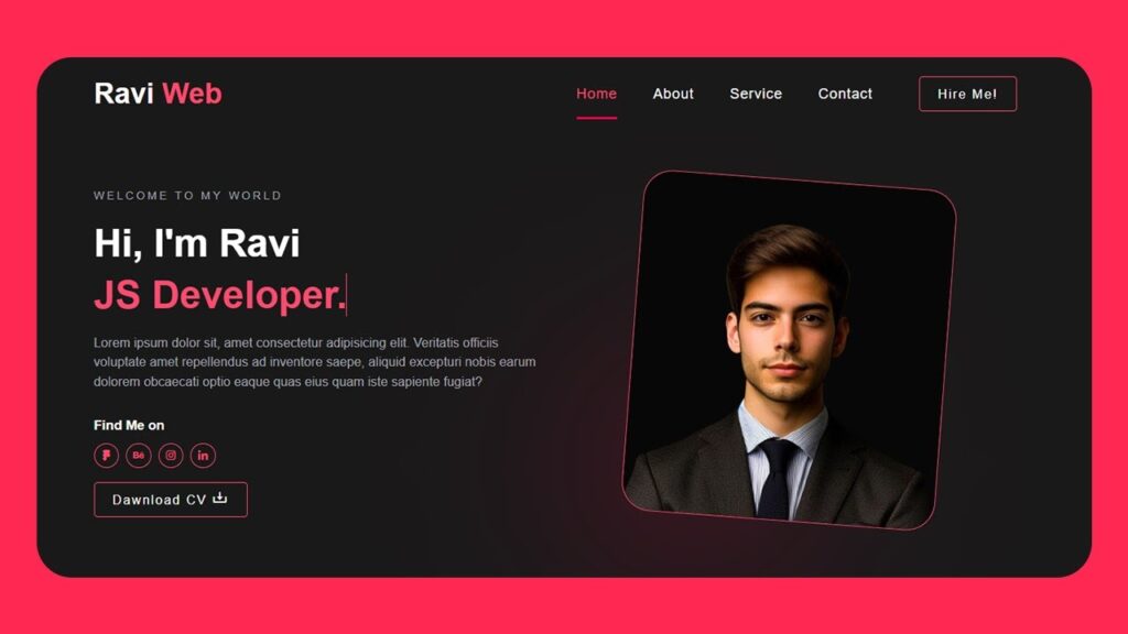
The free portfolio template download features a mobile-first approach ensuring perfect display across all devices. The layout automatically adapts from desktop sidebar navigation to mobile-friendly horizontal menu.
2. Interactive User Experience
Smooth transitions and hover effects create an engaging experience. The JavaScript handles section switching with elegant animations that enhance user engagement without overwhelming the content.
3. Professional Profile Section
The profile card showcases your photo, name, title, and social media links with creative overlay effects. The download CV button provides easy access to your resume.
4. Comprehensive Content Organization
Five main sections (Home, Resume, Works, Blog, Contact) provide complete coverage of your professional profile. Each section is optimized for showcasing different aspects of your skills and experience.
5. Skills Visualization
Animated progress bars in the resume section provide visual representation of your technical skills with smooth loading animations.
Implementation Guide
Setup Project Structure
Create the following folder structure:
portfolio-website/
├── index.html
├── style.css
├── script.js
└── images/
    ├── profile-img.jpg
    ├── work1.jpg
    ├── work2.jpg
    ├── work3.jpg
    ├── work4.jpg
    ├── blog1.jpg
    ├── blog2.jpg
HTML Code:
The modern portfolio website template HTML CSS JavaScript we’ll build features a clean, professional structure with five main sections:
<!DOCTYPE html>
<html lang="en">
<head>
<meta charset="UTF-8">
<meta http-equiv="X-UA-Compatible" content="IE=edge">
<meta name="viewport" content="width=device-width, initial-scale=1.0">
<title>Create a Responsive Portfolio Website Using HTML CSS and JavaScript </title>
<link href='https://unpkg.com/boxicons@2.1.4/css/boxicons.min.css' rel='stylesheet'>
<link rel="stylesheet" href="style.css">
</head>
<body>
<div class="page-wrapper">
<div class="container">
<!-- ====Header=== -->
<header class="header">
<!-- ===menu start=== -->
<div class="menu-wraper">
<ul>
<li><a href="#home" class="nav-item active"><i class="bx bx-home"></i>Home</a></li>
<li><a href="#resume" class="nav-item"><i class='bx bx-spreadsheet'></i>Resume</a></li>
<li><a href="#works" class="nav-item"><i class='bx bx-show'></i>Work</a></li>
<li><a href="#blog" class="nav-item"><i class='bx bxl-blogger'></i>Blog</a></li>
<li><a href="#contact" class="nav-item"><i class='bx bx-paper-plane'></i>Contact</a></li>
</ul>
</div>
<!-- ===menu End=== -->
</header>
<!-- ===Header End==== -->
<!-- =====Card Start=== -->
<div class="profile-card">
<!-- ===profile image=== -->
<div class="prof-img">
<img src="images/profle-img.jpg" alt="">
</div>
<!-- ===profile End=== -->
<!-- ==porfile title Start== -->
<div class="profile-content">
<h1>Ravi Ranjan</h1>
<h3>Ui/Ux Designer</h3>
</div>
<!-- ==porfile title End== -->
<!-- ====Profile Socials Start== -->
<div class="profile-socials">
<a href="#" class="fb"><i class='bx bxl-facebook'></i></a>
<a href="#" class="twit"><i class='bx bxl-twitter'></i></a>
<a href="#" class="drib"><i class='bx bxl-dribbble'></i></a>
<a href="#" class="link"><i class='bx bxl-linkedin'></i></a>
</div>
<!-- ====Profile Socials End== -->
<!-- =====Link Start=== -->
<div class="link-btn">
<a href="#"><i class='bx bx-download'></i>Donwload CV</a>
</div>
<!-- =====Link End=== -->
</div>
<!-- =====Card End=== -->
<!-- =====Content Sidebar Start=== -->
<div class="content-sidebar">
<!-- ===About Section Start=== -->
<div id="home" class="card-wrap open">
<h1 class="title"><span>A</span>bout</h1>
<h2 class="subtiele">Hello! I’m Ravi Ranjan.</h2>
<p class="text">Lorem ipsum dolor sit amet, consectetur adipisicing elit. Quae rerum molestias fuga.
Rem praesentium, voluptate quod pariatur temporibus accusamus eaque.</p>
<p class="text">Lorem ipsum dolor sit amet consectetur adipisicing elit. Amet quod animi cupiditate
odio iure magnam quam deleniti adipisci quis minus!</p>
<!-- =======Resume Start=== -->
<h1 class="title"><span>M</span>y Services</h1>
<div class="service-sec">
<div class="service-item">
<div class="icon"><i class="bx bx-code"></i></div>
<div class="name"><span>Web Development</span></div>
<div class="text">
<p>Lorem ipsum dolor sit amet, consectetuer adipiscing elit, sed diam euismod volutpat.
</p>
</div>
</div>
<div class="service-item">
<div class="icon"><i class='bx bx-music'></i></div>
<div class="name"><span>Music Writing</span></div>
<div class="text">
<p>Lorem ipsum dolor sit amet, consectetuer adipiscing elit, sed diam euismod volutpat.
</p>
</div>
</div>
<div class="service-item">
<div class="icon"><i class='bx bx-photo-album'></i></div>
<div class="name"><span>Photography</span></div>
<div class="text">
<p>Lorem ipsum dolor sit amet, consectetuer adipiscing elit, sed diam euismod volutpat.
</p>
</div>
</div>
<div class="service-item">
<div class="icon"><i class='bx bx-game'></i></div>
<div class="name"><span>Game Development</span></div>
<div class="text">
<p>Lorem ipsum dolor sit amet, consectetuer adipiscing elit, sed diam euismod volutpat.
</p>
</div>
</div>
</div>
<!-- =======Resume End=== -->
</div>
<!-- ===About Section Start=== -->
<!-- ====Resume Section Start===== -->
<div id="resume" class="card-wrap">
<h1 class="title"><span>R</span>esume</h1>
<div class="resume-sec">
<!-- ====resume items start== -->
<div class="resume-items">
<h3 class="resu-title"><i class="bx bx-briefcase"></i>EXPERIENCE</h3>
<div class="resue-item">
<span> 2021-2023</span>
<h3>Front-End Developer</h3>
<p>Delhi</p>
</div>
<div class="resue-item">
<span> 2021-2023</span>
<h3>Programming Course</h3>
<p>Delhi</p>
</div>
</div>
<!-- ====resume items End== -->
<!-- ====resume items start== -->
<div class="resume-items">
<h3 class="resu-title"><i class='bx bxs-graduation'></i>EDUCATION</h3>
<div class="resue-item">
<span> 2021-2023</span>
<h3>Senior Developer</h3>
<p>Delhi</p>
</div>
<div class="resue-item">
<span> 2021-2023</span>
<h3>Web Design Course</h3>
<p>Delhi</p>
</div>
</div>
<!-- ====resume items End== -->
</div>
<div class="resume-sec">
<!-- ====resume items start== -->
<div class="resume-items design-box">
<h3 class="resu-title"><i class='bx bxs-paint'></i>DESIGN</h3>
<!-- ====Progress bar Start === -->
<ul class="prog-lines">
<li>
<div class="name">
<span>Web Design </span>
<span>80%</span>
</div>
<div class="progress">
<div class="percentage" style="width: 80%;"></div>
</div>
</li>
<li>
<div class="name">
<span>Mobile App</span>
<span>95%</span>
</div>
<div class="progress">
<div class="percentage" style="width: 95%;"></div>
</div>
</li>
<li>
<div class="name">
<span>Photoshop</span>
<span>75%</span>
</div>
<div class="progress">
<div class="percentage" style="width: 75%;"></div>
</div>
</li>
<li>
<div class="name">
<span>Graphic Design</span>
<span>90%</span>
</div>
<div class="progress">
<div class="percentage" style="width: 80%;"></div>
</div>
</li>
</ul>
<!-- ====Progress bar End === -->
</div>
<!-- ====resume items End== -->
</div>
</div>
<!-- ====Resume Section Start===== -->
<!-- ====Works Section=== -->
<div id="works" class="card-wrap">
<h1 class="title"><span>W</span>orks</h1>
<div class="work-sec">
<div class="work-items">
<a href="#">
<img src="./images/work1.jpg" alt="">
<h3>Website Design</h3>
</a>
</div>
<div class="work-items">
<a href="#">
<img src="./images/work2.jpg" alt="">
<h3>Logo Design</h3>
</a>
</div>
<div class="work-items">
<a href="#">
<img src="./images/work3.jpg" alt="">
<h3>App Design</h3>
</a>
</div>
<div class="work-items">
<a href="#">
<img src="./images/work4.jpg" alt="">
<h3>Video</h3>
</a>
</div>
</div>
</div>
<!-- ====Work Section End==== -->
<!-- =====Blog Section Start=== -->
<div id="blog" class="card-wrap">
<h1 class="title"><span>B</span>Log</h1>
<div class="blog-sec">
<!-- ===blog items== -->
<div class="blog-items">
<a href="#">
<img src="images/blog1.jpg" alt="">
</a>
<div class="disc">
<a href="#"><span class="date"> April 28, 2020 </span></a>
<a href="#" class="name">Blog Title Name</a>
<p class="text">Lorem ipsum dolor sit amet consectetur, adipisicing elit. Vitae,
repellendus!</p>
</div>
</div>
<!-- ===blog items== -->
<!-- ===blog items== -->
<div class="blog-items">
<a href="#">
<img src="images/blog2.jpg" alt="">
</a>
<div class="disc">
<a href="#"><span class="date"> April 28, 2020 </span></a>
<a href="#" class="name">Blog Title Name</a>
<p class="text">Lorem ipsum dolor sit amet consectetur, adipisicing elit. Vitae,
repellendus!</p>
</div>
</div>
<!-- ===blog items== -->
<!-- ===blog items== -->
<div class="blog-items">
<a href="#">
<img src="images/blog1.jpg" alt="">
</a>
<div class="disc">
<a href="#"><span class="date"> April 28, 2020 </span></a>
<a href="#" class="name">Blog Title Name</a>
<p class="text">Lorem ipsum dolor sit amet consectetur, adipisicing elit. Vitae,
repellendus!</p>
</div>
</div>
<!-- ===blog items== -->
</div>
</div>
<!-- =====Blog Section Start=== -->
<!-- ============Contact Section Start==== -->
<div id="contact" class="card-wrap">
<h1 class="title"><span>C</span>ontact Form</h1>
<form action="">
<div class="contact-sec">
<div class="form-group">
<div class="input-field">
<input type="text" placeholder="Full Name">
</div>
<div class="input-field">
<input type="email" placeholder="Email Address">
</div>
</div>
<div class="form-group">
<div class="input-field">
<textarea cols="30" rows="10" placeholder="Your Message"></textarea>
</div>
</div>
<div class="form-group">
<button type="submit" class="sub-btn">Send Message</button>
</div>
</div>
</form>
</div>
<!-- ============Contact Section End==== -->
</div>
<!-- =====Main Content End=== -->
</div> <!-- ====Container=== -->
</div> <!-- ====Page Wrapper=== -->
<!-- ===JavaScript=== -->
<script src="script.js"></script>
</body>
</html>CSS Code:
The CSS file demonstrates modern portfolio website template HTML CSS JavaScript styling principles with mobile-first responsive design:
@import url('https://fonts.googleapis.com/css2?family=Poppins:wght@300;400;500;600;700;800&display=swap');

html {
    scroll-behavior: smooth;
    top: 100px;
}

* {
    margin: 0;
    padding: 0;
    box-sizing: border-box;
    font-family: 'Poppins', sans-serif;
}

.page-wrapper {
    position: relative;
    background-color: #DBEEF2;
    height: 100%;
    width: 100%;
    display: flex;
    justify-content: center;
    align-items: center;

}

.container {
    margin: 8vh 6vw;
    position: relative;
    width: 100%;
    min-height: 84vh;
    max-width: 1268px;
    max-height: 674px;
    transition: all .4s ease 0s;
    display: flex;
    align-items: center;
}

/* ====Header Start==== */
.header {
    margin-right: 25px;
    position: relative;
    width: 80px;
    z-index: 100;
}

.header .menu-wraper {
    padding: 10px 5px;
    width: 100%;
    background: #fff;
    border-radius: 10px;
}

.header .menu-wraper ul {
    list-style: none;
    display: flex;
    flex-direction: column;
}

.header .menu-wraper ul>li {
    margin: 5px 0;
}

.header .menu-wraper ul>li>a {
    text-decoration: none;
    text-align: center;
    display: flex;
    flex-direction: column;
    color: #323232;
    padding: 8px 5px;
    border-radius: 6px;
    font-size: 12px;
    font-weight: 500;
    text-align: center;
    text-transform: uppercase;
    transition: all 0.3s ease-in;
}

.header .menu-wraper ul>li>a i {
    font-size: 20px;
    margin-bottom: 2px;
}

.header .menu-wraper ul>li>a:hover,
.header .menu-wraper ul>li>a.active {
    background: rgb(250, 82, 82);
    background: linear-gradient(90deg, #fa5252 0%, #dd2476 100%);
    color: #fff;
}

/* =====Header End=== */

/* ====Profile Card Start=== */
.profile-card {
    position: relative;
    background-color: #fff;
    width: 480px;
    border-radius: 10px;
    z-index: 11;
    text-align: center;
    box-shadow: 10px 10px 15px rgba(0, 0, 0, .05);
}

.profile-card .prof-img {
    position: relative;
    overflow: hidden;
}

.profile-card .prof-img img {
    width: 100%;
}

.profile-card .prof-img::before {
    content: '';
    position: absolute;
    left: -25%;
    bottom: -63%;
    width: 100%;
    height: 70%;
    background: #fff;
    z-index: 3;
    transform: rotate(12deg);
}

.profile-card .prof-img::after {
    content: '';
    position: absolute;
    left: auto;
    right: -25%;
    bottom: -63%;
    width: 100%;
    height: 70%;
    background: #fff;
    z-index: 3;
    transform: rotate(-8deg);
}

.profile-card .profile-content {
    padding-top: 15px;
}

.profile-card .profile-content h1 {
    font-size: 26px;
    font-weight: 600;
    margin-bottom: 4px;
}

.profile-card .profile-content h3 {
    color: #7B7B7B;
    font-size: 17px;
    font-weight: 500;
}

.profile-card .profile-socials {
    display: flex;
    justify-content: center;
    gap: 20px;
    margin-top: 30px;
}

.profile-card .profile-socials a {
    text-decoration: none;
    font-size: 20px;
    width: 40px;
    height: 40px;
    background-color: #f3f6f6;
    border-radius: 8px;
    display: flex;
    justify-content: center;
    align-items: center;
    transition: all 0.3s ease;
}

.profile-card .profile-socials a.fb {
    color: #1773ea;
}

.profile-card .profile-socials a.twit {
    color: #1c9cea;
}

.profile-card .profile-socials a.drib {
    color: #e14a84;
}

.profile-card .profile-socials a.link {
    color: #0072b1;
}

.profile-card .profile-socials a:hover {
    background: rgb(250, 82, 82);
    background: linear-gradient(90deg, #fa5252 0%, #dd2476 100%);
    color: #fff;
}


.profile-card .link-btn {
    margin: 30px 0;
    display: flex;
    justify-content: center;
}

.profile-card .link-btn a {
    text-decoration: none;
    background: rgb(250, 82, 82);
    background: linear-gradient(90deg, #fa5252 0%, #dd2476 100%);
    color: #fff;
    font-size: 14px;
    font-weight: 600;
    text-align: center;
    text-transform: uppercase;
    padding: 14px 25px;
    border-radius: 15px;
    display: flex;
    align-items: center;
    transition: all 0.5s ease;

}

.profile-card .link-btn a:hover {
    background: #dd2476;
    background: linear-gradient(90deg, #dd2476 0%, #fa5252 100%);
}

.profile-card .link-btn a i {
    font-size: 20px;
    margin-right: 8px;
}

/* ====Profile Card End=== */

/* =====Content sidebar=== */
.content-sidebar {
    position: relative;
    width: 100%;
    height: 550px;
    display: flex;
    flex-direction: row;
    align-items: center;
    overflow: hidden;
}

.content-sidebar .card-wrap {
    width: 100%;
    height: 100%;
    position: absolute;
    left: 0;
    top: 0;
    background-color: #fff;
    border: 10px solid #fff;
    padding: 30px;
    border-radius: 0 5px 5px 0;
    transform: translateX(-100%);
    transition: all 0.5s;
    z-index: 9;
    overflow-y: scroll;
}

.content-sidebar .card-wrap::-webkit-scrollbar {
    display: none;
}

.content-sidebar .card-wrap.open {
    transform: translateX(0);
    z-index: 10;
}

.content-sidebar .card-wrap .title {
    font-size: 20px;
    color: #323232;
    font-weight: 600;
    margin-bottom: 30px;
    position: relative;
}

.content-sidebar .card-wrap .title::before {
    content: "";
    position: absolute;
    left: -10px;
    top: 3px;
    width: 30px;
    height: 30px;
    background: linear-gradient(135deg, #dd247645 0%, #fa525208 100%);
    border-radius: 50%;
}

.content-sidebar .card-wrap .title span {
    color: #e14a84;
}

.content-sidebar .card-wrap .subtiele {
    font-size: 18px;
    font-weight: 600;
    color: #44566c;
    margin-bottom: 10px;
}

.content-sidebar .card-wrap .text {
    font-size: 17px;
    color: #44566c;
    margin-bottom: 15px;
    line-height: 1.7;
}

/* ====Service sec=== */

.card-wrap .service-sec {
    display: flex;
    flex-wrap: wrap;
    flex-direction: row;
    gap: 20px;

}

.card-wrap .service-item {
    flex: 0 0 auto;
    width: 47%;
    text-align: center;
    background-color: #DBEEF2;
    border-radius: 10px;
    padding: 20px;
}

.card-wrap .service-item:nth-child(odd) {
    background-color: #fff4f4;
}

.card-wrap .service-item .icon {
    margin: 0 auto;
    width: 60px;
    height: 60px;
    line-height: 66px;
    border-radius: 60px;
    font-size: 32px;
    color: #fff;
    background: #dd2476;
    background: linear-gradient(90deg, #dd2476 0%, #fa5252 100%);
}

.card-wrap .service-item .name {
    margin: 10px 0 5px;
    font-size: 17px;
    color: #323232;
    font-weight: 600;
}


/* ============Resume section Start======== */
.card-wrap .resume-sec {
    display: flex;
    flex-direction: row;
    flex-wrap: wrap;
    gap: 20px;
    margin-bottom: 40px;
}

.resume-items {
    flex: 0 0 auto;
    width: 47%;
}

.resume-sec .resume-items .resu-title {
    color: #323232;
    font-size: 17px;
    font-weight: 600;
    text-transform: uppercase;
}

.resume-sec .resume-items .resu-title i {
    margin-right: 10px;
    width: 45px;
    height: 45px;
    line-height: 35px;
    font-size: 25px;
    text-align: center;
    color: #fff;
    background: #dd2476;
    background: linear-gradient(90deg, #dd2476 0%, #fa5252 100%);
    padding: 3px;
    border-radius: 50%;
}

.resume-items .resue-item {
    background-color: #DBEEF2;
    border-radius: 10px;
    padding: 20px;
    margin-top: 30px;
    display: flex;
    flex-direction: column;
    gap: 10px;
}

.resume-items .resue-item:nth-child(2n-1) {
    background-color: #fff4f4;
}

.resume-items .resue-item span {
    font-size: 14px;
}

.resume-items .resue-item h3 {
    font-size: 17px;
    color: #323232;
    font-weight: 600;
}

.resume-items .resue-item p {
    font-size: 17px;
    color: #323232;
    font-weight: 500;
}

.resume-sec .design-box {
    width: 100%;
}

.resume-sec .prog-lines {
    list-style: none;
}

.resume-sec .prog-lines li {
    position: relative;
    padding: 25px 0 0;
    font-size: 16px;
}

.resume-sec .prog-lines li .name {
    display: flex;
    justify-content: space-between;
}

.resume-sec .prog-lines li .name span {
    margin-right: 10px;
}

.resume-sec .prog-lines .progress {
    position: relative;
    display: block;
    width: 100%;
    height: 5px;
    background: #eee;
    margin-top: 5px;
}

.resume-sec .prog-lines .progress .percentage {
    position: absolute;
    left: 0;
    top: 0;
    width: 0;
    height: 100%;
    background: #dd2476;
    background: linear-gradient(90deg, #dd2476 0%, #fa5252 100%);
    transition: all .3s ease 0s;
}

/* ============Resume section End======== */

/* ============Works Section Start=== */
.card-wrap .work-sec {
    display: flex;
    flex-direction: row;
    flex-wrap: wrap;
    gap: 20px;
}

.card-wrap .work-sec .work-items {
    flex: 0 0 auto;
    width: 47%;
    padding: 0 0 20px 0;
}

.card-wrap .work-sec .work-items a {
    display: block;
    text-decoration: none;
}

.card-wrap .work-sec .work-items a img {
    width: 100%;
    height: 200px;
    object-fit: cover;
}


.card-wrap .work-sec .work-items a h3 {
    color: #44566c;
    font-size: 18px;
    font-weight: 500;
    text-align: center;
    margin-top: 10px;
}

/* ============Works Section End=== */

/* ===Blog Section Start=== */
.blog-sec {
    display: flex;
    flex-direction: row;
    flex-wrap: wrap;
    gap: 20px;
}

.blog-sec .blog-items {
    flex: 0 0 auto;
    width: 47%;
    border-radius: 10px;
    padding: 0 0 20px 0;
    text-align: center;
}

.blog-sec .blog-items a {
    text-decoration: none;
    display: block;
}

.blog-sec .blog-items img {
    width: 100%;
    height: 175px;
    margin-bottom: 10px;
}

.blog-sec .disc .date {
    color: #e14a84;
    font-size: 14px;
    font-weight: 500;
}

.blog-sec .disc .name {
    padding-bottom: 5px;
    font-size: 17px;
    font-weight: 600;
    color: #44566c;
    transition: all 0.5s;
}

.blog-sec .disc .name:hover {
    color: #e14a84;
}

/* ===Blog Section End=== */


/* =====Contact Form Start=== */
.contact-sec {
    margin-top: 60px;
}

.contact-sec .form-group {
    display: flex;
    flex-direction: row;
    justify-content: space-between;
    gap: 40px;

}

.form-group .input-field {
    width: 100%;
    margin-bottom: 30px;
}

.form-group .input-field input,
.form-group .input-field textarea {
    width: 100%;
    height: 50px;
    font-size: 16px;
    color: #323232;
    background-color: 0;
    border: 2px solid #eee;
    outline: 0;
    padding: 0 15px;
}

.form-group .input-field textarea {
    padding: 15px;
    height: 150px;
}

.form-group .sub-btn {
    background: rgb(250, 82, 82);
    background: linear-gradient(90deg, #fa5252 0%, #dd2476 100%);
    color: #fff;
    border: 0;
    font-size: 14px;
    font-weight: 600;
    text-align: center;
    text-transform: uppercase;
    padding: 14px 25px;
    border-radius: 15px;
    cursor: pointer;
    transition: all 0.5s ease;
}

.form-group .sub-btn:hover {
    opacity: 0.8;
}

/* =====Contact Form End=== */


/* ==========Responsive Design==== */
@media(max-width:992px) {

    /* ===Header Start===== */
    .container {
        flex-direction: column;
        margin: auto;
    }

    .header {
        width: 100%;
        margin-right: auto;
        position: fixed;
        top: 0;
        box-shadow: 10px 10px 15px rgba(0, 0, 0, .05);
    }

    .header .menu-wraper {
        padding: 10px 15px;
        width: 100%;
        border-radius: 0;
    }

    .header .menu-wraper ul {
        flex-direction: row;
        justify-content: space-around;
    }

    .header .menu-wraper ul>li {
        margin: auto 5px;
    }

    .header .menu-wraper ul>li>a {
        padding: 8px;
    }

    /* ===Header End===== */
    /* =======Profilce Card==== */
    .profile-card {
        width: 100%;
        margin-top: 75px;
        border-radius: 0;
        box-shadow: none;
    }

    /* =======Profilce Card End==== */

    .content-sidebar {
        flex-direction: column;
        overflow: inherit;
    }

    .content-sidebar .card-wrap {
        transform: unset;
        overflow: unset;
        position: static;
        height: auto;
        padding: 0 15px 0 15px;
    }

    /* =====About Section=== */
    .card-wrap .service-sec {
        flex-direction: column;
    }

    .card-wrap .service-item {
        width: 100%;
    }

    /* =====About Section End=== */

    /* =======Resume Section Start=== */
    .card-wrap .resume-sec {
        flex-direction: column;
    }

    .card-wrap .resume-sec .resume-items {
        width: 100%;
    }

    /* =======Resume Section End=== */

    /* ====Works Section Start==== */
    .card-wrap .work-sec {
        flex-direction: column;
    }

    .card-wrap .work-sec .work-items {
        width: 100%;
    }

    /* ====Works Section End==== */

    /* ===Blog Section Start==== */
    .blog-sec {
        flex-direction: column;
    }

    .blog-sec .blog-items {
        width: 100%;
    }

    /* ===Blog Section End==== */

}
JavaScript Code:
The interactive functionality uses modern JavaScript techniques:
const navbar = document.querySelectorAll(".nav-item");
const cardwrap = document.querySelectorAll(".card-wrap");

for (var i = 0; i < navbar.length; i++) {
  navbar[i].addEventListener("click", function () {
    var current = document.getElementsByClassName("active");
    current[0].className = current[0].className.replace(" active", "");
    this.className += " active";
  });
}

for (let i = 0; i < navbar.length; i++) {
  navbar[i].addEventListener("click", () => {
    for (let j = 0; j < cardwrap.length; j++) {
      if (i == j) {
        cardwrap[j].classList.add("open");
      } else {
        cardwrap[j].classList.remove("open");
      }
    }
  });
}
Conclusion
This comprehensive responsive portfolio website HTML CSS JavaScript tutorial provides everything needed to create a professional portfolio website in 2025. The free portfolio template download includes modern design principles, responsive functionality, and SEO optimization.
By following this how to create responsive portfolio website step by step guide, you’ll have a powerful tool for showcasing your skills and attracting clients. The personal portfolio website design framework ensures your site performs excellently across all devices while providing an engaging user experience.
Whether you’re starting your career or refreshing your online presence, this modern portfolio website template HTML CSS JavaScript provides the foundation for success in today’s competitive digital landscape. Download the complete template and start building your professional portfolio today!
Ready to build your dream portfolio? Download the complete source code and customize it to showcase your unique skills and personality. Your success story starts with a professional portfolio website!