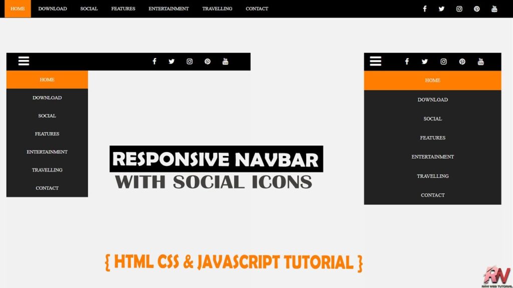
Responsive Navbar with Social Media Icons in HTML, CSS & JS
In today’s modern web development, a Responsive Navigation Bar (Navbar) is one of the most important elements of any website. A website’s Navbar is like a roadmap – it helps users navigate easily across different pages. Without a well-designed Navbar, users can feel lost, and this often leads to a bad user experience and a high bounce rate.
When you design a Navbar, there are two things you should always consider:
- It should be responsive (works well on all screens – desktop, tablet, and mobile).
- It should be engaging (clean design, includes essentials like social media icons).
In this article, we’ll learn step by step how to build a Responsive Navbar with Social Media Share Icons using HTML, CSS, and JavaScript. This Navbar will automatically adjust for mobile devices and display a hamburger menu (☰) for smaller screen sizes. Alongside the menu, we’ll also integrate popular social media icons like Facebook, Twitter, Instagram, YouTube, and Pinterest.
Watch the Video Tutorial: Responsive Navbar with Social Media Icons
Why Do You Need a Responsive Navbar?
Here’s why a responsive navigation bar is so important:
- Mobile-friendly: More than 60% of users browse websites on mobile phones. A responsive navbar makes sure they can easily access your site.
- User Experience: Easy navigation means users stay longer on your site.
- Professional Look: A stylish menu helps your site look modern and professional.
- SEO Benefits: Better navigation keeps users engaged, lowering bounce rate, which indirectly helps with Google rankings.
Project Setup
This project is simple and consists of only three files:
index.html→ HTML structure of the navigation barstyle.css→ Styling and responsivenessscript.js→ JavaScript for toggle functionality
HTML Code:
Let’s first create the HTML structure of the navbar. We will use a <nav> tag to wrap the entire navigation section. Inside it, we will place:
- A hamburger toggle button for mobile view.
- A list of menu items.
- A social media section on the right side.
<!DOCTYPE html>
<html lang="en">

<head>
    <meta charset="UTF-8">
    <meta name="viewport" content="width=device-width, initial-scale=1.0">
    <title>Responsive Navbar with Social Media share icons in HTML CSS & JavaScript </title>
    <link rel="stylesheet" href="https://cdnjs.cloudflare.com/ajax/libs/font-awesome/4.7.0/css/font-awesome.min.css">
    <link href="style.css" rel="stylesheet">

</head>

<body>
    <nav>
        <label class="toggle">
            <i class="fa fa-bars"></i>
        </label>
        <ul>
            <li><a class="active" href='#'>Home</a></li>
            <li><a href='#'>Download</a></li>
            <li><a href='#'>Social</a></li>
            <li><a href='#'>Features</a></li>
            <li><a href='#'>Entertainment</a></li>
            <li><a href='#'>Travelling</a></li>
            <li><a href='#'>Contact</a></li>
        </ul>
        <div class="socialtop">
            <div class='top-social'>
                <a href='#'><i class='fa fa-facebook'></i></a>
                <a href='#'><i class='fa fa-twitter'></i></a>
                <a href='#'><i class='fa fa-instagram'></i></a>
                <a href='#'><i class='fa fa-pinterest'></i></a>
                <a href="#"><i class='fa fa-youtube'></i></a>
            </div>
        </div>
    </nav>

    <!-- ====Javascript=== -->
    <script src="script.js"></script>


</body>

</html>
Here, the <ul> contains the menu links, and the right side contains social media icons using Font Awesome.
CSS Code:
Now let’s add CSS to style the navbar. We’ll create a black background with white text and an orange hover effect.
* {
    margin: 0;
    padding: 0;
    box-sizing: border-box;
}

body {
    background-color: #f1f1f1;
    font-family: Arial, Helvetica, sans-serif;
}

.toggle {
    font-size: 30px;
    color: white;
    float: left;
    line-height: 45px;
    margin-left: 5%;
    cursor: pointer;
    display: none;
}

nav {
    background: #000000;
    height: 45px;
    width: 100%;
}

ul {
    float: left;
    margin-left: 5%;
}

.socialtop {
    float: right;
    margin-right: 5%;
}

ul li {
    margin: 0;
    padding: 0;
    position: relative;
    display: inline-block;
    font-size: 16px;
}

ul a {
    font-weight: 400;
    padding: 15px;
    line-height: 45px;
    color: #fff;
    font-size: 12px;
    text-transform: uppercase;
    text-decoration: none;
}

ul li:first-child {
    background: #FF7D00;
}

ul li:hover {
    background: #FF7D00;
    color: #fff;
}

ul li a:hover {
    color: #fff;
}

.top-social a {
    padding: 13px;
    color: #fff;
}

.top-social {
    padding: 14px 15px;
}

.top-social a:hover {
    color: #FF7D00;
}

@media screen and (max-width: 1052px) {
    .toggle {
        display: block;
    }

    ul {
        z-index: -1;
        margin-top: -15px;
        position: fixed;
        top: -400px;
        right: 0;
        left: 0;
        width: 200px;
        background: #222222;
        display: inline-block;
        transition: top .4s;
        margin-left: 0;
    }

    ul.show {
        top: 60px;
    }

    ul li {
        top: 0;
        width: 100%;
        float: left;
        text-align: center;
    }
}

@media screen and (max-width:500px) {
    ul {
        width: 100%;
    }

}
The CSS ensures that the navbar looks good on large screens while automatically switching to a mobile-friendly layout with a hamburger toggle on smaller screens.
JavaScript Code:
Finally, we need to make the hamburger icon functional using JavaScript.
document.addEventListener("DOMContentLoaded", function () {
  const toggleIcon = document.querySelector(".toggle i");
  const navMenu = document.querySelector("nav ul");

  toggleIcon.addEventListener("click", function () {
    navMenu.classList.toggle("show");
  });
});
This simple script toggles the show class, sliding the menu up and down when the user clicks the hamburger icon.
How It Works
- On a desktop, you’ll see menu links on the left and social media icons on the right.
- On a mobile / smaller screen, the navigation links will collapse and show only the hamburger menu icon (☰).
- When you tap the hamburger icon, the menu will slide down (using CSS transitions).
Benefits of This Navbar
- Responsive Design – Works on desktops, tablets, and mobile devices.
- Easy Customization – Change colors, fonts, and icons easily.
- Social Media Integration – Users can quickly connect with your socials.
- Lightweight & Fast – Pure HTML, CSS, and a little JavaScript (no heavy frameworks).
Conclusion
In this tutorial, we successfully built a Responsive Navigation Bar with Social Media Share Icons using HTML, CSS & JavaScript.
This Navbar will not only make your website user-friendly but also improve your visitor’s experience across all devices. You can easily customize colors, icons, or add dropdown menus to enhance functionality further.