Responsive Multi-Level Dropdown Navigation Bar Tutorial | HTML CSS JS Guide
In this blog post, we will create a Responsive Multi-level Dropdown Navigation Bar using HTML, CSS, and JavaScript.
When we talk about creating a professional website, one of the first things that comes to mind is the Navigation Bar (Navbar).
It is the gateway for visitors to explore different sections of your website. Without a well-designed navigation bar, users may feel lost, and your website could fail to deliver a smooth browsing experience.
We will not only provide the complete code but also explain each step so that you can easily implement it on your website.
Watch the Video Tutorial: Responsive Multi-level Dropdown Navigation Bar
Why Do You Need a Navigation Bar?
A navigation bar is one of the most important parts of web design. Let’s look at why it is essential:
- Improves User Experience – It helps visitors quickly find the information they are looking for.
- Enhances Website Design – A stylish navbar makes your website look modern and professional.
- SEO Friendly – Proper navigation structure helps search engines crawl your site efficiently.
- Mobile Friendly Browsing – A responsive navbar ensures mobile users can also navigate easily.
- Organizes Content – Multi-level dropdown menus let you organize services, categories, or product lists in a structured way.
Features of Our Multi-level Dropdown Navigation Bar
The navigation bar we are building in this tutorial will have the following features:
- Fully responsive design that works on all screen sizes.
- Multi-level dropdown menus for nested categories.
- A search bar toggle option at the top.
- Hamburger icon for showing and hiding the menu on smaller screens.
- Clean, modern, and dark theme design with hover effects.
- Simple and lightweight – only HTML, CSS, and vanilla JavaScript are used.
HTML Code:
We’ll start with the HTML structure.
This code defines the logo, navigation menu, dropdowns, search bar, and mobile menu button.
<!DOCTYPE html>
<html lang="en">
<head>
<meta charset="UTF-8">
<meta http-equiv="X-UA-Compatible" content="IE=edge">
<meta name="viewport" content="width=device-width, initial-scale=1.0">
<title>Responsive Multi-level Dropdown Navigation Bar</title>
<link rel="stylesheet" href="style.css">
</head>
<body>
<div class="nav-wrapper">
<div class="nav-container">
<div id="top-search">
<form action="">
<div class="input-box">
<span class="topser-icon">⚲</span>
<input type="text" class="search" placeholder="Search...">
<span id="topsercross-icon">✕</span>
</div>
</form>
</div>
<div class="header">
<div class="logo">
<a href="#">Ravi Web</a>
</div>
<div class="navbar">
<ul id="menu">
<li><a href="#" class="active">home</a></li>
<li><a href="#">about</a></li>
<li>
<a href="#" class="droptoggle">Services <span class="down-arrow">🢓</span></a>
<ul class="submanu">
<li><a href="#">Navigation Bar</a></li>
<li><a href="#">Website Design</a></li>
<li><a href="#">Form Design</a></li>
<li>
<a href="#" class="sub-sub-drop">More <span class="arrow-right">❯</span></a>
<ul class="sub-sub-menu">
<li><a href="#">Footer Design</a></li>
<li><a href="#">Card Desing</a></li>
<li><a href="#">Buttons</a></li>
</ul>
</li>
</ul>
</li>
<li><a href="#">Projects</a></li>
<li><a href="#">Blog</a></li>
<li><a href="#">Contact</a></li>
</ul>
</div>
<div class="ser-btn">
<ul>
<li><a href="#"><span id="ser-btn-icon">⚲</span></a></li>
<li class="enquiry-bnt"><a href="#">Enquiry Now</a></li>
<li id="bar-icon"><a href="#">☰</a></li>
</ul>
</div>
</div>
</div>
</div>
<script src="script.js"></script>
</body>
</html>
CSS Code:
The CSS part will handle the design, responsiveness, hover effects, and dropdown styles.
* {
  margin: 0;
  padding: 0;
  box-sizing: border-box;
  font-family: Arial, Helvetica, sans-serif;
}

body {
  background-color: #e1e8ed;
}

#top-search {
  background-color: #2196f3;
  padding: 0px 5%;
  height: 0;
}

.input-box {
  position: relative;
}

#top-search .search {
  width: 100%;
  height: 40px;
  padding: 0 30px 0 30px;
  border: none;
  background-color: transparent;
  color: #fff;
  font-size: 17px;
}

#top-search .search::placeholder {
  font-size: 17px;
  color: #fff;
}

#top-search .search:focus {
  outline: none;
}

.topser-icon {
  position: absolute;
  top: 0;
  left: 0;
  bottom: 0;
  background-color: transparent;
  color: #fff;
  font-size: 27px;
  border: none;
  transform: rotate(-45deg);
  -webkit-transform: rotate(-45deg);
  -moz-transform: rotate(-45deg);
  -ms-transform: rotate(-45deg);
  -o-transform: rotate(-45deg);
}

#topsercross-icon {
  position: absolute;
  right: 0;
  color: #fff;
  font-size: 20px;
  font-weight: 700;
  cursor: pointer;
  top: 3px;
}

.header {
  position: relative;
  background: #152733;
  padding: 0 5%;
  display: flex;
  flex-direction: row;
  align-items: center;
  justify-content: space-between;
}

.logo a {
  text-decoration: none;
  color: #fff;
  font-size: 35px;
  font-weight: 800;
  text-transform: uppercase;
  letter-spacing: 0;
}

.navbar ul {
  list-style: none;
}

.navbar>ul {
  display: flex;
  flex-direction: row;
}

.navbar ul li {
  position: relative;
}

.navbar ul li a {
  position: relative;
  display: block;
  color: #fff;
  font-size: 17px;
  font-weight: 700;
  text-decoration: none;
  padding: 22px 20px;
  text-transform: uppercase;
  letter-spacing: 0.5px;
  transition: all 0.5s;
  -webkit-transition: all 0.5s;
  -moz-transition: all 0.5s;
  -ms-transition: all 0.5s;
  -o-transition: all 0.5s;
}

.navbar ul li a.active,
.navbar ul>li>a:hover {
  color: #0093FF;
}

.ser-btn ul {
  display: flex;
  flex-direction: row;
  align-items: center;
  list-style: none;
  gap: 20px;
}

.ser-btn ul li a {
  text-decoration: none;
}

.ser-btn #ser-btn-icon {
  display: inline-block;
  font-size: 28px;
  color: #fff;
  font-weight: 700;
  transform: rotate(-45deg);
  -webkit-transform: rotate(-45deg);
  -moz-transform: rotate(-45deg);
  -ms-transform: rotate(-45deg);
  -o-transform: rotate(-45deg);
}

.ser-btn .enquiry-bnt a {
  padding: 10px 15px;
  color: #fff;
  font-size: 15px;
  display: block;
  background-color: #0093FF;
  border: 2px solid #0093FF;
  text-align: center;
  letter-spacing: 2px;
  font-weight: 600;
  text-transform: uppercase;
  border-radius: 4px;
  -webkit-border-radius: 4px;
  -moz-border-radius: 4px;
  -ms-border-radius: 4px;
  -o-border-radius: 4px;
  transition: all 0.5s;
  -webkit-transition: all 0.5s;
  -moz-transition: all 0.5s;
  -ms-transition: all 0.5s;
  -o-transition: all 0.5s;
}

.ser-btn .enquiry-bnt a:hover {
  color: #152733;
  background-color: #fff;
  border: 2px solid #152733;
}

#bar-icon {
  display: none;
}

.down-arrow {
  position: absolute;
  right: 0;
  top: 20px;
  display: inline-block;
  font-size: 30px;
}

.navbar ul ul li a .arrow-right {
  display: block;
  position: absolute;
  right: 10px;
  top: 8px;
}

@media(min-width:992px) {
  .navbar ul li ul {
    position: absolute;
    border-top: 3px solid #0093FF;
    list-style: none;
    min-width: 250px;
    background: #152733;
    padding: 0;
    border-radius: 0;
    -webkit-border-radius: 0;
    -moz-border-radius: 0;
    -ms-border-radius: 0;
    -o-border-radius: 0;
    box-shadow: 0 3px 5px 0 rgb(0 0 0 / 20%);
    transition: all 0.3s;
    -webkit-transition: all 0.3s;
    -moz-transition: all 0.3s;
    -ms-transition: all 0.3s;
    -o-transition: all 0.3s;
    transform: translateY(20px);
    -webkit-transform: translateY(20px);
    -moz-transform: translateY(20px);
    -ms-transform: translateY(20px);
    -o-transform: translateY(20px);
    visibility: hidden;
    opacity: 0;
  }

  .navbar ul>li:hover>ul {
    visibility: visible;
    opacity: 1;
    transform: translateY(0);
    -webkit-transform: translateY(0);
    -moz-transform: translateY(0);
    -ms-transform: translateY(0);
    -o-transform: translateY(0);
  }

  .navbar ul ul li {
    position: relative;
  }

  .navbar ul ul li a {
    display: block;
    color: #fff;
    font-weight: 700;
    font-size: 15px;
    padding: 8px 10px;
    line-height: 1.8rem;
    border-bottom: 1px solid #ddd;
    transition: all 0.5s;
    -webkit-transition: all 0.5s;
    -moz-transition: all 0.5s;
    -ms-transition: all 0.5s;
    -o-transition: all 0.5s;
  }

  .navbar ul ul li a:hover {
    color: #fff;
    background-color: #0d6efd;
    border-color: transparent;
    padding-left: 25px;
  }

  .navbar ul li ul ul {
    position: absolute;
    left: 100%;
    top: 0;
  }

}


@media(max-width:1200px) {
  .logo a {
    font-size: 20px;
  }

  .navbar ul li a {
    font-size: 15px;
    padding: 22px 16px;
  }

  .ser-btn .enquiry-bnt {
    padding: 10px 3px;
    font-size: 12px;
  }
}

@media(max-width:992px) {
  .navbar>ul {
    position: absolute;
    background-color: #152733;
    left: 0;
    right: 0;
    top: 60px;
    width: 90%;
    margin: auto;
    flex-direction: column;
    border-top: 8px solid #0d6efd;
  }

  .header {
    height: 60px;
  }

  .ser-btn .enquiry-bnt {
    display: none;
  }

  .ser-btn #bar-icon {
    display: block;
  }

  .ser-btn #bar-icon a {
    background-color: #0162CA;
    color: #fff;
    font-size: 27px;
    padding: 1px 5px;
  }

  .logo a {
    font-size: 30px;
    font-weight: 800;
  }

  .navbar ul li {
    border-top: 1px solid #e6e6e6;
  }

  .navbar ul li a {
    padding: 15px 16px;
  }

  .navbar ul li>ul {
    background-color: #2b5570;
  }

  .navbar ul li>ul li a {
    font-size: 13px;
    padding: 10px 25px;
  }

  .navbar ul ul li a .arrow-right {
    font-size: 18px;
    transform: rotate(90deg);
    -webkit-transform: rotate(90deg);
    -moz-transform: rotate(90deg);
    -ms-transform: rotate(90deg);
    -o-transform: rotate(90deg);
  }

  .navbar ul li a .down-arrow {
    right: 10px;
    top: 9px;
    font-size: 35px;
  }

  .navbar ul li ul li>ul {
    background-color: #0162cA;
  }

  #menu {
    max-height: 0;
    visibility: hidden;
    opacity: 0;
    transition: all 0.5s;
    -webkit-transition: all 0.5s;
    -moz-transition: all 0.5s;
    -ms-transition: all 0.5s;
    -o-transition: all 0.5s;
  }

  #menu.show {
    overflow-y: scroll;
    visibility: visible;
    opacity: 1;
    max-height: 100vh;
  }

  .submanu,
  .sub-sub-menu {
    display: none;
  }

  .submenushow,
  .show-sub-sub-menu {
    display: block;
  }

}
JavaScript Code:
Now let’s add JavaScript to handle search toggle, mobile menu toggle, and dropdown expansion.
const seaCont = document.getElementById("top-search");
const serHide = document.getElementById("topsercross-icon");
const serShow = document.getElementById("ser-btn-icon");

serShow.addEventListener("click", () => {
  seaCont.style.padding = "5px 5%";
  seaCont.style.height = "50px";
  seaCont.style.transition = "all 0.5s";
});

serHide.addEventListener("click", () => {
  seaCont.style.height = "0";
  seaCont.style.padding = "0 5%";
});

// =============Navbar Hide and Show==============

const barbtn = document.getElementById("bar-icon");
const dropdown = document.getElementById("menu");

barbtn.addEventListener("click", () => {
  dropdown.classList.toggle("show");
});

// =============submenu====================

const droptog = document.querySelectorAll(".droptoggle");
const submenu = document.getElementsByClassName("submanu");

for (let x = 0; x < droptog.length; x++) {
  droptog[x].addEventListener("click", () => {
    submenu[x].classList.toggle("submenushow");
  });
}

// ============sub=sub=dropdown=================

const subsubtog = document.querySelectorAll(".sub-sub-drop");
const subSubMenu = document.getElementsByClassName("sub-sub-menu");

for (let y = 0; y < subsubtog.length; y++) {
  subsubtog[y].addEventListener("click", () => {
    subSubMenu[y].classList.toggle("show-sub-sub-menu");
  });
}
How It Works
- On Desktop:
- Hovering over “Services” shows a dropdown menu.
- Inside Services, you can also find a nested dropdown under “More”.
- On Mobile:
- Clicking the hamburger icon (
☰) toggles the navigation menu. - Dropdown menus expand when you click on the arrow.
- Clicking the hamburger icon (
- Search Bar:
- Clicking on the search icon shows the search bar.
- Clicking the cross (
×) hides the search bar again.
Benefits of This Navbar
- Works perfectly on both desktop and mobile devices.
- Lightweight – no external libraries required.
- Stylish and modern dark theme with hover animations.
- Easy-to-use search bar integration.
- Multi-level dropdown for organizing large websites.
Common Use Cases
You can use this navigation bar in different types of projects, such as:
- Portfolio Websites
- Business Websites
- Blogging Platforms
- E-commerce Stores
- Educational Websites
- Dashboard UI
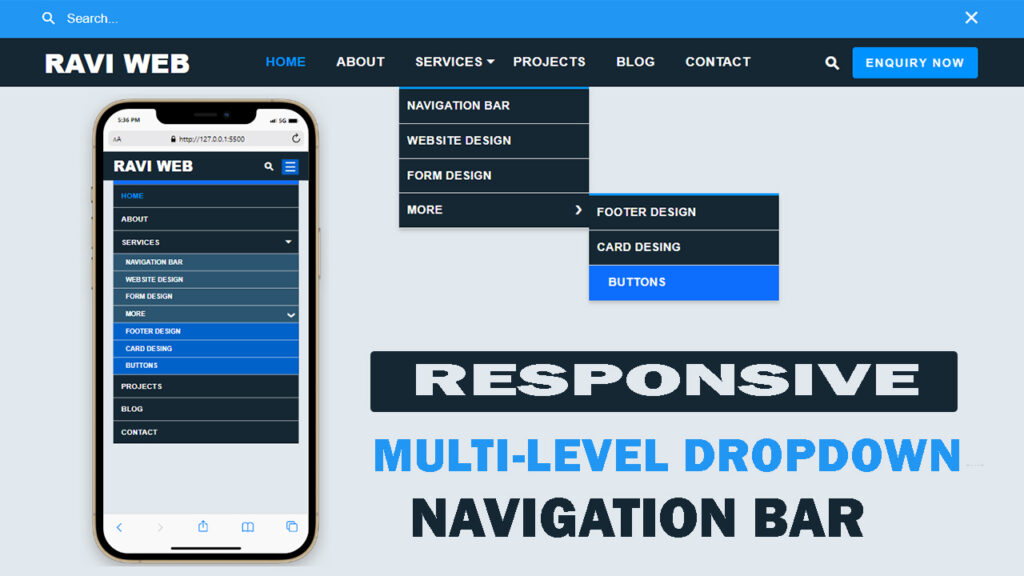
Final Output Preview of Navigation Bar
After adding all three parts (HTML + CSS + JavaScript), your Responsive Multi-level Dropdown Navigation Bar will be ready to use.
- Desktop users will see a clean navbar with hover dropdowns.
- Mobile users will get a hamburger icon with expandable menus.
- A stylish search bar is also included for better usability.
Conclusion
In this tutorial, we learned how to build a Responsive Multi-level Dropdown Navigation Bar step by step using HTML, CSS, and JavaScript.
- First, we created the HTML structure with logo, menu, and dropdowns.
- Then, we styled it with CSS to make it responsive and modern.
- Finally, we added JavaScript for search toggle and mobile menu functionality.
This navigation bar is lightweight, and user-friendly. You can directly use this code for your projects or customize it further according to your needs.