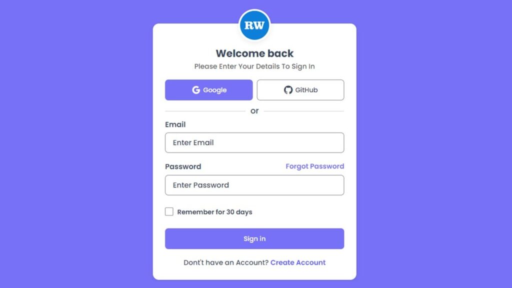
Responsive Login Page in HTML & CSS – Modern UI with Code
In today’s digital world, a login page is one of the most important parts of any website or web application. Whether you are building a personal portfolio, admin dashboard, SaaS platform, or startup website, the login page is usually the first interaction point between the user and your product.
A well-designed login page not only improves user experience (UX) but also builds trust, credibility, and professionalism. Poorly designed forms can increase bounce rate, while a clean and responsive login UI can significantly improve user engagement.
In this tutorial, you will learn how to create a fully responsive, modern login page using only HTML and CSS, without any JavaScript or external frameworks. The design includes social login buttons, clean typography, responsive layout, and a professional UI look suitable for real-world projects.
Watch the Video : Responsive Login Page
Why a Good Login Page Design Matters
A login page is more than just an email and password form. It plays a critical role in:
- User trust and security perception
- First impression of your brand
- Mobile usability and responsiveness
- Conversion rate optimization
- Lower bounce rate
Also Read
- Responsive Login and Signup Form using HTML & CSS
- Login Form Validation With Error Message Using HTML, CSS & JavaScript
Features of This Login Page Design
This login page is created keeping real user behavior and modern web standards in mind. Instead of focusing only on design, this layout balances usability, readability, and performance, which makes it suitable for real projects as well as learning purposes.
Here’s what makes this login page stand out:
- A clean and modern user interface that feels professional and familiar to users
- Fully responsive layout that adapts smoothly to mobile phones, tablets, and desktops
- Social login button design for Google and GitHub to match modern authentication trends
- Well-structured form layout with proper spacing to avoid visual clutter
- Easy-to-read typography using the Poppins font for better readability
- Simple color contrast that improves accessibility and user focus
- Beginner-friendly HTML and CSS structure that is easy to understand and customize
Technologies Used
This project uses only lightweight and industry-standard technologies:
- HTML5 – For semantic structure
- CSS3 – For layout, styling, and responsiveness
- Google Fonts (Poppins) – For modern typography
- Boxicons – For social media icons
Also Read
Project Folder Structure
Keeping your project organized is a best practice. Here’s the recommended folder structure:
login-page-ui/
│── index.html
│── style.css
│── logo.png
Understanding the HTML Structure
The HTML file provides the skeleton of the login page. The structure includes:
- A main wrapper to center the layout
- Logo section for branding
- Heading and subtitle for user guidance
- Social login buttons
- Login form with email and password fields
- Remember me checkbox
Best Practices Used in HTML
- Semantic elements
- Proper label usage
- Clean and readable structure
HTML Code:
Below is the complete HTML code for the responsive login page. You can copy and paste it directly into your project.
<!DOCTYPE html>
<html lang="en">

<head>
    <meta charset="UTF-8">
    <meta http-equiv="X-UA-Compatible" content="IE=edge">
    <meta name="viewport" content="width=device-width, initial-scale=1.0">
    <title>Sign In Form Design Using HTML And CSS || Ravi Web</title>
    <!-- ======Boxicons CDN=== -->
    <link href='https://unpkg.com/boxicons@2.1.4/css/boxicons.min.css' rel='stylesheet'>
    <!-- ========CSS Link======= -->
    <link rel="stylesheet" href="style.css">
</head>

<body>
    <div class="wrapper">
        <div class="form-container">
            <div class="logo"><img src="logo.png" alt=""></div>
            <h1 class="title">Welcome back</h1>
            <p class="para-text">Please Enter Your Details To Sign In</p>

            <!-- ===========Social Icons Start========== -->
            <div class="social-signup">
                <a href="#"><i class="bx bxl-google"></i>Google</a>
                <a href="#"><i class="bx bxl-github"></i>GitHub</a>
            </div>
            <!-- ===========Social Icons End========== -->
            <p class="subtitle">or</p>
            <form action="">
                <!-- =========form group start======= -->
                <div class="form-group">
                    <label class="label-title">Email</label>
                    <input type="email" placeholder="Enter Email">
                </div>
                <!-- =========form group End======= -->

                <!-- =========form group start======= -->
                <div class="form-group">
                    <label class="label-title">Password</label>
                    <input type="password" placeholder="Enter Password">
                    <a href="#" class="forgot-password">Forgot Password</a>
                </div>
                <!-- =========form group End======= -->

                <!-- ========Check Group start=== -->
                <div class="check-group">
                    <input type="checkbox" id="check">
                    <label for="check" class="checktext">Remember for 30 days</label>
                </div>
                <!-- ========Check Group End=== -->

                <button class="submit-btn">Sign in</button>
                <p class="signup-link">Dont't have an Account? <a href="#">Create Account</a></p>

            </form>
        </div>
    </div>
</body>

</html>
CSS Code:
Now let’s move to the CSS code, which handles layout, colors, responsiveness, and UI effects.
/* =======Google Fonts Poppins======= */
@import url('https://fonts.googleapis.com/css2?family=Poppins:wght@400;500;600;700;800;900&display=swap');

*{
    margin: 0;
    padding: 0;
    box-sizing: border-box;
    font-family: 'Poppins', sans-serif;
}
.wrapper{
    background-color: #7771f7;
    width: 100%;
    min-height: 100vh;
    padding:50px 15px;
    display: flex;
    justify-content: center;
    align-items: center;
}
.form-container{
    max-width: 500px;
    width: 100%;
    background-color: #fff;
    padding: 30px 30px;
    border-radius: 15px;
    box-shadow: rgba(0,0,0,0.08) 0px 4px 12px;
    position: relative;
}
.logo{
    position: absolute;
    width: 100%;
    top: -35px;
    left: 0;
    display: flex;
    justify-content: center;
}
.logo img{
    width: 80px;
    height: 80px;
    border-radius: 50%;
    box-shadow: rgba(0,0,0,0.08) 0px 4px 12px;
    border: 5px solid #fff;
}
.title{
    font-size: 25px;
    color: #38475a;
    font-weight: 700;
    text-align: center;
    margin-top: 25px;
}

.para-text{
    font-size: 17px;
    font-weight: 500;
    color: #5c5b5b;
    margin-bottom: 15px;
    text-align: center;
}
.social-signup{
    margin-top: 20px;
    display: flex;
    align-items: center;
    justify-content: space-between;
    gap: 10px;
}
.social-signup a{
    width: 100%;
    text-decoration: none;
    display: flex;
    justify-content: center;
    align-items: center;
    font-size: 16px;
    font-weight: 500;
    color: #38475a;
    border: 2px solid #81858c;
    padding: 12px 10px;
    border-radius: 8px;
    transition: all 0.3s ease;
}
.social-signup a:hover{
    background-color: #7771f7;
    border: 2px solid #7771f7;
    color: #fff;
}
.social-signup a i{
    font-size: 25px;
    margin-right: 5px;
}
.subtitle{
    margin-top: 10px;
    text-align: center;
    color: #38475a;
    font-size: 20px;
    font-weight: 500;
    position: relative;
}
.subtitle::before,
.subtitle::after{
    content: "";
    position: absolute;
    width: 45%;
    height: 3px;
    top: 50%;
    background-color: #0000001a;
    border-radius: 4px;
}
.subtitle::before{
    left: 0;
}
.subtitle::after{
    right: 0;
}

.form-group{
    position: relative;
    margin-bottom: 20px;
}
.form-group .label-title{
    color: #38475a;
    text-transform: capitalize;
    margin: 5px 0 6px 0;
    font-size: 18px;
    font-weight: 600;
    display: block;
}
.form-group input{
    background: none;
    color: #38475a;
    height: 50px;
    width: 100%;
    font-size: 17px;
    font-weight: 500;
    padding: 9px 18px 9px 18px;
    border: 2px solid #81858c;
    outline: none;
    border-radius: 8px;
}

.form-group input::placeholder{
    color: #38475a;
    font-size: 18px;
    font-weight: 500;
}
.form-group input:focus::placeholder{
    color: #625BFE;
}
.form-group input:focus{
    border: 2px solid #625BFE;
}

.form-group .label-title:has(+ input:focus){
    color: #625BFE;
}
.form-group .forgot-password{
    position: absolute;
    top: 0;
    right: 0;
    text-decoration: none;
    color: #7771f7;
    text-transform: capitalize;
    font-size: 17px;
    font-weight: 600;
}

.check-group{
    margin-top: 30px;
}
.check-group #check{
    width: 20px;
    height: 20px;
    cursor: pointer;
}
.check-group .checktext{
    font-size: 16px;
    color: #38475a;
    margin-left: 10px;
    font-weight: 600;
    position: absolute;
    cursor: pointer;
}

.submit-btn{
    width: 100%;
    background: #7771f7;
    border: 1px solid transparent;
    border-radius: 8px;
    font-size: 16px;
    color: #fff;
    padding: 13px;
    margin-top: 25px;
    font-weight: 500;
    text-align: center;
    cursor: pointer;
    transition: all 0.4s;
}

.submit-btn:hover{
    opacity: 0.8;
}

.signup-link{
    margin-top: 20px;
    text-align: center;
    color: #38475a;
    font-size: 17px;
    font-weight: 500;
    position: relative;
}
.signup-link a{
    text-decoration: none;
    color: #625BFE;
    font-weight: 600;
}
.signup-link a:hover{
    opacity: 0.8;
}
Explanation of the UI Design
1. Wrapper Section
The .wrapper uses Flexbox to center the login form both vertically and horizontally. This ensures perfect alignment on all screen sizes.
2. Logo Placement
The logo is positioned absolutely to create a floating effect. This is a common modern UI pattern seen in SaaS platforms.
3. Social Login Buttons
Even though these buttons are UI-only, they represent modern authentication methods and improve user trust.
Also Read
- Responsive Registration Form in HTML and CSS
- Custom Drag and Drop File Upload Using HTML, CSS & JavaScript
Responsive Design Strategy
This login page automatically adapts to:
- Mobile phones
- Tablets
- Laptops and desktops
Conclusion
Creating a responsive login page using HTML and CSS is an essential skill for every web developer. This tutorial demonstrates how you can build a professional, modern, and user-friendly login UI without using JavaScript or heavy frameworks.
If you are a beginner, this project will strengthen your fundamentals. If you are a professional, it can be reused and customized for real-world applications.
A clean UI, good UX, fast loading speed, and SEO-friendly structure make this login page perfect for portfolio projects, blogs, and client work