Responsive Login Form Design Using HTML CSS | Modern Sign In Page UI (Free Code)
If you’re looking to create a responsive login form design that looks modern, clean, and works perfectly on all devices, then this guide is for you.
A good responsive login form design is essential for every website today because it directly impacts user experience. When users visit your site, the first interaction often happens through a login page — so having a professional responsive login form design can increase engagement and trust.
In this tutorial, you will learn how to build a modern login page HTML CSS project from scratch. This is a beginner-friendly frontend project HTML CSS that you can use in your portfolio or real-world websites.
Also Read
Watch the Video Tutorial: Responsive Login Form Design Using HTML CSS
What You Will Learn
In this guide, we’re going to build a responsive login form design step by step using simple HTML and CSS. You’ll see how to create a modern login page HTML CSS layout that looks clean, professional, and works smoothly on all screen sizes. We’ll also explore how to add a stylish glassmorphism login form effect to give your UI a fresh and modern feel. Along the way, you’ll get clean and reusable sign in form HTML CSS code that you can easily use in your own projects. By the end, you’ll have a complete frontend project HTML CSS ready, which you can showcase in your portfolio or use in real websites.
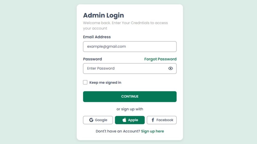
Why Responsive Login Form Design is Important
A login form HTML CSS is often the first interaction point between users and your system. If your login form looks outdated or doesn’t work properly on mobile devices, users may leave your website instantly.
Here are some key reasons why a responsive login form design matters:
- Better user experience on all devices
- Improved website credibility
- Higher user engagement
- Lower bounce rate
A well-designed login UI design HTML CSS ensures users can easily access their accounts without frustration.
Also Read
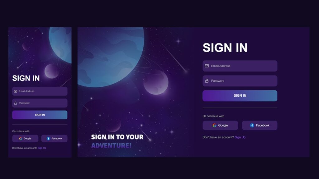
Features of This Login Form
This modern login page HTML CSS project comes with a fully responsive layout that adapts perfectly to all screen sizes, ensuring a seamless user experience on mobile, tablet, and desktop devices. The design follows a clean and minimal UI approach, making it visually appealing and easy to use. It also includes a stylish glassmorphism login form effect that gives the interface a modern and professional look. Along with that, smooth input animations enhance user interaction and make the form feel more dynamic. The code is simple and beginner-friendly, so even new developers can understand and customize it easily. Overall, this is a perfect example of a html css form design free code that you can reuse in multiple projects without any difficulty.
HTML Code:
<!DOCTYPE html>
<html lang="en">

<head>
    <meta charset="UTF-8">
    <meta name="viewport" content="width=device-width, initial-scale=1.0">
    <title>Responsive Sign in form</title>

    <!-- Boxicons CDN -->
    <link href="https://unpkg.com/boxicons@2.1.4/css/boxicons.min.css" rel="stylesheet">

    <!-- CSS File -->
    <link rel="stylesheet" href="style.css">
</head>

<body>

    <div class="wrapper">

        <!-- ===== Hero Wrapper Start ===== -->
        <div class="hero-wrapper">
            <h3 class="hero-title">
                Sign in to your <br> <span>adventure!</span>
            </h3>
        </div>
        <!-- ===== Hero Wrapper End ===== -->


        <!-- ===== Form Content Start ===== -->
        <div class="form-content">
            <form action="#" class="form-wrapper">

                <h2 class="title">Sign in</h2>

                <!-- ===== Input Group Start ===== -->
                <div class="input-group">
                    <span class="icons">
                        <i class='bx bx-envelope'></i>
                    </span>
                    <input class="input-field" type="email" placeholder="Email Address">
                </div>
                <!-- ===== Input Group End ===== -->


                <!-- ===== Input Group Start ===== -->
                <div class="input-group">
                    <span class="icons">
                        <i class='bx bx-lock-alt'></i>
                    </span>
                    <input class="input-field" type="password" placeholder="Password">
                </div>
                <!-- ===== Input Group End ===== -->


                <!-- ===== Input Group Start ===== -->
                <div class="input-group">
                    <button type="submit" class="btn">Sign in</button>
                </div>
                <!-- ===== Input Group End ===== -->


                <!-- Divider Line -->
                <div class="line"></div>

                <!-- Continue Text -->
                <p class="text-continue">Or continue with</p>

                <!-- ===== Social Wrap Start ===== -->
                <div class="social-wrap">
                    <a href="#" class="social-btn">
                        <img src="google.png" alt="google">
                        Google
                    </a>

                    <a href="#" class="social-btn">
                        <img src="facebook.png" alt="facebook">
                        Facebook
                    </a>
                </div>
                <!-- ===== Social Wrap End ===== -->


                <!-- Account Text -->
                <p class="text-account">
                    Don't have an account?
                    <a href="#">Sign up</a>
                </p>


            </form>
        </div>
        <!-- ===== Form Content End ===== -->

    </div>

</body>

</html>
CSS Code:
* {
    margin: 0;
    padding: 0;
    box-sizing: border-box;
}

body {
    color: #fff;
    background-color: #000;
    font-size: 16px;
    font-family: sans-serif;
}

.wrapper {
    min-height: 100vh;
    display: flex;
    position: relative;
}

.wrapper::before {
    content: "";
    position: absolute;
    top: 0;
    left: 0;
    width: 100%;
    height: 100%;
    background: url("bg.png");
    background-position: center center;
    background-repeat: no-repeat;
    background-size: cover;
    z-index: -1;
}

.hero-wrapper,
.form-content {
    position: relative;
    width: 50%;
}

.hero-wrapper {
    min-height: 100vh;
    padding: 40px
}

.hero-title {
    position: absolute;
    bottom: 50px;
    font-size: 30px;
    font-weight: 700;
    color: #fff;
    text-transform: uppercase;
}

.hero-title span {
    background: linear-gradient(90deg, #501795 0%, #3e70a1 100%);
    -webkit-background-clip: text;
    -webkit-text-fill-color: transparent;
    background-clip: text;
}

.form-content {
    display: flex;
    flex-direction: column;
    align-items: center;
    justify-content: center;
    padding: 30px;
}

.form-content .title {
    font-size: 65px;
    font-weight: 700;
    margin-bottom: 30px;
    text-transform: uppercase;
}

.form-content .form-wrapper {
    max-width: 400px;
    width: 100%;
}

.form-wrapper .input-group {
    position: relative;
    margin-bottom: 20px;
}

.form-wrapper .input-group .input-field {
    width: 100%;
    padding-left: 45px;
    border-radius: 14px;
    height: 60px;
    background-color: #382063;
    border: 1px solid #382063;
    color: #A4A4A4;
    font-family: sans-serif;
    font-size: 16px;
    font-weight: 400;
}

.form-wrapper .input-group .input-field::placeholder {
    color: #A4A4A4;
    font-size: 16px;
    font-family: sans-serif;
}

.form-wrapper .input-group .icons {
    position: absolute;
    left: 0;
    top: 0;
    width: 45px;
    height: 100%;
    display: flex;
    justify-content: center;
    align-items: center;
    font-size: 25px;
    background-color: transparent;
    color: #A4A4A4;
}

.form-wrapper .btn {
    display: inline-block;
    background: linear-gradient(90deg, #501794 0%, #3e70a1 100%);
    width: 100%;
    min-height: 60px;
    color: #fff;
    font-size: 18px;
    font-weight: 600;
    text-transform: uppercase;
    border-radius: 18px;
    border: 1px solid transparent;
    cursor: pointer;
    transition: background 0.3s ease;
}

.form-wrapper .btn:hover {
    background: linear-gradient(90deg, #3e70a1 0%, #501794 100%);
}

.form-wrapper .line {
    width: 100%;
    height: 1px;
    background-color: #727272;
    margin: 35px 0;
}

.text-continue {
    font-size: 16px;
    color: #A4A4A4;
    margin-bottom: 15px;
}

.social-wrap {
    display: flex;
    gap: 20px;
}

.social-wrap .social-btn {
    width: 100%;
    min-height: 50px;
    border-radius: 14px;
    background: #3B2063;
    color: #fff;
    display: flex;
    justify-content: center;
    align-items: center;
    gap: 10px;
    text-decoration: none;
    font-weight: 500;
    transition: background 0.3s ease;
}

.social-wrap .social-btn:hover {
    background: #501794;
}

.form-wrapper .text-account {
    color: #A4A4A4;
    margin-top: 30px;
}

.form-wrapper .text-account a {
    color: #9D5CE9;
    text-decoration: none;
    transition: color 0.3s ease;
}

.form-wrapper .text-account a:hover {
    color: #501794;
}

@media(max-width:992px) {
    .wrapper {
        flex-wrap: wrap;
    }

    .wrapper::before {
        background: url('mobile-bg.png');
        background-position: left center;
        background-size: cover;
    }

    .hero-wrapper,
    .form-content {
        width: 100%;
        min-height: 20vh;
    }

    .form-content .title {
        font-size: 50px;
    }

    .hero-wrapper .hero-title {
        display: none;
    }
}
Step-by-Step Code Explanation
HTML Structure
The HTML part creates the basic layout of the sign in form HTML CSS code, which is essential for building a clean and structured login interface. The container is used to center the form on the screen, ensuring proper alignment on all devices. Inside the container, the form element holds all the input fields and buttons required for user interaction. Each input field is wrapped inside an input box, which helps manage the label animation and improves the overall user experience. This structured approach makes the code easy to understand, maintain, and reuse in different projects.
CSS Styling
The CSS styling plays a key role in enhancing the overall look and feel of the login UI design HTML CSS. In this project, we use a gradient background to create a modern and visually appealing interface that instantly grabs user attention. To make the design more stylish, we apply the glassmorphism login form effect, which is achieved using a transparent background, a subtle blur effect, and soft border radius. These elements together give the login form a clean, modern, and premium look, making it stand out as a professional modern login page HTML CSS design.
Responsive Behavior
While working on this responsive login form design, I didn’t want to rely on fixed sizes because they usually break on smaller screens. So instead, I used flexible width and max-width to let the layout adjust on its own.
When you open it on a mobile phone, the form fits nicely without any horizontal scroll, which is something users really expect now. On tablets and laptops, it still looks balanced and doesn’t feel stretched or cramped. Even on bigger desktop screens, the form stays centered and easy to focus on.
Honestly, the idea was simple — no matter what device someone is using, the experience should feel smooth and familiar. That’s why this login form HTML CSS setup works well in real-world use, not just as a demo.
Conclusion
Creating a responsive login form design using HTML and CSS is one of the best beginner-friendly projects. It helps you understand layout, styling, and UI design concepts. This modern login page HTML CSS project can be used in real-world applications and portfolios.
If you continue building projects like this, you will master frontend project HTML CSS and become a confident web developer.