Responsive Login and Signup Form using HTML & CSS | Modern UI Design
Categories: Forms
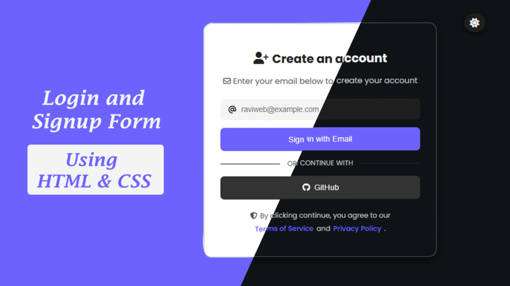
In this tutorial, you will learn how to create a modern UI login form and dark mode signup form using HTML, CSS, and JavaScript that is mobile-friendly, responsive, and visually attractive.
In today’s digital world, a Responsive Login and Signup Form is essential for every website and web application. A modern and user-friendly login/signup system is not only crucial for user authentication but also enhances your website’s credibility and professional look.
Why Create a Login & Signup Form?
- Security and User Authentication: Keeps user data safe and secure.
- Professional Appearance: Modern UI design gives your website a polished look.
- Better User Experience: Responsive design and easy-to-use interface make navigation smooth for users.
Watch the Video Tutorial: Responsive Login and Signup Form using HTML & CSS | Modern UI Design
- Watching the video helps you see live coding, theme toggle, and social login integration in action.
- Perfect for visual learners who want a step-by-step guide.
Key Features of This Project
- Responsive Design: Works perfectly on desktops and mobile devices.
- Dark/Light Mode Toggle: Users can choose their preferred theme.
- Social Login Integration: GitHub login button for easy social login.
- Modern UI Design: Smooth hover effects and minimalistic layout.
HTML Code:
<!DOCTYPE html>
<html lang="en">

<head>
    <meta charset="UTF-8">
    <meta name="viewport" content="width=device-width, initial-scale=1.0">
    <title>Responsive Login and Signup Form using HTML & CSS | Modern UI Design</title>
    <!-- Font Awesome CDN -->
    <link rel="stylesheet" href="https://cdnjs.cloudflare.com/ajax/libs/font-awesome/6.6.0/css/all.min.css"/>
    <!-- CSS Link -->
    <link rel="stylesheet" href="style.css">
</head>

<body>

    <!-- Theme Toggle -->
     <button class="theme-toggle" id="themeToggle">
        <i class="fa-solid fa-moon"></i>
     </button>

     <!-- Container  -->

     <div class="create-account-container">

        <div class="create-account-header">
            <h2>
                <i class="fa-solid fa-user-plus"></i>
                Create an account
            </h2>
            <p>
                <i class="fa-regular fa-envelope"></i>
                Enter your email below to create your account
            </p>
        </div>

        <div class="create-account-content">
            <form action="">
                <div class="input-box">
                    <i class="fa-solid fa-at"></i>
                    <input type="email" placeholder="raviweb@example.com" required>
                </div>
                <input type="submit" class="submit-btn" value="Sign in with Email">
            </form>

            <p class="create-account-continue-with">
                Or Continue with
            </p>

            <button class="create-account-social">
                <i class="fa-brands fa-github"></i>
                Github
            </button>
        </div>

        <p class="create-account-footer">
            <i class="fa-solid fa-shield-halved"></i>
            By clicking continue you agree to our
            <a href="#">Terms of Service</a> and <a href="#">Privacy Policy</a>
        </p>

     </div>
</body>

</html>
CSS Code:
/* Import Google font - Poppins */
@import url('https://fonts.googleapis.com/css2?family=Poppins:wght@400;500;600;700&display=swap');

/* -----theme variable---- */
:root{
    --bg-color:#ffffff;
    --text-color:#222;
    --secondary-text:#555;
    --input-bg:#f4f4f4;
    --btn-bg:#6c63ff;
    --btn-hover:#357ABD;
    --card-border-color:#4141414d;
    --card-shadow:rgba(0,0,0,0.1);
}

body.dark{
    --bg-color:#101316;
    --text-color:#f4f4f4;
    --secondary-text:#ccc;
    --input-bg:#1e1e1e;
    --btn-bg:#6c63ff;
    --btn-hover:#574b90;
    --card-border-color:#ffffff4d;
    --card-shadow:rgba(0,0,0,0.6);
}

/* ---General Style--- */
body{
    font-family: 'Poppins', sans-serif;
    background: var(--bg-color);
    color: var(--text-color);
    display: flex;
    justify-content: center;
    align-items: center;
    min-height: 100vh;
    margin: 0;
    transition: background 0.3s, color 0.3s;
}

/* --theme toggle--- */
.theme-toggle{
    position: absolute;
    top: 16px;
    right: 70px;
    background: var(--input-bg);
    border: none;
    padding: 8px 11px;
    border-radius: 50%;
    cursor: pointer;
    box-shadow: 0 4px 10px var(--card-shadow);
    transition: background 0.3s;
}

.theme-toggle i{
    font-size: 18px;
    color: var(--text-color);
}

.create-account-container{
    background: var(--bg-color);
    padding: 32px;
    margin: 15px;
    border-radius: 16px;
    box-shadow: 0 8px 20px var(--card-shadow);
    max-width: 400px;
    width: 100%;
    transition: background 0.3s, color 0.3s;
    border: 1px solid var(--card-border-color);
}

.create-account-container .create-account-header h2{
    font-size: 24px;
    margin-bottom: 8px;
    display: flex;
    align-items: center;
    justify-content: center;
    gap: 8px;
}

.create-account-header p{
    font-size: 16px;
    color: var(--secondary-text);
    text-align: center;
}

.create-account-content{
    margin: 24px 0;
}
form{
    display: flex;
    flex-direction: column;
    gap: 16px;
}

.input-box{
    display: flex;
    align-items: center;
    gap: 8px;
    background: var(--input-bg);
    padding: 12px 16px;
    border-radius: 8px;
    transition: background 0.3s;
}
.input-box input{
    border: none;
    outline: none;
    flex: 1;
    background: transparent;
    font-size: 16px;
    color: var(--text-color);
}

input.submit-btn{
    background: var(--btn-bg);
    color: #fff;
    padding: 14px;
    border: none;
    border-radius: 8px;
    font-size: 16px;
    cursor: pointer;
    transition: background 0.3s, transform 0.2s;
}
input.submit-btn:hover{
    background: var(--btn-hover);
    transform: scale(1.02);
}


.create-account-continue-with{
    text-align: center;
    color: var(--secondary-text);
    font-size: 14px;
    text-transform: uppercase;
    position: relative;
    overflow-x: hidden;
}

.create-account-continue-with::before{
    content: "";
    position: absolute;
    left: 0;
    top: 50%;
    width: 30%;
    height: 1px;
    background-color: var(--card-border-color);
}

.create-account-continue-with::after{
    content: "";
    position: absolute;
    left: unset;
    right: 0;
    top: 50%;
    width: 30%;
    height: 1px;
    background-color: var(--card-border-color);
}

.create-account-social{
    width: 100%;
    background: #333;
    color: #fff;
    padding: 14px;
    border: none;
    border-radius: 8px;
    font-size: 16px;
    display: flex;
    align-items: center;
    justify-content: center;
    gap: 8px;
    cursor: pointer;
    transition: background 0.3s transform 0.2s;
}

.create-account-social:hover{
    background: #000;
    transform: scale(1.02);
}

.create-account-footer{
    font-size: 14px;
    color: var(--secondary-text);
    display: flex;
    align-items: center;
    gap: 6px;
    margin-top: 16px;
    text-align: center;
    flex-wrap: wrap;
    justify-content: center;
}
.create-account-footer a{
    color: var(--btn-bg);
    text-decoration: none;
    font-weight: 500;
}
.create-account-footer a:hover{
    text-decoration: underline;
}
JavaScript Code:
<!-- =====Javascript== -->
     <script>
        const toggleBtn = document.getElementById("themeToggle");
        const body = document.body;
        toggleBtn.addEventListener("click", ()=>{
            body.classList.toggle("dark");
            toggleBtn.innerHTML=body.classList.contains("dark")
            ? '<i class="fa-solid fa-sun"> </i>' : '<i class="fa-solid fa-moon"> </i>'
        })
     </script>
Conclusion
This Responsive Login and Signup Form using HTML & CSS | Modern UI Design tutorial is perfect for both beginners and professionals.
- Modern UI and responsive design make it user-friendly.
- Dark mode and social login features make it interactive and professional.