Responsive Admin Dashboard Design Using HTML and CSS | Modern Dashboard UI
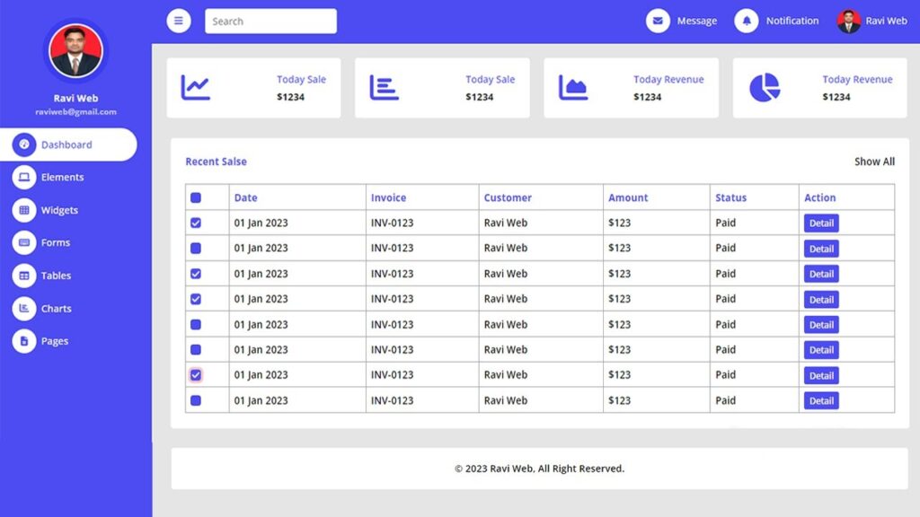
In this article, we will learn how to create a responsive admin dashboard page using HTML and CSS. This project includes a sidebar menu, top navigation bar, sales and revenue widgets, a recent sales table, and a footer. The design is beginner-friendly, and you can easily customize it to match your own project requirements.
A responsive admin dashboard is an essential part of any web application. It gives developers and users the ability to control, monitor, and manage different aspects of a system in one place. With the increasing use of mobile devices, having a dashboard that adjusts to different screen sizes is no longer optional—it’s a necessity.
This project demonstrates how to build a modern admin dashboard using HTML, CSS, and JavaScript. It is beginner-friendly, fully customizable, and can be extended to fit professional needs.
Watch the Video Tutorial: Responsive Admin Dashboard Design Using HTML and CSS
To better understand the project, watch this step-by-step video tutorial:
Features of the Responsive Admin Dashboard
- Sidebar navigation menu with icons
- Responsive top navigation bar with search option
- Sales and revenue summary widgets
- Recent sales table with checkboxes and actions
- Sticky footer with copyright
- Fully responsive layout that works on desktop, tablet, and mobile
Why Responsive Design is Important
In today’s world, people access websites not just from desktops but also from tablets and mobile devices. A non-responsive dashboard creates usability problems and limits accessibility. That’s why responsive design ensures that the layout adjusts smoothly across all screen sizes, providing:
- Better user experience
- Time-saving for developers (one design fits all)
- Improved professional look
- Improved professional look
Why Learn Admin Dashboard Design?
- How to structure complex layouts
- How to create responsive UI components
- How to use Flexbox and CSS Grid effectively
- How to integrate JavaScript toggle functions for sidebar menus
Such projects are often required in real-world applications like e-commerce dashboards, CMS panels, analytics platforms, and admin portals.
The base of this project is the HTML skeleton. It is divided into two main parts:
- Sidebar navigation menu
- Main content section
HTML Code:
<!DOCTYPE html>
<html lang="en">
<head>
<meta charset="UTF-8">
<meta http-equiv="X-UA-Compatible" content="IE=edge">
<meta name="viewport" content="width=device-width, initial-scale=1.0">
<title>Responsive admin dashboard page design in html and css || Ravi Web</title>
<!-- ===== Font Awesome cdn Link=========== -->
<link rel="stylesheet" href="https://cdnjs.cloudflare.com/ajax/libs/font-awesome/6.4.0/css/all.min.css" />
<!-- ==============CSS Link======= -->
<link rel="stylesheet" href="style.css">
</head>
<body>
<!-- =====================Sidebar Start=============== -->
<div id="sidebarmenu" class="sidebar">
<nav class="sidenavbar">
<div class="sidebar-header"><img src="ravi.jpeg" class="user-photo">
<p class="username">Ravi Web<br><small>raviweb@gmail.com</small></p>
</div>
<div class="navbar-nav">
<a href="#" class="active"><i class="fa fa-tachometer-alt"></i>Dashboard</a>
<a href="#"><i class="fa fa-laptop"></i>Elements</a>
<a href="#"><i class="fa fa-th"></i>Widgets</a>
<a href="#"><i class="fa fa-keyboard"></i>Forms</a>
<a href="#"><i class="fa fa-table"></i>Tables</a>
<a href="#"><i class="fa fa-chart-bar"></i>Charts</a>
<a href="#"><i class="far fa-file-alt"></i>Pages</a>
</div>
</nav>
</div>
<!-- ====================Sidebar End=============== -->
<!-- ================Content Start========== -->
<div id="content" class="content">
<!-- =============Top Navbar Start============ -->
<nav class="top-nav">
<a href="#" id="togglemenu" class="toggler">
<i class="fa fa-bars"></i>
</a>
<form action="" class="search-form">
<input type="search" placeholder="Search">
</form>
<div class="right-top-nav">
<div class="nav-item">
<a href="#"><i class="fa fa-envelope me-lg-2"></i><span>Message</span></a>
<a href="#"><i class="fa fa-bell me-lg-2"></i><span>Notificatin</span></a>
<a href="#"><img src="ravi.jpeg" alt=""><span>Ravi Web</span></a>
</div>
</div>
</nav>
<!-- =============Top Navbar End============ -->
<!-- Sale & Revenue Start -->
<div class="sale-revenue">
<div class="box">
<i class="fa fa-chart-line"></i>
<div class="right-text">
<p>Today Sale</p>
<h6>$1234</h6>
</div>
</div>
<div class="box">
<i class="fa fa fa-chart-bar"></i>
<div class="right-text">
<p>Today Sale</p>
<h6>$1234</h6>
</div>
</div>
<div class="box">
<i class="fa fa-chart-area"></i>
<div class="right-text">
<p>Today Revenue</p>
<h6>$1234</h6>
</div>
</div>
<div class="box">
<i class="fa fa-chart-pie"></i>
<div class="right-text">
<p>Today Revenue</p>
<h6>$1234</h6>
</div>
</div>
</div>
<!-- Sale & Revenue End -->
<!-- Recent Sales Start -->
<div class="recent-sales">
<div class="container-recent">
<div class="top-text">
<h6>Recent Salse</h6>
<a href="#">Show All</a>
</div>
<div class="table-container">
<table>
<thead>
<tr>
<th><input type="checkbox"></th>
<th>Date</th>
<th>Invoice</th>
<th>Customer</th>
<th>Amount</th>
<th>Status</th>
<th>Action</th>
</tr>
</thead>
<tbody>
<tr>
<td><input type="checkbox"></td>
<td>01 Jan 2045</td>
<td>INV-0123</td>
<td>Jhon Doe</td>
<td>$123</td>
<td>Paid</td>
<td><a href="#">Detail</a></td>
</tr>
<tr>
<td><input type="checkbox"></td>
<td>01 Jan 2045</td>
<td>INV-0123</td>
<td>Jhon Doe</td>
<td>$123</td>
<td>Paid</td>
<td><a href="#">Detail</a></td>
</tr>
<tr>
<td><input type="checkbox"></td>
<td>01 Jan 2045</td>
<td>INV-0123</td>
<td>Jhon Doe</td>
<td>$123</td>
<td>Paid</td>
<td><a href="#">Detail</a></td>
</tr>
<tr>
<td><input type="checkbox"></td>
<td>01 Jan 2045</td>
<td>INV-0123</td>
<td>Jhon Doe</td>
<td>$123</td>
<td>Paid</td>
<td><a href="#">Detail</a></td>
</tr>
<tr>
<td><input type="checkbox"></td>
<td>01 Jan 2045</td>
<td>INV-0123</td>
<td>Jhon Doe</td>
<td>$123</td>
<td>Paid</td>
<td><a href="#">Detail</a></td>
</tr>
<tr>
<td><input type="checkbox"></td>
<td>01 Jan 2045</td>
<td>INV-0123</td>
<td>Jhon Doe</td>
<td>$123</td>
<td>Paid</td>
<td><a href="#">Detail</a></td>
</tr>
<tr>
<td><input type="checkbox"></td>
<td>01 Jan 2045</td>
<td>INV-0123</td>
<td>Jhon Doe</td>
<td>$123</td>
<td>Paid</td>
<td><a href="#">Detail</a></td>
</tr>
</tbody>
</table>
</div>
</div>
</div>
<!-- Recent Sales End -->
<!-- footer section Start -->
<footer class="footer">
<div class="copy-right">
<a href="#"><span>© 2023 Ravi Ranjan</span>, All Right Reserved.</a>
</div>
</footer>
<!-- footer section End -->
</div>
<!-- ================Content End============ -->
</body>
</html>CSS is used to design the layout. With Flexbox and Grid, the dashboard becomes fully responsive. CSS is also used for:
- Color themes
- Sidebar hover effects
- Typography styling
- Grid-based widgets
CSS Code:
@import url('https://fonts.googleapis.com/css2?family=Open+Sans:wght@300;400;500;600;700;800&display=swap');

* {
    margin: 0;
    padding: 0;
    box-sizing: border-box;
    font-family: 'Open Sans', sans-serif;
}

/* ==========Sidebar css=========== */
.sidebar {
    position: fixed;
    top: 0;
    left: 0;
    bottom: 0;
    width: 250px;
    height: 100vh;
    overflow-y: auto;
    background: #4C4CF1;
    transition: 0.5s;
    z-index: 999;
}

.sidebar .sidenavbar {
    position: relative;
    padding: 8px 0;
}

.sidebar .sidenavbar .sidebar-header {
    padding: 16px 20px;
    text-align: center;
}

.sidebar .sidenavbar .sidebar-header .user-photo {
    background-color: #e9ecef;
    box-shadow: 0 0 0 10px #3c3cef;
    border: 1px solid transparent;
    width: 90px;
    height: 90px;
    margin: 16px 0;
    padding: 2px;
    border-radius: 50%;
}

.sidebar .sidenavbar .sidebar-header .username {
    color: #fff;
    padding: 2px 0;
    font-size: 16px;
    font-weight: 700;
    margin: 0;
    white-space: nowrap;
}

.sidebar .sidenavbar .sidebar-header .username small {
    color: #ffffffa8;
}

.sidebar .sidenavbar .navbar-nav {
    display: flex;
    flex-direction: column;
    padding-left: 0;
    padding-right: 25px;
    margin-bottom: 0;
    list-style: none;
}

.sidebar .sidenavbar .navbar-nav a {
    color: #fff;
    padding: 7px 20px;
    font-size: 16px;
    font-weight: 500;
    border-radius: 0 30px 30px 0;
    outline: none;
    text-decoration: none;
}

.sidebar .sidenavbar .navbar-nav a:hover,
.sidebar .sidenavbar .navbar-nav a.active {
    color: #4c4cf1;
    background: #fff;
    border-color: #3c3cef;
}

.sidebar .sidenavbar .navbar-nav a i {
    width: 40px;
    height: 40px;
    display: inline-flex;
    align-items: center;
    justify-content: center;
    background: #fff;
    color: #4C4CF1;
    border-radius: 40px;
    margin-right: 8px;
}
.sidebar .sidenavbar .navbar-nav a:hover i,
.sidebar .sidenavbar .navbar-nav a.active i{
    background-color: #4C4CF1;
    color: #fff;
}
@media (min-width: 992px) {
    .sidebar.open {
        margin-left: -250px;
    }
}
@media(max-width:992px) {
    .sidebar {
        margin-left: -250px;
        margin-top: 70px;
    }

    .sidebar.open {
        margin-left: 0;
        margin-top: 70px;
    }
}

/* =========End=Sidebar css=========== */

/* ================Content Start css========== */
.content {
    margin-left: 250px;
    min-height: 100vh;
    background-color: #e5e5e5;
    transition: 0.5s;

}

/* =============Top Navbar Start css============ */
.content .top-nav {
    display: flex;
    justify-content: flex-start;
    background-color: #4C4CF1;
    padding: 16px 24px;
    position: sticky;
    top: 0;
}

.content .top-nav .toggler {
    width: 40px;
    height: 40px;
    display: inline-flex;
    align-items: center;
    justify-content: center;
    background: #fff;
    color: #4C4CF1;
    border-radius: 40px;
    text-decoration: none;
}

.content .top-nav .search-form {
    display: flex;
    padding-left: 24px;
}

.content .top-nav .search-form input {
    background-color: #fff;
    border: 0;
    outline: none;
    display: block;
    width: 100%;
    padding: 6px 12px;
    font-size: 16px;
    font-weight: 400;
    line-height: 1.5;
    color: #000000;
    background-clip: padding-box;
    appearance: none;
    border-radius: 5px;
}

.content .top-nav .right-top-nav {
    margin-left: auto;
    display: flex;
    align-items: center;
}

.content .top-nav .right-top-nav .nav-item a {
    margin-left: 25px;
    color: #fff;
    outline: none;
    text-decoration: none;
}

.content .top-nav .right-top-nav .nav-item a i {
    width: 40px;
    height: 40px;
    display: inline-flex;
    align-items: center;
    justify-content: center;
    background: #fff;
    color: #4C4CF1;
    border-radius: 40px;
    margin-right: 8px;
}

.content .top-nav .right-top-nav .nav-item a img {
    width: 40px;
    height: 40px;
    border-radius: 50%;
    margin-right: 8px;
    vertical-align: middle;
    background: #fff;
}

.content .top-nav .right-top-nav .nav-item a:hover {
    opacity: 0.9;
}

@media (min-width: 992px) {
    .content.open {
        width: 100%;
        margin-left: 0;
    }
}

@media(max-width:576px) {
    .content .top-nav .search-form {
        display: none;
    }
}

@media(max-width:992px) {
    .content {
        width: 100%;
        margin-left: 0;
    }
}

@media(max-width:1200px) {
    .content .top-nav .right-top-nav .nav-item a span {
        display: none;
    }
}


/* =============Top Navbar End css============ */

/* =====Sale & Revenue Start css==== */
.sale-revenue {
    padding: 24px 24px 0 24px;
    display: flex;
    flex-direction: row;
    align-items: center;
    justify-content: space-between;
    gap: 24px;
}

.sale-revenue .box {
    width: 100%;
    background-color: #ffffff;
    border-radius: 5px;
    padding: 24px;
    display: flex;
    justify-content: space-between;
}

.sale-revenue .box i {
    color: #4c4cf1;
    font-size: 48px;
}

.sale-revenue .box .right-text {
    margin-left: 16px;
}

.sale-revenue .box .right-text p {
    color: #4c4cf1;
    font-size: 16px;
    font-weight: 500;
    margin-bottom: 8px;
}

.sale-revenue .box .right-text h6 {
    font-size: 16px;
    font-weight: 700;
    color: #191c24;
}

@media(max-width:1300px) {
    .sale-revenue {
        flex-wrap: wrap;
    }

    .sale-revenue .box {
        flex: 0 0 auto;
        width: 48%;
    }
}

@media(max-width:668px) {
    .sale-revenue .box {
        width: 100%;
    }
}

/* =====Sale & Revenue End css==== */

/* Recent Sales Start css*/
.recent-sales {

    padding: 24px 24px 0 24px;
}

.recent-sales .container-recent {
    background-color: #ffff;
    padding: 24px;
    border-radius: 5px;

}

.recent-sales .container-recent .top-text {
    margin-bottom: 24px;
    display: flex;
    align-items: center;
    justify-content: space-between;
}

.recent-sales .container-recent .top-text h6 {
    font-size: 16px;
    font-weight: 700;
    color: #4c4cf1;
}

.recent-sales .container-recent .top-text a {
    color: #000000;
    text-decoration: none;
    font-size: 16px;
    font-weight: 600;
}

.table-container {
    overflow-x: auto;
}

.table-container table {
    width: 100%;
    text-align: left;
    margin-bottom: 0;
    vertical-align: middle;
    border-color: #4c4cf1;
}

.table-container table thead {
    vertical-align: bottom;
}

.table-container table thead tr {
    color: #4c4cf1;
}

.table-container table thead tr th {
    padding: 8px;
}

.table-container table,
.table-container table th,
.table-container table td {
    border: 1px solid #a6a6a6;
    border-collapse: collapse;
}

.table-container table td {
    padding: 8px;
    color: #000000;
    font-size: 16px;
    font-weight: 600;
}

.table-container table tr td input,
.table-container table tr th input {
    width: 16px;
    height: 16px;
    margin-top: 0.25em;
    vertical-align: top;
    background-color: #4c4cf1;
    background-repeat: no-repeat;
    background-position: center;
    background-size: contain;
    border: 1px solid rgba(0, 0, 0, 0.25);
    appearance: none;
    border-radius: 4px;
    cursor: pointer;
}

.table-container table tr td input:focus,
.table-container table tr th input:focus {
    outline: 0;
    box-shadow: 0 0 0 .25rem rgba(235, 22, 22, 0.25);
}

.table-container table td input:checked,
.table-container table th input:checked {
    background-color: #4C4CF1;
    border-color: #4C4CF1;
    position: relative;
    color: #fff;
    padding: 1px;
}

.table-container table td input:checked::before,
.table-container table th input:checked::before {
    content: "\f00c";
    font-family: "FontAwesome";
    position: absolute;
}

.table-container table tr td a {
    color: #fff;
    background-color: #4c4cf1;
    border-color: #4c4cf1;
    padding: 4px 8px;
    font-size: 14px;
    border-radius: 3px;
    text-decoration: none;
}

.table-container table tr td a:hover {
    opacity: 0.8;
}

/* Recent Sales Start End*/

/* footer section Start */
.footer {
    padding: 24px 24px 0 24px;
}

footer .copy-right {
    background-color: #fff;
    border-radius: 5px;
    display: flex;
    justify-content: center;
    align-items: center;
    padding: 24px;
}

footer .copy-right a {
    text-decoration: none;
    color: #000000;
    font-size: 16px;
    font-weight: 600;
}


/* footer section End */

/* ================Content Start End========== */
To make the dashboard interactive, JavaScript is added. Features like:
- Sidebar expand/collapse
- Smooth transitions
JavaScript Code:
<!-- =================Javascript code Start========= -->
    <script>
        const sidebarmenu = document.getElementById("sidebarmenu");
        const togglemenu = document.getElementById("togglemenu");
        const content = document.getElementById("content");
        togglemenu.addEventListener("click", () => {
            sidebarmenu.classList.toggle("open");
            content.classList.toggle("open");
        });

    </script>
    <!-- =================End Javascript code========= -->
Conclusion
The Responsive Admin Dashboard built with HTML, CSS, and JavaScript is not only an excellent beginner-friendly project but also a practical foundation for real-world applications. It teaches the fundamentals of structure, design, and interactivity, while being flexible enough to grow with advanced features.
Whether you are a student, a front-end developer, or a freelancer, this project will add significant value to your portfolio and can be customized for professional use.