Registration Form in HTML and CSS – Responsive Form Design Tutorial
Creating a registration form is one of the most important skills for every frontend developer. Almost every website needs a form to collect user information such as name, email, password, gender, and agreement to terms.
In this article, you will learn how to design a modern registration form in HTML and CSS with a clean user interface, responsive layout, and professional styling.
Also Read
- Drag and Drop File Upload Using HTML, CSS & JavaScript
- Login Form In HTML and CSS | Toggle Password Visibility in JavaScrip
- Responsive Table In HTML & CSS
- Animation Clock Design using HTML and CSS
- Responsive Navigation Menu Bar in HTML CSS
Watch the Video Tutorial: Responsive Registration Form in HTML and CSS
Why Registration Form UI Design Is Important?
A good registration form:
- Improves user experience
- Improves user experience
- Increases sign-ups
- Makes your website look professional
- Helps your project stand out in a portfolio
That is why learning registration form in html css design is very important for beginners.
What You Will Learn in This Tutorial
What You Will Learn in This Tutorial
- How to structure a form using HTML
- How to style the form using CSS
- How to create custom radio buttons and checkboxes
- How to make the form responsive
- How to organize your code properly
- Best practices for UI design
This project is also perfect for:
- College projects
- Practice
- Portfolio
- Freelance work
- Freelance work
Project Overview
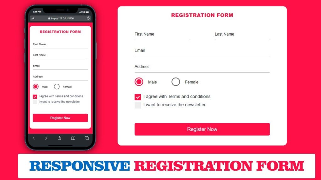
When I started working on this registration form, my main goal was to keep everything simple and practical so that anyone, even a beginner, can understand how the form works just by looking at it.
Instead of adding too many fields and complex validation, I focused on the most common details that users usually enter while signing up on a website. The form allows users to type their first and last name, provide their email address, and add their home address in a clean and organized layout.
To make the form more realistic, I also included a gender selection option where users can choose between male and female. This is designed using custom-styled radio buttons so it looks modern and easy to use.
At the bottom of the form, there are two checkboxes. One is for accepting the terms and conditions, which is very common on most websites. The second one is optional and lets users subscribe to a newsletter if they want to receive updates in the future.
Finally, a clear and bold “Register Now” button is added so users can easily complete the process. Overall, this project is created to show how a simple registration form can look professional, user-friendly, and responsive using only HTML and CSS.
Technologies Used
This registration form project is built using only basic frontend technologies, so it stays lightweight, fast, and easy to understand. I intentionally avoided complex frameworks to keep the focus on clean design and simple structure.
This registration form project is built using only basic frontend technologies, so it stays lightweight, fast, and easy to understand. I intentionally avoided complex frameworks to keep the focus on clean design and simple structure.
For styling and visual design, CSS3 is used. It controls everything you see on the screen, including colors, spacing, fonts, button styles, custom radio buttons, checkboxes, and the responsive layout for mobile devices. CSS also helps in adding smooth hover effects and a clean professional look without making the design heavy.
Step 1: HTML Structure of Registration Form
Before adding colors or layout, we first need to prepare the foundation of the registration form. This foundation is created using HTML.
Before adding colors or layout, we first need to prepare the foundation of the registration form. This foundation is created using HTML.
In this project, HTML is mainly responsible for arranging all form elements in a clear and logical order so that users can easily fill in their details without confusion.
Here is how HTML is used in this registration form:
- A main form container is created to hold all elements in one place.
- A main form container is created to hold all elements in one place.
- Separate input fields are added for first name, last name, email address, and home address.
- Two checkboxes are included – one for accepting the terms and conditions and another for subscribing to the newsletter.
- Finally, a register button is placed at the bottom to submit the form.
This structured approach makes the form easier to maintain, easier to style later using CSS, and more comfortable for users to interact with on both desktop and mobile devices.
This structured approach makes the form easier to maintain, easier to style later using CSS, and more comfortable for users to interact with on both desktop and mobile devices.
HTML Code:
<!DOCTYPE html>
<html lang="en">

<head>
    <meta charset="UTF-8">
    <meta http-equiv="X-UA-Compatible" content="IE=edge">
    <meta name="viewport" content="width=device-width, initial-scale=1.0">
    <title>Registration Form in HTML and CSS – Responsive Form Design Tutorial</title>
    <link rel="stylesheet" href="style.css">
</head>

<body>
    <section class="formContainer">
        <h1>Registration Form</h1>
        <form action="">
            <div class="form-group">
                <input type="text" class="inputcontrol" placeholder="First Name">
                <input type="text" class="inputcontrol" placeholder="Last Name">
            </div>

            <div class="form-group">
                <input type="text" class="inputcontrol" placeholder="Email">
            </div>

            <div class="form-group">
                <input type="text" class="inputcontrol" placeholder="Address">
            </div>

            <div class="form-group">
                <div class="radioButton">
                    <div class="input-name">
                        <input type="radio" name="radiogroup1" id="male" class="radio-button" checked="">
                        <label for="male" class="emoployed"><span>Male</span></label>
                        <input type="radio" name="radiogroup1" id="female" class="radio-button">
                        <label for="female" class="emoployed"><span>Female</span></label>
                    </div>
                </div>
            </div>

            <div class="form-group">
                <div class="checkBox">
                    <label class="checkcont" for="">I agree with Terms and conditions
                        <input type="checkbox" checked="checked">
                        <span class="checkmark"></span>
                    </label>

                    <label class="checkcont">
                        I want to receive the newsletter
                        <input type="checkbox">
                        <span class="checkmark"></span>
                    </label>

                </div>
            </div>

            <div class="form-group">
                <button class="button" type="submit">Register Now</button>
            </div>

        </form>
    </section>
</body>

</html>
Step 2: CSS Styling Code – Making the Registration Form Beautiful & Responsive
After completing the HTML structure, the next important task is to make the registration form visually attractive and easy to use. This is where CSS plays a major role.
CSS is responsible for how your form looks on the screen. It controls spacing, colors, fonts, alignment, borders, and responsiveness. Without CSS, a form may work correctly, but it will not look professional.
In simple words, HTML builds the skeleton of the form, while CSS adds life to it.
CSS Code:
*{
  margin: 0;
  padding: 0;
  box-sizing: border-box;
}
body{
  background: #ff1046;
  font-family: Arial, Helvetica, sans-serif;
}
.formContainer{
  width: 50%;
  background-color: #fff;
  margin: 100px auto;
  padding: 20px 5%;
  border-radius: 15px;
  -webkit-border-radius: 15px;
  -moz-border-radius: 15px;
  -ms-border-radius: 15px;
  -o-border-radius: 15px;
}
.formContainer h1{
  font-size: 20px;
  font-weight: 800;
  line-height: 30px;
  letter-spacing: 0.025em;
  text-transform: uppercase;
  text-align: center;
  color: #ff1046;
  margin-bottom: 40px;
}

.form-group{
  display: flex;
  flex-direction: row;
  justify-content: space-between;
  gap: 100px;
  margin-bottom: 20px;
}
.inputcontrol{
  width: 100%;
  font-size: 16px;
  font-weight: 400;
  color: #000;
  border: none;
  border-bottom: 1px solid #0000007a;
  padding: 10px 0;
  line-height: 1.5;
  border-radius: 2px;
  -webkit-border-radius: 2px;
  -moz-border-radius: 2px;
  -ms-border-radius: 2px;
  -o-border-radius: 2px;
}

.inputcontrol::placeholder{
  font-size: 16px;
  font-weight: 500;
  color: #000;
}
.inputcontrol:focus{
  outline: none;
  border-bottom: 1px solid #ff1046;
}
.inputcontrol:focus::placeholder{
  color: #ff1046;
}
.radioButton{
  width: 100%;
}
.radioButton .radio-button{
  border: 0;
  clip: rect(0 0 0 0);
  height: 1px;
  margin: -1px;
  overflow: hidden;
  padding: 0;
  position: absolute;
  width: 1px;
}
.emoployed{
  margin-right: 10%;
}
.emoployed::before{
  content: "";
  display: inline-block;
  width: 20px;
  height: 20px;
  margin-right: 20px;
  border-radius: 100%;
  -webkit-border-radius: 100%;
  -moz-border-radius: 100%;
  -ms-border-radius: 100%;
  -o-border-radius: 100%;
  border: 3px solid #6c6c6c;
  padding: 4px;
  background-color: transparent;
  background-clip: content-box;
  transition: all 0.2s ease;
  -webkit-transition: all 0.2s ease;
  -moz-transition: all 0.2s ease;
  -ms-transition: all 0.2s ease;
  -o-transition: all 0.2s ease;
  cursor: pointer;
  vertical-align: -10px;
}

.radio-button:hover+.emoployed::before{
  border-color: #ff1046;
}
.radio-button:checked+.emoployed::before{
  background-color: #ff1046;
  border-color: #ff1046;
}
.radio-button label.emoployed span{
  display: inline-block;
  vertical-align: super;
  font-style: normal;
  font-weight: 400;
  font-size: 18px;
  color: #292F42;
}

.checkBox .checkcont{
  display: block;
  position: relative;
  padding-left: 35px;
  margin: 12px 0;
  cursor: pointer;
  font-style: normal;
  font-size: 18px;
  font-weight: 400;
  user-select: none;
  color: #292F42;
}
.checkBox .checkcont input{
  position:absolute;
  opacity: 0;
  cursor: pointer;
  height: 0;
  width: 0;
}
.checkmark{
  position: absolute;
  top: 0;
  left: 0;
  height: 25px;
  width: 25px;
  background-color: #eee;
}
.checkcont:hover input~.checkmark{
  background: #ccc;
}
.checkcont input:checked~.checkmark{
  background: #ff1046;
}
.checkmark::after{
  content: " ";
  position: absolute;
  display: none;
}

.checkcont input:checked~.checkmark::after{
  display: block;
}
.checkcont .checkmark::after{
  left: 9px;
  top:5px;
  width: 5px;
  height: 10px;
  border: solid #fff;
  border-width: 0 3px 3px 0;
  transform: rotate(45deg);
  -webkit-transform: rotate(45deg);
  -moz-transform: rotate(45deg);
  -ms-transform: rotate(45deg);
  -o-transform: rotate(45deg);
}
.button{
  width: 100%;
  height: 50px;
  background-color: #ff1046;
  color: #fff;
  margin-top: 30px;
  font-style: normal;
  font-weight: 500;
  font-size: 20px;
  line-height: 20px;
  border: 2px solid #ff1046;
  border-radius: 5px;
  -webkit-border-radius: 5px;
  -moz-border-radius: 5px;
  -ms-border-radius: 5px;
  -o-border-radius: 5px;
  box-shadow: -2px 4px 4px rgb(0 0 0 / 1%);
  cursor: pointer;
  transition: all 0.5s ease-in-out;
  -webkit-transition: all 0.5s ease-in-out;
  -moz-transition: all 0.5s ease-in-out;
  -ms-transition: all 0.5s ease-in-out;
  -o-transition: all 0.5s ease-in-out;
}
.button:hover{
  border: 2px solid #ff1046;
  background-color: transparent;
  color: #ff1046;
}

@media(max-width:768px){
  .formContainer{
    width: 95%;
  }
  .form-group{
    flex-direction: column;
    gap: 20px;
  }
  .checkcont{
    font-size: 16px;
    margin: 20px 0;
  }
}
Conclusion
Creating a registration form using HTML and CSS is a great first step for anyone who wants to enter the world of front-end development. It may look simple at the beginning, but this small project teaches many important concepts that are used in real websites every day.
Creating a registration form using HTML and CSS is a great first step for anyone who wants to enter the world of front-end development. It may look simple at the beginning, but this small project teaches many important concepts that are used in real websites every day.
This project helps you learn:
- How to structure a page properly
- How to style input fields in a clean way
- How to organize UI elements logically
- How to make designs work on mobile devices
- How real registration forms are created for websites
If you take time to practice and experiment with colors, spacing, and layout, your confidence in front-end design will grow naturally. After this, creating more advanced UI components like login pages, dashboards, and profile forms will feel much easier.
Keep practicing, keep improving, and most importantly, enjoy the learning process. Small projects like this are the foundation of strong web development skills.