How To Create Responsive Table Using HTML & CSS
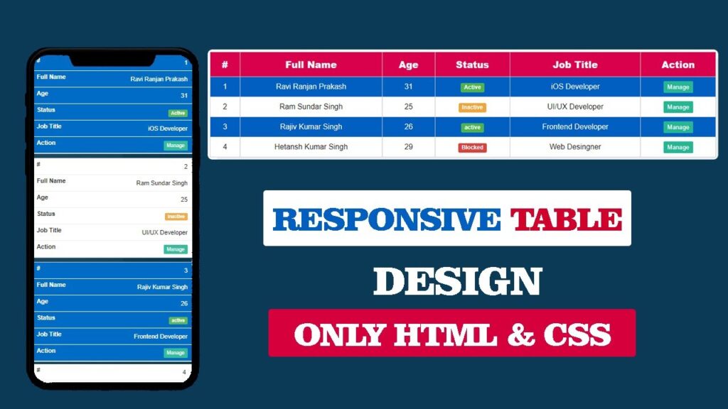
Creating a Responsive Table in HTML and CSS is one of the most important skills for modern web development. Many beginners face difficulty when their HTML table breaks on small devices like mobile or tablets. In this article, we will explain step by step how to create a Responsive Table that works perfectly on every screen size.
This guide will cover everything – from basic HTML Table Structure to advanced Responsive Table Design in CSS.
Watch the Video Tutorial: Responsive Table Using HTML & CSS
What is a Responsive Table?
A Responsive Table is a table that automatically adjusts its layout based on the screen size. On desktop, it shows the full table in rows and columns. On mobile devices, it either scrolls horizontally or rearranges into a card layout so users can read easily without zooming.
For example:
- HTML Table Design looks normal on desktop.
- On mobile, the same Responsive Table CSS makes it scrollable.
Why Use Responsive Tables in Websites?
Here are the main reasons why you should use Responsive Tables in HTML and CSS:
- Better User Experience – Users can easily read your Responsive Table Example on any device.
- Professional Look – A well-styled HTML Table CSS Design makes your website look modern.
HTML Code:
Before diving into responsive styling, it’s crucial to understand the semantic HTML structure that forms the backbone of our responsive table.
<!DOCTYPE html>
<html lang="en">

<head>
  <meta charset="UTF-8">
  <meta http-equiv="X-UA-Compatible" content="IE=edge">
  <meta name="viewport" content="width=device-width, initial-scale=1.0">
  <title>Responsive Table Desing Using HTML & CSS</title>
  <link rel="stylesheet" href="style.css">
</head>

<body>

  <div class="table-container">
    <table>
      <thead>
        <tr>
          <th>#</th>
          <th>Full Name</th>
          <th>Age</th>
          <th>Status</th>
          <th>Job Title</th>
          <th>Action</th>
        </tr>
      </thead>

      <tbody>
        <tr>
          <td>1</td>
          <td>Ravi Ranjan Prakash</td>
          <td>31</td>
          <td><span class="label label-success">Active</span></td>
          <td>iOS Developer</td>
          <td><a href="#" class="btn">Manage</a></td>
        </tr>

        <tr>
          <td>2</td>
          <td>Ram Sundar Singh</td>
          <td>25</td>
          <td><span class="label label-warning">Inactive</span></td>
          <td>UI/UX Developer</td>
          <td><a href="#" class="btn">Manage</a></td>
        </tr>

        <tr>
          <td>3</td>
          <td>Rajiv Kumar Singh</td>
          <td>26</td>
          <td><span class="label label-success">active</span></td>
          <td>Frontend Developer</td>
          <td><a href="#" class="btn">Manage</a></td>
        </tr>

        <tr>
          <td>4</td>
          <td>Hetansh Kumar Singh</td>
          <td>29</td>
          <td><span class="label label-danger">Blocked</span></td>
          <td>Web Desingner</td>
          <td><a href="#" class="btn">Manage</a></td>
        </tr>
      </tbody>
    </table>
  </div>

</body>

</html>
The HTML structure follows semantic best practices by utilizing proper table elements. The <thead> section contains column headers, while the <tbody> houses the data rows. Each table row (<tr>) contains table cells (<td>) with various content types, including text, status labels, and action buttons. The entire table is wrapped in a container div with the class table-container, which provides layout control and styling hooks.
The viewport meta tag in the HTML head is crucial for responsive behavior, instructing browsers to set the viewport width to the device width and maintain a 1.0 initial scale. This ensures that CSS media queries function correctly across different devices and prevents unwanted zooming behavior on mobile browsers.
CSS Code:
The CSS implementation begins with foundational styles that establish the visual hierarchy and basic layout.
    * {
        margin: 0;
        padding: 0;
        box-sizing: border-box;
    }

    body {
        font-family: sans-serif;
        background: linear-gradient(104deg, #204B66, #00324a);
        background-size: cover;
    }

    .table-container {
        display: flex;
        justify-content: center;
        margin: 20vh auto;
        width: 80%;
        background-color: #fff;
        border-radius: 10px;
        padding: 5px;
    }

    table {
        width: 100%;
        box-shadow: 15px 15px #0000000d;
        border-collapse: collapse;
    }

    tr:nth-of-type(odd) {
        background-color: #006cc6;
        color: #fff;
    }

    tr:nth-of-type(even) {
        background-color: #fff;
        color: #333;
    }

    th {
        background-color: #Dc005A;
        color: #fff;
        font-weight: 800;
        font-size: 20px;
    }

    td,
    th {
        padding: 12px;
        border: 1px solid #ccc;
        text-align: center;
    }

    .label {
        display: inline;
        padding: 0.2em 0.6em 0.3em;
        font-size: 75%;
        font-weight: 700;
        line-height: 1;
        color: #fff;
        text-align: center;
        white-space: nowrap;
        vertical-align: baseline;
        border-radius: 0.25em;
    }

    .label-success {
        background-color: #5cb85c;
    }

    .label-warning {
        background-color: #f0ad4e;
    }

    .label-danger {
        background-color: #d9534f;
    }

    .btn {
        color: #fff;
        background-color: #37BC9B;
        font-size: 13px;
        padding: 5px 8px;
        border: none;
        border-radius: 2px;
        transition: all 0.3s ease;
        text-decoration: none;
    }

    .btn:hover {
        background-color: #2e9c81;
    }


    @media only screen and (max-width:768px),
    (min-device-width:768px) and (max-device-width:992px) {
        .table-container {
            width: 95%;
            background: transparent;
        }

        table,
        thead,
        tbody,
        th,
        td,
        tr {
            display: block;
        }

        thead tr {
            position: absolute;
            top: -9999px;
            left: -9999px;
        }

        tr {
            border: 1px solid #ccc;
            margin-bottom: 10px;
        }

        td {
            border: none;
            border-bottom: 1px solid #eee;
            position: relative;
            padding-left: 50%;
            text-align: right;
        }

        td::before {
            position: absolute;
            top: 6px;
            left: 6px;
            width: 45%;
            padding-right: 10px;
            white-space: nowrap;
            font-size: 16px;
            font-weight: 600;
            text-align: left;
        }

        td:nth-of-type(1)::before {
            content: "#";
        }

        td:nth-of-type(2)::before {
            content: "Full Name";
        }

        td:nth-of-type(3)::before {
            content: "Age";
        }

        td:nth-of-type(4)::before {
            content: "Status";
        }

        td:nth-of-type(5)::before {
            content: "Job Title";
        }

        td:nth-of-type(6)::before {
            content: "Action";
        }
    }
The CSS reset using the universal selector (*) eliminates browser default margins and padding, while setting box-sizing: border-box ensures that padding and borders are included within element dimensions. This creates a consistent foundation across different browsers and eliminates layout inconsistencies.
The table container uses flexbox for horizontal centering and applies attractive visual styling including rounded corners, white background, and subtle padding. The gradient background on the body creates a modern, professional appearance that enhances the overall visual appeal of the table design.
Alternating row colors are achieved through the :nth-of-type() CSS pseudo-selector, creating a zebra-stripe effect that improves readability and visual organization. Odd rows receive a blue background with white text, while even rows maintain a white background with dark text, ensuring optimal contrast and accessibility.
The status labels utilize a component-based approach with a base label class and modifier classes for different states (success, warning, danger). This modular CSS architecture promotes maintainability and scalability while providing consistent visual feedback for different data states.
Conclusion
Creating responsive tables using HTML and CSS requires careful consideration of user experience, technical implementation, and performance optimization. The approach demonstrated in this guide provides a robust foundation for handling tabular data across diverse devices and screen sizes.
The transformation from traditional table layout to mobile-friendly cards represents modern web development best practices that prioritize user experience without sacrificing functionality. Proper implementation of responsive tables contributes to improved SEO performance, better accessibility, and enhanced user engagement across all device categories.
By following these techniques and principles, web developers can create data presentations that perform excellently in our multi-device world. The combination of semantic HTML, efficient CSS, and thoughtful design ensures that tabular content remains accessible, readable, and professionally presented regardless of how users access the content.