How To Create Responsive Table In HTML & CSS
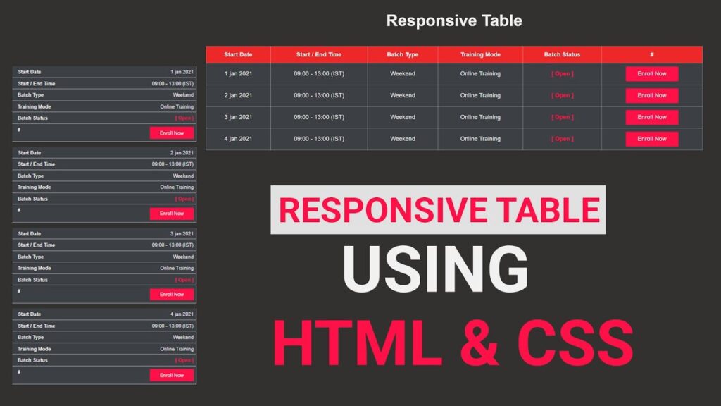
If you are looking for an easy way to make a responsive table HTML CSS, you’ve landed in the right place. In this post, we’ll build a professional and mobile-friendly responsive table using only HTML and CSS — no JavaScript needed.
The phrase responsive table HTML CSS simply means creating a table that automatically adjusts its layout to fit different screen sizes such as desktop, tablet, and mobile. This design approach ensures that your users can easily read and interact with your table data, no matter what device they use.
If you’re new to front-end design, you can also check out our detailed tutorial on Responsive Navbar in HTML and CSS for a complete beginner setup.
What is a Responsive Table?
A responsive table HTML CSS implementation automatically adjusts its layout based on the screen size of the viewing device. Unlike traditional tables that maintain fixed column widths, responsive tables reorganize their content to provide better readability on smaller screens. This approach eliminates horizontal scrolling and makes data consumption effortless for mobile users.
HTML Code:
To build our responsive table, we start with a simple HTML structure. The table includes headings like Start Date, Start / End Time, Batch Type, Training Mode, Batch Status, and a Call-to-Action (CTA) button column.
<!DOCTYPE html>
<html lang="en">

<head>
    <meta charset="UTF-8">
    <meta name="viewport" content="width=device-width, initial-scale=1.0">
    <title>Responsive Table HTML & CSS</title>
    <link rel="stylesheet" href="style.css">
</head>

<body>
    <div class="table-container">
        <h1 class="heading">Responsive Table</h1>
        <table class="table">
            <thead>
                <tr>
                    <th>Start Date</th>
                    <th>Start / End Time</th>
                    <th>Batch Type</th>
                    <th>Training Mode</th>
                    <th>Batch Status</th>
                    <th>#</th>
                </tr>
            </thead>
            <tbody>
                <tr>
                    <td data-label="Start Date">1 jan 2021</td>
                    <td data-label="Start / End Time">9:00 - 13:00 (IST)</td>
                    <td data-label="Batch Type">Weekend</td>
                    <td data-label="Training Mode">Online Training</td>
                    <td data-label="Batch Status"><span class="text_open">[Open]</span></td>
                    <td data-label="#"><a href="#" class="btn">Enroll Now</a></td>
                </tr>
                <tr>
                    <td data-label="Start Date">2 jan 2021</td>
                    <td data-label="Start / End Time">9:00 - 13:00 (IST)</td>
                    <td data-label="Batch Type">Weekend</td>
                    <td data-label="Training Mode">Online Training</td>
                    <td data-label="Batch Status"><span class="text_open">[Open]</span></td>
                    <td data-label="#"><a href="#" class="btn">Enroll Now</a></td>
                </tr>
                <tr>
                    <td data-label="Start Date">4 jan 2021</td>
                    <td data-label="Start / End Time">9:00 - 13:00 (IST)</td>
                    <td data-label="Batch Type">Weekend</td>
                    <td data-label="Training Mode">Online Training</td>
                    <td data-label="Batch Status"><span class="text_open">[Open]</span></td>
                    <td data-label="#"><a href="#" class="btn">Enroll Now</a></td>
                </tr>
            </tbody>
        </table>
    </div>
</body>

</html>
Explanation of the HTML Code
<table>– Defines the main table element.<thead>– Contains the header row with column names.<tbody>– Holds the table data rows.data-label– A custom attribute used for mobile view to display the header label before each cell.<a href="#" class="btn">Enroll Now</a>– A styled button link for user interaction.
If you want to understand how to create more structured layouts, visit HTML CSS Layout Tutorials for beginners.
CSS Code:
To make the table visually appealing and responsive, add the following CSS in your style.css file.
* {
    margin: 0;
    padding: 0;
    box-sizing: border-box;
}

body {
    background-color: #32312f;
    font-family: sans-serif;
}

.table-container {
    padding: 0 10%;
    margin: 40px auto 0;
}

.heading {
    font-size: 40px;
    text-align: center;
    color: #f1f1f1;
    margin-bottom: 40px;
}

.table {
    width: 100%;
    border-collapse: collapse;
}

.table thead {
    background-color: #ee2828;
}

.table thead tr th {
    font-size: 14px;
    font-weight: 600;
    letter-spacing: 0.35px;
    color: #FFFFFF;
    opacity: 1;
    padding: 12px;
    vertical-align: top;
    border: 1px solid #dee2e685;
}

.table tbody tr td {
    font-size: 14px;
    font-weight: normal;
    letter-spacing: 0.35px;
    color: #f1f1f1;
    background-color: #3c3f44;
    padding: 8px;
    text-align: center;
    border: 1px solid #dee2e685;
}

.table .text_open {
    font-size: 14px;
    letter-spacing: 0.35px;
    font-weight: bold;
    color: #FF1046;
}

.table tbody tr td .btn {
    width: 130px;
    text-decoration: none;
    line-height: 35px;
    display: inline-block;
    background-color: #FF1046;
    font-weight: medium;
    color: #FFFFFF;
    text-align: center;
    vertical-align: middle;
    user-select: none;
    border: 1px solid transparent;
    font-size: 14px;
    opacity: 1;
}
Explanation of the CSS
- Base Reset – The universal selector
*removes default browser padding and margin. - Background – The dark background (
#32312f) gives a professional, modern look. - Typography – A clean sans-serif font improves readability.
- Table Width –
width: 100%ensures the table takes up full space. - Table Borders – Light borders improve data separation.
- Header Styling – Bright red header row (
#ee2828) makes column titles visible. - Button Design – “Enroll Now” button uses a bold red color and centered alignment for clear CTAs.
Making the Table Responsive with Media Query
Now, we’ll use CSS media queries to make the table look perfect on smaller devices.
@media(max-width:768px) {
    .table thead {
        display: none;
    }

    .table,
    .table tbody,
    .table tr,
    .table td {
        display: block;
        width: 100%;
    }

    .table tr {
        margin-bottom: 15px;
    }

    .table tbody tr td {
        text-align: right;
        padding-left: 50%;
        position: relative;
    }

    .table td::before {
        content: attr(data-label);
        position: absolute;
        left: 0;
        width: 50%;
        padding-left: 15px;
        font-weight: 600;
        font-size: 14px;
        text-align: left;
    }
}
How It Works
- Hides Table Header: When the screen width is less than 768px, the table header (
thead) is hidden. - Converts Rows into Blocks: Each table row becomes a block element, making them stack vertically for better mobile readability.
- Adds Labels for Each Cell: The
data-labelattribute dynamically displays the header text before each data cell using the::beforepseudo-element. - Improves Readability on Small Screens: Text is aligned to the right, and each label appears on the left like a card layout.
For more about responsive layouts, check our article Responsive Design in CSS – Complete Guide
Conclusion
Creating responsive table HTML CSS designs is essential for modern web development success. The techniques covered in this guide provide a comprehensive foundation for building tables that work beautifully across all devices. Remember to prioritize user experience, maintain accessibility standards, and test thoroughly across different devices and browsers.
By implementing these responsive table strategies, you’ll create data presentations that engage users, improve SEO performance, and provide excellent user experiences regardless of the device being used. The combination of semantic HTML structure, strategic CSS styling, and mobile-first design principles ensures your tables remain functional and attractive in our increasingly mobile-first world.
Whether you’re building a simple data table or a complex interactive dashboard, these responsive table HTML CSS techniques will serve as your foundation for creating outstanding user experiences that work seamlessly across all devices and screen sizes.