How To Create Responsive Portfolio Website Using HTML, CSS and JavaScript
In this blog post, I’m going to show you how you can easily build a Responsive Portfolio Website using only HTML, CSS, and JavaScript. We’ll go step by step, starting from basic structure, adding styling, and finally making it interactive with JavaScript.
In today’s digital age, a portfolio website is more than just a luxury—it’s a necessity. Whether you are a fresher looking for your first job, a freelancer trying to attract clients, or a senior developer showcasing your skills, your portfolio reflects your work and personality.
The goals of this post:
- Clean & modern layout
- Sticky header + mobile menu toggle
- Hero section with CTA (Download CV & Contact)
- 100% responsive design
- A hamburger menu for mobile devices
At the end, you will have a professional looking portfolio template that you can customize with your own name, picture, and content.
You can also follow along with the video tutorial here:
Watch the Video Tutorial: Responsive Portfolio Website
Why Do You Need a Portfolio Website?
Before we dive into coding, let’s talk about why portfolio websites are so important:
- Your personal brand – It gives a professional impression.
- Centralized showcase – All your projects, services, and achievements in one place.
- HRs and clients prefer it – Recruiters and companies often check portfolios before hiring.
- Better than resumes – An interactive webpage is far more engaging than a static PDF resume.
- Freelance edge – Clients take you more seriously when you have a portfolio website.
Project Structure
We’ll create 3 simple files:
project/
├── hero-person-img.png
├── index.html
├── style.css
└── script.js
HTML Code:
Let’s create the foundation with HTML. This defines the structure of our website.
<!DOCTYPE html>
<html lang="en">
<head>
<meta charset="UTF-8">
<meta name="viewport" content="width=device-width, initial-scale=1.0">
<title>Responsive Portfolio Webiste using html and css || Ravi Web</title>
<!-- =============Boxicon CDN Link======= -->
<link href='https://unpkg.com/boxicons@2.1.4/css/boxicons.min.css' rel='stylesheet'>
<!-- ===========CSS Link======== -->
<link rel="stylesheet" href="style.css">
</head>
<body>
<!-- =================Start Header=========== -->
<div class="header">
<div class="header-container">
<!-- ========Logo Start====== -->
<div class="logo">
<a href="#">Ravi <span>Web</span></a>
</div>
<!-- ========Logo End====== -->
<!-- ========Navbar Start======== -->
<nav>
<ul>
<li class="active"><a href="#">Home</a></li>
<li><a href="#">Services</a></li>
<li><a href="#">Works</a></li>
<li><a href="#">Blog</a></li>
<li><a href="#">Contact</a></li>
</ul>
</nav>
<!-- ========Navbar End======== -->
<!-- ======Toggle Start==== -->
<div class="toggle">
<i class="bx bx-menu"></i>
</div>
<!-- ======Toggle End==== -->
</div>
</div>
<!-- =================End Header=========== -->
<!-- ============Hero Section Start====== -->
<section class="hero-section">
<div class="hero-container">
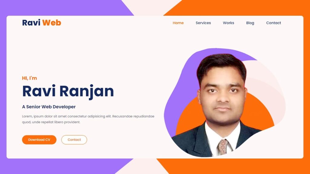
<div class="left">
<span>HI, I'm</span>
<h1>Ravi Ranjan</h1>
<h3>A Senior Web Developer</h3>
<p>Lorem, ipsum dolor sit amet consectetur adipisicing elit. Recusandae repudiandae quod, unde repellat libero
provident.</p>
<div class="hero-btn">
<a href="#" class="download">Download CV</a>
<a href="#" class="contect">Contact</a>
</div>
</div>
<div class="right">
<img src="hero-person-img.png" alt="">
</div>
</div>
</section>
<!-- ============Hero Section ENd====== -->
<!-- ====JavaScript==== -->
<script src="script.js"></script>
</body>
</html>This skeleton lays out the structure: a header at the top and a hero section with text and an image. Next step, we’ll style it using CSS.
CSS Code:
Now let’s make it beautiful with CSS. Save this as style.css.
/* ==========Google Fonts Poppins======== */
@import url('https://fonts.googleapis.com/css2?family=Poppins:wght@400;500;600;700;800;900&display=swap');

* {
  margin: 0;
  padding: 0;
  box-sizing: border-box;
  font-family: 'Poppins', sans-serif;
}

/* ======Header Start===== */
.header {
  width: 100%;
  padding: 10px 0;
  position: fixed;
  top: 0;
  transition: all 0.5s ease;
}

.header.sticky {
  background-color: #fff;
}

.header-container {
  padding: 0 6%;
  display: flex;
  flex-direction: row;
  justify-content: space-between;
  align-items: center;
}

.header-container .logo a {
  text-decoration: none;
  font-size: 40px;
  font-weight: 800;
  color: #15295F;
}

.header-container .logo a span {
  color: #fd6e0a;
}

.header-container .toggle {
  display: none;
}

.header-container nav ul {
  display: flex;
  align-items: center;
  margin-bottom: 0;
  list-style: none;
}

.header-container nav ul li a {
  padding: 15px 30px;
  text-decoration: none;
  color: #15295F;
  font-size: 18px;
  font-weight: 500;
  transition: all 0.5s ease;
}

.header-container nav ul li.active a,
.header-container nav ul li a:hover {
  color: #fd6e0a;
}

/* ============Hero Section Start====== */
.hero-section {
  background-color: #fdf8f7;
  min-height: 100vh;
  padding: 120px 0 0 0;
  display: flex;
  flex-direction: column;
  justify-content: flex-end;
}

.hero-section .hero-container {
  padding: 0 6%;
  display: flex;
  align-items: center;
  flex-direction: row;
  justify-content: space-between;
}

.hero-section .hero-container .left {
  width: 50%;
  margin-top: 70px;
}

.hero-section .hero-container .left span {
  color: #fd6e0a;
  font-size: 24px;
  font-weight: 700;
}

.hero-section .hero-container .left h1 {
  color: #15295F;
  font-size: 75px;
  font-weight: 700;
  line-height: 1.5;
  margin: 10px 0;
  margin-top: -10px;
}

.hero-section .hero-container .left h3 {
  color: #15295F;
  font-size: 22px;
  font-weight: 600;
  line-height: 1.2;
  text-transform: capitalize;
}

.hero-section .hero-container .left p {
  margin: 20px 0 50px;
  color: #6f6b80;
  font-size: 16px;
  line-height: 1.8;
}

.hero-section .hero-container .left .hero-btn {
  display: flex;
  flex-direction: row;
  gap: 25px;
}

.hero-section .hero-container .left .hero-btn a {
  text-decoration: none;
  font-size: 16px;
  font-weight: 500;
  border: 2px solid #fd6e0a;
  padding: 10px 30px;
  border-radius: 50px;
  transition: all 0.3s ease;
}

.hero-section .hero-container .left .hero-btn a.download {
  background-color: #fd6e0a;
  color: #fff;
}

.hero-section .hero-container .left .hero-btn a.contect {
  background-color: #fff;
  color: #fd6e0a;
}

.hero-section .hero-container .left .hero-btn a:hover.download {
  background-color: #fff;
  color: #fd6e0a;
}

.hero-section .hero-container .left .hero-btn a:hover.contect {
  background-color: #fd6e0a;
  color: #fff;
}

.hero-section .hero-container .right {
  display: flex;
  flex-direction: column;
  justify-content: end;
}

.hero-section .hero-container .right img {
  width: 100%;
}

/* =====Responsive Code========= */

@media(max-width:992px) {
  .header-container nav {
    width: 88%;
    height: 0;
    position: absolute;
    top: 80px;
    left: 0;
    right: 0;
    margin: 0 auto;
    background-color: #fff;
    border-top: 3px solid #fd6e0a;
    transition: all 0.5s ease;
    z-index: 999;
    visibility: hidden;
    opacity: 0;
  }

  .header-container nav.toggle {
    visibility: visible;
    opacity: 1;
    height: auto;
  }

  .header-container nav ul {
    display: block;
  }

  .header-container nav ul li a {
    display: block;
    border-bottom: 1px solid #e0e3ed;
  }

  .header-container nav ul li:last-child a {
    border-bottom: none;
  }

  .header-container .toggle {
    display: block;
    font-size: 30px;
    cursor: pointer;
  }

  .hero-section .hero-container {
    flex-direction: column;
    gap: 60px;
  }

  .hero-section .hero-container .left {
    width: 100%;
    margin-top: 0;
  }
}
This CSS:
- Fixes the header on top
- Colors and styles the text
- Makes buttons interactive with hover effects
- Adjusts layout for responsiveness
JavaScript Code:
Now let’s add JavaScript to make the header sticky and toggle the menu in mobile view. Create a file named script.js:
// ==========Menu Toggle=====
const toggle = document.querySelector(".toggle");
const nav = document.querySelector("nav");
toggle.addEventListener("click", () => {
  nav.classList.toggle("toggle");
});

// =========Header Background color on  scroll=======
const header = document.querySelector(".header");
window.addEventListener("scroll", () => {
  if (window.scrollY > 50) {
    header.classList.add("sticky");
  } else {
    header.classList.remove("sticky");
  }
});
That’s it! With only a few lines of JavaScript, your website becomes dynamic and responsive.
How the Final Website Works
- On larger screens, you see a horizontal navbar with links.
- Left side intro (Name, Role, Description)
- Right side profile image/illustration
- Sticky navbar with active states
- On smaller devices, you see a hamburger icon; when clicked, the menu drops down.
Required Assets
- Boxicons CDN (for icons)
- Google Fonts – Poppins
- Hero Image:
hero-person-img.png(transparent PNG or illustration)
Conclusion
In this tutorial, we built a Responsive Portfolio Website from scratch using nothing but HTML, CSS, and JavaScript.
We covered:
- How to structure the portfolio with HTML
- Styling and responsiveness with CSS
- Adding interactivity with JavaScript
This project is beginner‑friendly yet professional enough to be used as your actual portfolio. You can easily extend it with projects, skills, testimonials, and more.