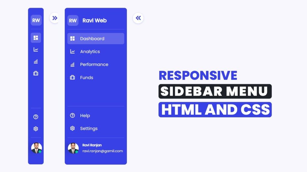
How To Create a Responsive Dashboard Sidebar Menu using HTML and CSS
In this post, we will build a responsive sidebar dashboard menu step by step using HTML, CSS, and a little bit of JavaScript. We’ll also use Boxicons for icons and Google Fonts to give our sidebar a modern look.
In today’s world of web development, dashboards and side navigation menus play a huge role in creating interactive user interfaces. Whether you are building an admin panel, a project management tool, or even a personal portfolio website, having a fully responsive sidebar makes navigation simple and user-friendly.
Watch the Video Tutorial: Responsive Dashboard Sidebar Menu
By the end of this tutorial, you will have a sidebar that:
- Expands and collapses smoothly
- Looks professional and modern
- Works on all screen sizes
- Is completely customizable
Why Sidebar Menus Are Important?
A sidebar navigation menu provides a vertical list of links that can expand or collapse depending on user interaction. It is widely used in dashboards, admin panels, and SaaS platforms.
Some key benefits include:
- Better Navigation: Helps users quickly move between different sections.
- Responsive Design: Adapts easily for smaller devices.
- Cleaner UI: Keeps the header clutter-free.
- User Experience: Makes your application more interactive.
What We Will Build
We are going to build a sidebar with:
- A logo section at the top.
- A menu list (Dashboard, Analytics, Performance, Funds, etc.).
- A footer section with Help, Settings, and Profile info.
- A footer section with Help, Settings, and Profile info.
- An expand/collapse button for responsiveness.
Here’s how it will look:
- Sidebar fully expanded with text.
- Sidebar collapsed showing only icons.
Project Structure
First, create a project folder and inside it create the following files:
/sidebar-project
  |-- index.html
  |-- style.css
  |-- script.js
  |-- profile.png
HTML Code:
Let’s start by writing the sidebar HTML structure in index.html.
<!DOCTYPE html>
<html lang="en">

<head>
    <meta charset="utf-8">
    <title>Responsive Sidebar Design Using HTML & CSS</title>
    <!-- ======Box icon CDN==== -->
    <link href='https://unpkg.com/boxicons@2.1.4/css/boxicons.min.css' rel='stylesheet'>
    <!-- ======Google Font=== -->
    <link href="https://fonts.googleapis.com/css2?family=Poppins&display=swap" rel="stylesheet">
    <!-- ============CSS Link========= -->
    <link rel="stylesheet" href="style.css">
</head>

<body>
    <div class="sidebar-wrapper">
        <!-- ========Header Top Start===== -->
        <div class="sidebar-top">
            <a href="#" class="logo-wrapper">
                <span class="logo">RW</span>
                <h2 class="hide">Ravi Web</h2>
            </a>
            <div class="expand-btn">
                <i class="bx bxs-chevrons-left"></i>
            </div>
        </div>
        <!-- ========Header Top End===== -->

        <!-- ==========Sidebar-links start===== -->
        <div class="sidebar-links">
            <ul>
                <li>
                    <a href="#" class="active">
                        <i class="bx bxs-dashboard"></i>
                        <span class="link hide">Dashboard</span>
                    </a>
                </li>

                <li>
                    <a href="#">
                        <i class="bx bxs-chart"></i>
                        <span class="link hide">Analytics</span>
                    </a>
                </li>

                <li>
                    <a href="#">
                        <i class="bx bx-bar-chart-alt"></i>
                        <span class="link hide">Performance</span>
                    </a>
                </li>

                <li>
                    <a href="#">
                        <i class="bx bx-briefcase-alt"></i>
                        <span class="link hide">Funds</span>
                    </a>
                </li>

            </ul>
        </div>
        <!-- ==========Sidebar-links End===== -->

        <!-- ============Sidebar Bottom Start======= -->
        <div class="sidebar-bottom">
            <div class="sidebar-links">
                <ul>
                    <li>
                        <a href="#">
                            <i class="bx bx-help-circle"></i>
                            <span class="link hide">Help</span>
                        </a>
                    </li>
                    <li>
                        <a href="#">
                            <i class="bx bx-cog"></i>
                            <span class="link hide">Settings</span>
                        </a>
                    </li>

                </ul>
            </div>

            <div class="sidebar-profile">
                <div class="avatar-wrapper">
                    <img class="avatar" src="profile.png" alt="">
                    <div class="online-status"></div>
                </div>
                <div class="avatar-name hide">
                    <div class="user-name">Ravi Ranjan</div>
                    <div class="email">ravi.ranjan@gmail.com</div>
                </div>
            </div>

        </div>
        <!-- ============Sidebar Bottom End======= -->
    </div>

    <!-- ====JavaScript==== -->
    <script src="script.js"></script>

</body>

</html>
CSS Code:
Now, add styling in style.css. This will define how our sidebar looks and behaves.
* {
    margin: 0;
    padding: 0;
    box-sizing: border-box;
}

body {
    font-family: 'Poppins', sans-serif;
    background-color: #F8F7FD;
}

body.collapsed .sidebar-wrapper {
    width: 4.5rem;
}

body.collapsed .hide {
    position: absolute;
    display: none;
    pointer-events: none;
    transition: 0.5s ease;
}

body.collapsed .expand-btn i {
    transform: rotate(180deg);
}

.sidebar-wrapper {
    position: sticky;
    background-color: #3841E6;
    top: 0;
    left: 0;
    height: 100vh;
    width: 18rem;
    padding: 10px 12px;
    display: flex;
    color: #fff;
    flex-direction: column;
    transition: width 0.5s linear;
}

/* =====Sidebar-top Start====== */
.sidebar-top {
    display: flex;
    flex-direction: column;
    justify-content: center;
    padding: 1rem 0;
}

.logo-wrapper {
    display: flex;
    justify-content: start;
    align-items: center;
    gap: 1.25rem;
    color: #fff;
    text-decoration: none;
}

.logo {
    padding: 0.5rem 0.5rem;
    background-color: #6067EB;
    border-radius: 0.5rem;
    display: flex;
    align-items: center;
    justify-content: center;
    font-size: 22px;
    font-weight: 700;
    text-wrap: nowrap;
}

.logo-wrapper h2 {
    text-wrap: nowrap;
}

.expand-btn {
    position: absolute;
    top: 1rem;
    right: -4.75rem;
    display: flex;
    justify-content: center;
    align-items: center;
    border-radius: 50%;
    width: 3rem;
    height: 3rem;
    background-color: #fff;
    cursor: pointer;
    box-shadow: #6067EB50 0px 2px 8px 0px;
}

.expand-btn i {
    color: #3841E6;
    font-size: 35px;
}

/* =====Sidebar-top End====== */

/* ========= Sidebar Links Start====== */
.sidebar-links {
    padding: 0.5rem 0;
    border-top: 1px solid #6067EB;
}

.sidebar-links ul {
    list-style-type: none;
    position: relative;
}

.sidebar-links li {
    position: relative;
}

.sidebar-links li a {
    color: #F8F7FD;
    padding: 0.7rem 0.675rem;
    margin: 0.5rem 0;
    font-size: 1.25rem;
    display: flex;
    text-decoration: none;
    justify-content: start;
    align-items: center;
    border-radius: 0.675rem;
    transition: all 0.2s ease-in-out;
}

.sidebar-links li a i {
    font-size: 25px;
}

.sidebar-links .link {
    margin-left: 1.5rem;
}

.hide {
    transition: all 0.5rem ease-in-out;
}

.sidebar-links li a:hover,
.sidebar-links li a:focus,
.sidebar-links li a.active {
    width: 100%;
    background-color: #6067EB;
    border-radius: 0.5rem;
    outline: none;
    color: #F8F7FD;
}

.sidebar-links .active {
    color: #fff;
}

/* ========= Sidebar Links End====== */

/* ==========Sidebar Bottom Start=======  */
.sidebar-bottom {
    padding: 0.5rem 0;
    display: flex;
    flex-direction: column;
    justify-content: center;
    margin-top: auto;
}

.sidebar-profile {
    display: flex;
    align-items: center;
    gap: 1.125rem;
    flex-direction: row;
    padding: 1.5rem 0.125rem;
    border-top: 1px solid #6067EB;
}

.avatar-wrapper {
    position: relative;
    display: flex;
}

.avatar {
    display: block;
    width: 3.125rem;
    height: 3.125rem;
    cursor: pointer;
    border-radius: 50%;
    object-fit: cover;
    filter: drop-shadow(-20px 0 10px rgba(0, 0, 0, 0.1));
}

.online-status {
    position: absolute;
    width: 0.75rem;
    height: 0.75rem;
    border-radius: 50%;
    background-color: #00C896;
    bottom: 0;
    right: 0.1875rem;
}

.avatar-name {
    display: flex;
    flex-direction: column;
    gap: 0.25rem;
}

.user-name {
    font-size: 0.95rem;
    font-weight: 700;
    text-align: left;
}

/* ==========Sidebar Bottom End=======  */
JavaScript Code:
Now add the functionality to expand/collapse the sidebar in script.js.
const expendBtn = document.querySelector(".expand-btn");
expendBtn.addEventListener("click", () => {
  document.body.classList.toggle("collapsed");
});
This simple JavaScript toggles the class collapsed on the <body> whenever the expand button is clicked.
Final Output
When you run this, you’ll see:
- A full sidebar with “Dashboard, Analytics, Performance, Funds” etc.
- On clicking the expand button, the sidebar shrinks to just icons.
- A profile section with user image & online indicator.
- Fully responsive and professional-looking design.
Conclusion
We just built a fully functional responsive sidebar navigation menu using HTML, CSS, and JavaScript. This sidebar can be easily integrated into admin dashboards, CRM panels, e-commerce stores, or personal portfolios.
Whether you’re a beginner in web development or building your professional UI components, this sidebar is a great addition to your toolkit.
If you found this tutorial helpful, don’t forget to share it with your developer friends