How To Create a Login Form Validation With Error Message Using HTML, CSS & JavaScript
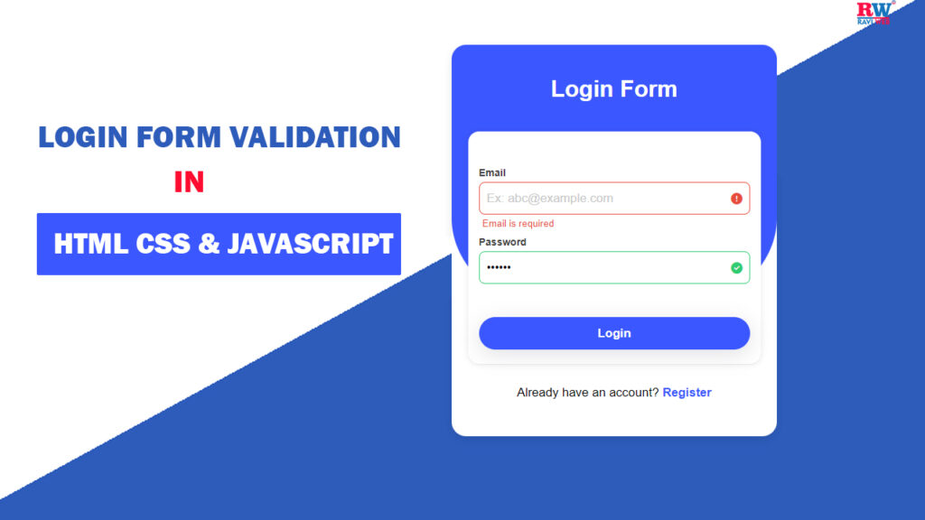
In this article, you’ll learn step by step how to build a Login Form with validation and error messages using HTML, CSS, and JavaScript. By the end, you’ll have a fully working form that displays success and error indicators in real time.
Login forms are everywhere on the web, and validating them is key to keeping user data clean, secure, and the experience frustration-free. In this guide, discover how to build a beautiful, interactive login form with real-time error messages using only HTML, CSS, and JavaScript — no frameworks required.
Watch the Video Tutorial: Login Form Validation With Error Message
Why is Form Validation Important?
Form validation plays a crucial role for multiple reasons:
- Better User Experience: Users immediately see where they went wrong.
- Data Accuracy: Only correct and formatted data gets stored in the database.
- Security: Prevents malicious inputs such as SQL injections or XSS attacks.
- Professional Look: With inline error messages and icons, forms look modern and user-friendly.
Features of This Login Form
- Real-time validation with error messages
- Success and error icons
- Clear custom error messages for email and password
- Responsive design for mobile screens
- Stylish gradient background and modern UI
- Secure and professional input validation
- Easily reusable for any web project
HTML Code:
Let’s start by creating the HTML layout for our login form. We’ll have two input fields: one for Email and one for Password. We’ll also include small tags to show error messages and font-awesome icons for validation indicators.
<!DOCTYPE html>
<html lang="en">

<head>
  <meta charset="UTF-8">
  <meta http-equiv="X-UA-Compatible" content="IE=edge">
  <meta name="viewport" content="width=device-width, initial-scale=1.0">
  <title>Login form validation with error message || Ravi Web</title>
  <!-- font awesome cdn -->
  <link rel="stylesheet" href="https://cdnjs.cloudflare.com/ajax/libs/font-awesome/6.4.0/css/all.min.css">
  <!-- css link -->
  <link rel="stylesheet" href="style.css">
</head>

<body>

  <div class="wrapper">
    <div class="form-container">
      <h1>Loing Form</h1>
      <div class="form-box">
        <form id="form" action="">

          <div class="input-field">
            <label for="email">Email</label>
            <input type="text" name="email" placeholder="Ex: abc@example.com" id="email">
            <small id="email-error">Error</small>
            <i class="fa-solid fa-circle-check"></i>
            <i class="fa-solid fa-circle-exclamation"></i>
          </div>

          <div class="input-field">
            <label for="password">Password</label>
            <input type="password" name="password" placeholder="*********" id="password" autocomplete="off">
            <small id="password-error">Error</small>
            <i class="fa-solid fa-circle-check"></i>
            <i class="fa-solid fa-circle-exclamation"></i>
          </div>

          <div class="input-field">
            <button type="submit">Login</button>
          </div>

        </form>
      </div>
      <p class="text">Already have an account? <a href="javascript:void(0)">Register</a></p>
    </div>
  </div>

  <!-- javascript link -->
  <script src="script.js"></script>
</body>

</html>
CSS Code:
Next, let’s make our login form attractive and responsive. We’ll use a gradient background, a card-style container, shadows, and color indicators for success and error states.
* {
  margin: 0;
  padding: 0;
  box-sizing: border-box;
  font-family: Arial, Helvetica, sans-serif;
}

.wrapper {
  width: 100%;
  height: 100vh;
  padding: 15px;
  background: #2d5cbb;
  background: linear-gradient(339deg, #2d5cbb 50%, #ffffff 0%);
}

.form-container {
  width: 450px;
  padding: 20px 0;
  background-color: #fff;
  margin: 50px auto;
  position: relative;
  border-radius: 25px 25px 20px 20px;
  box-shadow: #0000001a 0px 4px 12px;
}

.form-container::before {
  content: "";
  top: 0;
  position: absolute;
  width: 100%;
  height: 68%;
  background: #3b57ff;
  border-radius: 20px 20px 35% 35%;
}

.form-container h1 {
  position: absolute;
  width: 100%;
  text-align: center;
  margin-top: 5%;
  color: #fff;
  font-weight: 600;
}

.form-container .form-box {
  width: 90%;
  background-color: #fff;
  position: relative;
  z-index: 1;
  box-shadow: #11111a0d 0px 1px 0px, #11111a1a 0px 0px 8px;
  border-radius: 15px;
  margin: auto;
  margin-top: 100px;
  padding: 15px;
}

.form-box form {
  margin-top: 30px;
}

.form-box .input-field {
  position: relative;
  width: 100%;
  margin-bottom: 5px;
}

.form-box .input-field label {
  font-weight: 600;
  font-size: 14px;
  line-height: 25px;
  color: #3a3a3a;
}

.form-box .input-field input {
  width: 100%;
  height: 45px;
  padding: 0 30px 0 10px;
  border-radius: 8px;
  font-weight: 400;
  font-size: 16px;
  border: 1px solid #3b57ff;
  outline: none;
}

.form-box .input-field input::placeholder {
  font-size: 17px;
  font-weight: 500px;
  color: #C8C8C8;
  line-height: 50px;
}

.form-box .input-field.success input {
  border-color: #2ecc71;
}

.form-box .input-field.error input {
  border-color: #e74c3c;
}

.input-field small {
  color: #e74c3c;
  display: inline;
  margin: 5px 5px 0 5px;
  visibility: hidden;
}

.input-field.error small {
  visibility: visible;
}

.form-box .input-field i {
  display: inline-block;
  position: absolute;
  top: calc(50% - 6px);
  right: 10px;
  visibility: hidden;
}

.form-box .input-field.success i.fa-circle-check {
  color: #2ecc71;
  visibility: visible;
}

.form-box .input-field.error i.fa-circle-exclamation {
  color: #e74c3c;
  visibility: visible;
}

.form-box .input-field button {
  width: 100%;
  height: 45px;
  background-color: #3b57ff;
  color: #fff;
  outline: none;
  border: none;
  font-size: 17px;
  font-weight: 600;
  box-shadow: #64646f33 0px 7px 29px 0px;
  border-radius: 40px;
  margin-top: 20px;
  cursor: pointer;
  transition: all 0.5s ease;
}

.form-box .input-field button:hover {
  opacity: 0.8;
}

.text {
  text-align: center;
  margin: 30px 0;
  font-weight: 500;
  font-size: 17px;
}

.text a {
  color: #3b57ff;
  font-weight: 700;
  font-size: 17px;
  text-decoration: none;
}

@media(max-width:576px) {
  .form-container {
    width: 100%;
  }
}
JavaScript Code:
Finally, let’s add JavaScript to validate the form inputs. We’ll check for:
- Empty fields
- Correct email format using Regex
- Password length between 3 and 15 characters
const form = document.getElementById("form");
const email = document.getElementById("email");
const password = document.getElementById("password");
const emailError = document.getElementById("email-error");
const passwordError = document.getElementById("password-error");

// Event Listeners

form.addEventListener("submit", (e) => {
  e.preventDefault();

  // check email is valid
  let regex = /^[a-z0-9._%+-]+@[a-z0-9.-]+\.[a-z]{2,4}$/;

  if (email.value.trim() === "") {
    email.parentElement.className = "input-field error";
    emailError.innerHTML = "Email is required";
  } else if (regex.test(email.value.trim())) {
    email.parentElement.className = "input-field success";
  } else {
    email.parentElement.className = "input-field error";
    emailError.innerHTML = "Email is not invalid";
  }

  // check passwords Length

  if (password.value.trim() === "") {
    password.parentElement.className = "input-field error";
    passwordError.innerHTML = "Password is required";
  } else if (password.value.trim().length < 3) {
    password.parentElement.className = "input-field error";
    passwordError.innerHTML = "Password must be at least 3 chacacters";
  } else if (password.value.trim().length > 15) {
    password.parentElement.className = "input-field error";
    passwordError.innerHTML = "password must be less than 15 characters";
  } else {
    password.parentElement.className = "input-field success";
  }
});
How This JavaScript Works
- Regex: Ensures email matches standard format (
example@gmail.com). - Trim(): Removes extra spaces before validation.
- Conditions: Checks whether inputs are empty, valid, or too long/short.
- Class Changes: Applies CSS classes (
successorerror) so the correct styles and icons appear.
Conclusion
You’ve now learned how to create a Login Form Validation with Error Messages using HTML, CSS, and JavaScript.
In this tutorial we covered:
- Why form validation is important
- How to structure a login form with HTML
- Adding stylish design with CSS
- Implementing validation with JavaScript
This form can be customized further for your own projects and integrated into any web application.
Full Source Code Block for Easy Copy-Paste
Paste these three code blocks into your files: index.html, style.css, and script.js — and your modern login form is ready to use!
If you’d like to see this process in action, check out YouTube for step-by-step guidance.
