Floating Label Input with Password Toggle
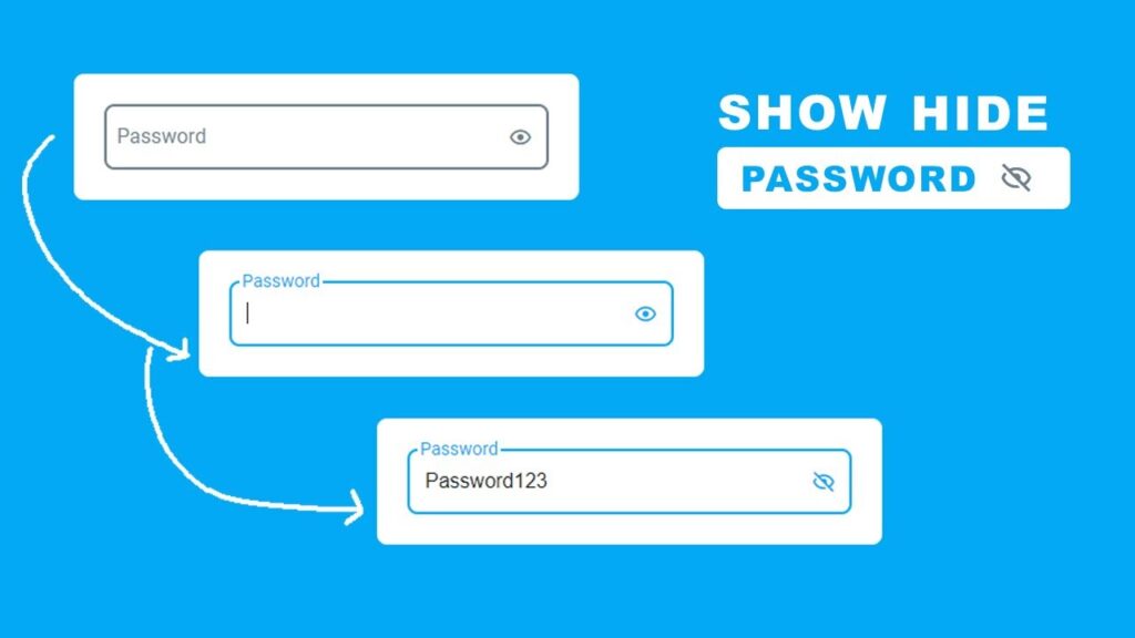
When we talk about modern web forms, floating label input with password toggle is one of the most used UI patterns. It not only makes forms look professional but also improves user experience by allowing users to easily show or hide passwords while typing. In this article, we will learn how to create a floating label input with password toggle using HTML, CSS, and JavaScript.
The best part? You’ll get the complete code snippet with step-by-step explanations. By the end of this guide, you will be able to implement it in your own projects with confidence.
If you are new to form handling, you might also like our detailed guide on HTML Login Form Validation.
What is a Floating Label Input with Password Toggle?
A floating label input with password toggle is a form input field where the label floats above the input when the user types. At the same time, there’s an eye icon that allows users to toggle between showing and hiding their password.
This type of input design has two important features:
- Floating Label Input
- Instead of a placeholder disappearing after typing, the label stays visible above the field.
- It helps users know what the field is for even after typing.
- Password Toggle with Eye Icon
- A small icon (eye/eye-slash) is placed at the right side of the input.
- On click, it switches the input type from
"password"to"text"and back again. - This is commonly called a password visibility toggle.
For more design tips, check out our post on Modern Forms Best Practices.
Why Use Floating Label Input with Password Toggle?
There are multiple benefits:
- Better user experience (UX) – users can confirm their password.
- Clean and modern design – floating labels make forms look professional.
- Accessibility – users with visibility issues can see their input clearly.
- Works perfectly in login forms, sign-up forms, and password reset pages.
We discussed form styling in detail in our article on Responsive Registration Form.
HTML Code:
<!DOCTYPE html>
<html lang="en">

<head>
  <meta charset="UTF-8">
  <meta name="viewport" content="width=device-width, initial-scale=1.0">
  <title>Floating Input Placeholder With Show Hide Password</title>
  <!-- ===============Box Icons CDN Link============ -->
  <link href='https://unpkg.com/boxicons@2.1.4/css/boxicons.min.css' rel='stylesheet'>
  <!-- ============CSS Link======== -->
  <link rel="stylesheet" href="style.css">
</head>

<body>

  <div class="centering">
    <div class="box">
      <div class="input-wrapper">
        <input type="password" id="password" class="input-field" placeholder="Your Passwrod">
        <label for="password" class="input-label">Password</label>
        <i class="bx bx-show input-icon"></i>
      </div>
    </div>
  </div>


  <script src="script.js"></script>
</body>

</html>
Explanation:
- The
input-fieldis set to type"password". - A
labelis added for the floating effect. - An
<i>tag with Boxicons eye icon (bx bx-show) is used for the toggle.
CSS Code:
/* ============Roboto Font============= */
@import url(https://fonts.googleapis.com/css?family=Roboto);

html {
  font-family: 'Roboto', sans-serif;
  font-size: 14px;
}

* {
  margin: 0;
  padding: 0;
  box-sizing: border-box;
}

.centering {
  display: flex;
  justify-content: center;
  align-items: center;
  height: 100vh;
  width: 100vw;
  background: #03A9F4;
}

.box {
  max-width: 400px;
  width: 100%;
  background-color: #fff;
  padding: 24px;
  border-radius: 8px;
}

.input-wrapper {
  position: relative;
}

.input-field {
  width: 100%;
  border: 2px solid #6F7E8C;
  outline: 0;
  font-size: 16px;
  color: #212121;
  padding: 15px 35px 15px 12px;
  background: transparent;
  transition: border-color 0.2s;
  border-radius: 8px;
}

.input-field::placeholder {
  color: transparent;
}

.input-field:placeholder-shown~.input-label {
  font-size: 16px;
  color: #6F7E8C;
  cursor: text;
  left: 8px;
  top: 16px;
}

label,
.input-field:focus~.input-label {
  position: absolute;
  top: -8px;
  display: block;
  font-size: 14px;
  left: 8px;
  color: #03A9F4;
  transition: 0.3s;
  background-color: #fff;
  padding: 0 2px;
}

.input-field:focus {
  border: 2px solid #03A9F4;
}

.input-icon {
  position: absolute;
  right: 0;
  bottom: 0;
  top: 0;
  font-size: 20px;
  color: #6F7E8C;
  width: 45px;
  height: 100%;
  display: flex;
  justify-content: center;
  align-items: center;
  cursor: pointer;
}

.input-field:focus~.input-icon {
  color: #03A9F4;
}
Key Points:
- Floating label effect is achieved with
:placeholder-shownselector. - On focus, label shifts upward and changes color.
- The eye icon stays aligned on the right.
For more design inspiration, read our Responsive Login Form with HTML & CSS
JavaScript Code:
Now comes the main part – the JavaScript toggle logic.
const input = document.querySelector(".input-field");
const inputIcon = document.querySelector(".input-icon");

inputIcon.addEventListener("click", (ele) => {
  ele.preventDefault();
  if (input.type === "password") {
    inputIcon.classList.add("bx-hide");
    inputIcon.classList.remove("bx-show");
  } else if (input.type === "text") {
    inputIcon.classList.remove("bx-hide");
    inputIcon.classList.add("bx-show");
  }
  input.setAttribute(
    "type",
    input.getAttribute("type") === "password" ? "text" : "password"
  );
});
How it works:
- By default, the input type is
"password". - On icon click, JavaScript checks the input type.
- If it’s
"password", it changes to"text"and updates the icon. - If it’s
"text", it switches back to"password".
Step-by-Step Breakdown of Floating Label Input with Password Toggle
- HTML Input Field – holds the password text.
- Label – floats above the input when user types.
- CSS – styles the floating effect and input box.
- Eye Icon – clickable toggle for password visibility.
- JavaScript – switches between
"password"and"text".
Conclusion
In this guide, we built a floating label input with password toggle using HTML, CSS, and JavaScript. This modern design improves usability and makes your forms look professional.
We also learned about:
- Floating labels and why they are useful.
- Password toggle functionality with icons.
- Full code snippet ready to use.
If you want to explore more, check our article on Responsive Login and Signup Form with HTML & CSS for a complete login page design.