CSS Animation Clock Design using HTML and CSS | Step by Step Tutorial
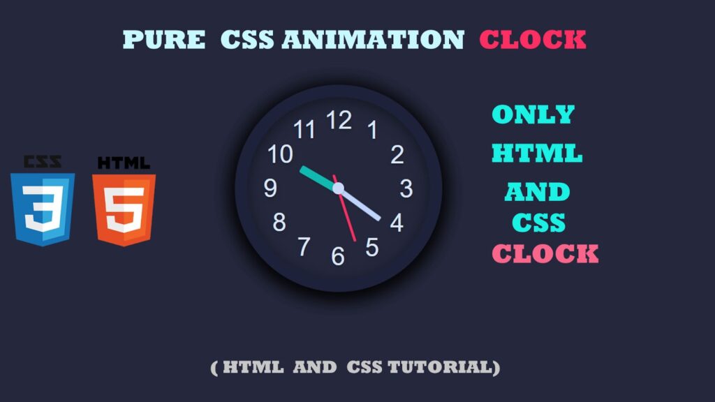
In this article, we will create a beautiful CSS Animation Clock Design using only HTML and CSS. This project is simple, responsive, and perfect for beginners who want to learn how to make a Clock design using HTML and CSS. By the end of this article, you’ll be able to design your own responsive clock with CSS and use it in your web projects.
Watch the Video Tutorial : CSS Animation Clock Design using HTML and CSS | Step by Step Tutorial
Here’s a detailed video walkthrough for this project:
Creating a digital or analog clock design in CSS is a great way to practice front-end development. With just a few lines of code, you can make an interactive and visually appealing clock for your website.
Features of This Clock Design
- Responsive design – works on desktop & mobile
- Pure HTML and CSS – no JavaScript required
- Modern UI look with shadows and gradients
- Step by step explanation
- Beginner-friendly project
HTML Code
<!DOCTYPE html>
<html lang="en">

<head>
  <meta charset="UTF-8">
  <meta name="viewport" content="width=device-width, initial-scale=1.0">
  <title>CSS Animation Clock Design using HTML and CSS | Step by Step Tutorial</title>
  <link href="style.css" rel="stylesheet">
</head>

<body>
  <div class="wrapper">
    <ul id="clock">
      <li class="numbers"><span>1</span></li>
      <li class="numbers"><span>2</span></li>
      <li class="numbers"><span>3</span></li>
      <li class="numbers"><span>4</span></li>
      <li class="numbers"><span>5</span></li>
      <li class="numbers"><span>6</span></li>
      <li class="numbers"><span>7</span></li>
      <li class="numbers"><span>8</span></li>
      <li class="numbers"><span>9</span></li>
      <li class="numbers"><span>10</span></li>
      <li class="numbers"><span>11</span></li>
      <li class="numbers"><span>12</span></li>
      <li id="hour"></li>
      <li id="minute"></li>
      <li id="second"></li>
    </ul>
  </div>
</body>

</html>
CSS Code
* {
    margin: 0;
    padding: 0;
}

.wrapper {
    height: 100vh;
    width: 100%;
    background-color: #25283D;
    font-family: 'Josefin Sans', sans-serif;
    float: left;
}

#clock {
    width: 280px;
    height: 280px;
    background: #25283D;
    border: 18px solid #1e213a;
    border-radius: 50%;
    margin: 200px auto 60px;
    position: relative;
    box-shadow: inset 0 5px 25px #00000080,
        0 5px 25px #00000080,
        0 5px 30px #00000080,
        0 5px 35px #00000080,
        0 5px 40px #00000080,
        0 5px 45px #00000080;
}

#clock:before {
    content: '';
    position: absolute;
    width: 280px;
    height: 280px;
    left: -18px;
    top: -10px;
    border: 18px solid #CCCCCC;
    border-radius: 50%;
    z-index: -2;
}

#clock:after {
    content: '';
    width: 18px;
    height: 18px;
    background: #c7d8f8;
    position: absolute;
    border-radius: 50%;
    left: calc(50% - 9px);
    top: calc(50% - 9px);
    box-shadow: 0 2px 4px #00000026;
}

#clock li {
    list-style-type: none;
    position: absolute;
}

.numbers {
    position: absolute;
    width: 90%;
    height: 90%;
    padding: 5%;
    text-align: center;
}

.numbers span {
    display: block;
    color: #dbe7fd;
    font-size: 38px;
    text-shadow: 0 5px 18px #00000026, 0 2px 3px #00000033;
}

.numbers:nth-child(1) {
    transform: rotate(30deg);
}

.numbers:nth-child(1) span {
    transform: rotate(-30deg);
}

.numbers:nth-child(2) {
    transform: rotate(60deg);
}

.numbers:nth-child(2) span {
    transform: rotate(-60deg);
}

.numbers:nth-child(3) {
    transform: rotate(90deg);
}

.numbers:nth-child(3) span {
    transform: rotate(-90deg);
}

.numbers:nth-child(4) {
    transform: rotate(120deg);
}

.numbers:nth-child(4) span {
    transform: rotate(-120deg);
}

.numbers:nth-child(5) {
    transform: rotate(150deg);
}

.numbers:nth-child(5) span {
    transform: rotate(-150deg);
}

.numbers:nth-child(6) {
    transform: rotate(180deg);
}

.numbers:nth-child(6) span {
    transform: rotate(-180deg);
}

.numbers:nth-child(7) {
    transform: rotate(210deg);
}

.numbers:nth-child(7) span {
    transform: rotate(-210deg);
}

.numbers:nth-child(8) {
    transform: rotate(240deg);
}

.numbers:nth-child(8) span {
    transform: rotate(-240deg);
}

.numbers:nth-child(9) {
    transform: rotate(270deg);
}

.numbers:nth-child(9) span {
    transform: rotate(-270deg);
}

.numbers:nth-child(10) {
    transform: rotate(300deg);
}

.numbers:nth-child(10) span {
    transform: rotate(-300deg);
}

.numbers:nth-child(11) {
    transform: rotate(330deg);
}

.numbers:nth-child(11) span {
    transform: rotate(-330deg);
}

#second {
    width: 100%;
    height: 100%;
    animation: sec 60s steps(60, end) infinite;
}

#second:after {
    content: '';
    width: 4px;
    height: 107px;
    border-radius: 2px;
    background: #FD2E62;
    position: absolute;
    left: calc(50% - 2px);
    top: 55px;
    box-shadow: 1px 2px 3px #00000026;
}

#minute {
    width: 100%;
    height: 100%;
    animation: sec 3600s steps(60, end) infinite;
}

#minute:after {
    content: '';
    width: 8px;
    height: 79px;
    border-radius: 4px 4px 2px 2px;
    background: #bed4fd;
    position: absolute;
    left: calc(50% + 30px);
    top: 29%;
    transform: rotate(-120deg);
    box-shadow: -1px 0 5px #00000026;
}

#hour {
    width: 100%;
    height: 100%;
    transform: rotate(120deg);
}

#hour:after {
    content: '';
    width: 12px;
    height: 65px;
    border-radius: 6px 6px 3px 3px;
    background: #07f3dfb4;
    position: absolute;
    left: calc(50% - 4px);
    top: 50%;
    box-shadow: 1px 0 4px #00000026;
}

@keyframes sec {
    to {
        transform: rotate(360deg);
    }
}
Why Build a CSS Animation Clock?
- Enhances your CSS animation skills
- Perfect mini-project for your portfolio
- Helps in understanding CSS transitions & transformations
- Improve your skills in modern UI design with HTML and CSS.
- Enhance your portfolio with a creative responsive clock design.
Conclusion
The CSS Animation Clock Design is a fun and practical way to learn how to combine HTML, CSS, and animations for interactive designs. By following this step by step CSS clock tutorial, you will be able to create a fully functional responsive clock with CSS that enhances your UI design skills.
Start experimenting with different colors, sizes, and animation speeds to create your own modern UI design with HTML and CSS.