How to Create a Payment Form in HTML and CSS
Creating a Payment Form in HTML and CSS is one of the most common front-end tasks for web developers. Whether you are designing an e-commerce checkout page, a donation form, or an online subscription form, a payment form plays a crucial role in user experience and conversions.
In this guide, we will build a modern, clean, and responsive payment form step by step. We will also explain the code in detail so that even beginners can easily understand. By completing this tutorial, you’ll end up with a polished and ready-to-use payment form layout. This design can easily be connected with popular payment gateways like Stripe, PayPal, or Razorpay, making it practical for real-world projects.
For more front-end UI ideas, visit our HTML & CSS Projects section.
Watch the Video Tutorial: Payment Form in HTML and CSS Page Design
Why is a Good Payment Form Important?
A payment form is the last step before a user makes a purchase. If the checkout form appears cluttered, outdated, or unsafe, many users abandon the payment midway. Studies show that over one-fifth of online shoppers quit their purchase if the payment flow appears complicated or insecure.
An effective payment form usually includes these key elements:
- Clean layout with clear labels
- Responsive design (works on desktop & mobile)
- Easy to use inputs with proper validation
- A secure look that builds user trust
Planning Your Payment Form
It’s better to plan the form’s structure first, before jumping into the code:
- Account Information (Full Name, Nickname, Email)
- Date of Birth & Gender
- Payment Method (Credit Card vs. PayPal)
- Card Details (Number, CVC, Expiry)
- Submit Button
HTML Code:
Below is the full HTML layout for our payment form. Take a look at the code — we’ll explain each part step by step.
<!DOCTYPE html>
<html lang="en">

<head>
  <meta charset="UTF-8">
  <meta name="viewport" content="width=device-width, initial-scale=1.0">
  <title>How to create Payment form page design In html and css</title>
  <link href="paymentform.css" rel="stylesheet">
  <link href="https://stackpath.bootstrapcdn.com/font-awesome/4.7.0/css/font-awesome.min.css" rel="stylesheet"
    integrity="sha384-wvfXpqpZZVQGK6TAh5PVlGOfQNHSoD2xbE+QkPxCAFlNEevoEH3Sl0sibVcOQVnN" crossorigin="anonymous">
  <link rel="stylesheet" href="style.css">
</head>

<body>
  <div class="wrapper">
    <h2>Payment Form</h2>
    <form method="POST">
      <h4>Account</h4>
      <div class="input-group">
        <div class="input-box">
          <input type="text" placeholder="Full Name" required class="name">
          <i class="fa fa-user icon"></i>
        </div>
        <div class="input-box">
          <input type="text" placeholder="Nick Name" required class="name">
          <i class="fa fa-user icon"></i>
        </div>
      </div>
      <div class="input-group">
        <div class="input-box">
          <input type="email" placeholder="Email Adress" required class="name">
          <i class="fa fa-envelope icon"></i>
        </div>
      </div>
      <div class="input-group">
        <div class="input-box">
          <h4> Date of Birth</h4>
          <input type="text" placeholder="DD" class="dob">
          <input type="text" placeholder="MM" class="dob">
          <input type="text" placeholder="YYYY" class="dob">
        </div>
        <div class="input-box">
          <h4> Gender</h4>
          <input type="radio" id="b1" name="gendar" checked class="radio">
          <label for="b1">Male</label>
          <input type="radio" id="b2" name="gendar" class="radio">
          <label for="b2">Female</label>
        </div>
      </div>
      <div class="input-group">
        <div class="input-box">
          <h4>Payment Details</h4>
          <input type="radio" name="pay" id="bc1" checked class="radio">
          <label for="bc1"><span><i class="fa fa-cc-visa"></i> Credit Card</span></label>
          <input type="radio" name="pay" id="bc2" class="radio">
          <label for="bc2"><span><i class="fa fa-cc-paypal"></i> Paypal</span></label>
        </div>
      </div>
      <div class="input-group">
        <div class="input-box">
          <input type="tel" placeholder="Card Number" required class="name">
          <i class="fa fa-credit-card icon"></i>
        </div>
      </div>
      <div class="input-group">
        <div class="input-box">
          <input type="tel" placeholder="Card CVC" required class="name">
          <i class="fa fa-user icon"></i>
        </div>
        <div class="input-box">
          <select>
            <option>01 jun</option>
            <option>02 jun</option>
            <option>03 jun</option>
          </select>
          <select>
            <option>2020</option>
            <option>2021</option>
            <option>2022</option>
          </select>
        </div>
      </div>
      <div class="input-group">
        <div class="input-box">
          <button type="submit">PAY NOW</button>
        </div>
      </div>
    </form>
  </div>
</body>

</html>
Breakdown of Key Sections
- Wrapper (
div.wrapper): Centers content and applies a white background with subtle shadow for depth. - Headings (
h2,h4): Clear section markers; colored to match accent. - Input Groups (
.input-group): Flex container for alignment. - Icons (
.icon): Font Awesome icons positioned absolutely inside inputs.
CSS Code:
Next, create a style.css file and paste the CSS below:
* {
  margin: 0;
  padding: 0;
  box-sizing: border-box;
}

body {
  background-color: #f5f5f5;
  font-family: Arial, Helvetica, sans-serif;
}

.wrapper {
  background-color: #fff;
  width: 500px;
  padding: 25px;
  margin: 25px auto 0;
  box-shadow: 0px 0px 20px rgba(0, 0, 0, 0.5);
}

.wrapper h2 {
  background-color: #fcfcfc;
  color: #7ed321;
  font-size: 24px;
  padding: 10px;
  margin-bottom: 20px;
  text-align: center;
  border: 1px dotted #333;
}

h4 {
  padding-bottom: 5px;
  color: #7ed321;
}

.input-group {
  margin-bottom: 8px;
  width: 100%;
  position: relative;
  display: flex;
  flex-direction: row;
  padding: 5px 0;
}

.input-box {
  width: 100%;
  margin-right: 12px;
  position: relative;
}

.input-box:last-child {
  margin-right: 0;
}

.name {
  padding: 14px 10px 14px 50px;
  width: 100%;
  background-color: #fcfcfc;
  border: 1px solid #00000033;
  outline: none;
  letter-spacing: 1px;
  transition: 0.3s;
  border-radius: 3px;
  color: #333;
}

.name:focus,
.dob:focus {
  -webkit-box-shadow: 0 0 2px 1px #7ed32180;
  -moz-box-shadow: 0 0 2px 1px #7ed32180;
  box-shadow: 0 0 2px 1px #7ed32180;
  border: 1px solid #7ed321;
}

.input-box .icon {
  width: 48px;
  display: flex;
  justify-content: center;
  align-items: center;
  position: absolute;
  top: 0px;
  left: 0px;
  bottom: 0px;
  color: #333;
  background-color: #f1f1f1;
  border-radius: 2px 0 0 2px;
  transition: 0.3s;
  font-size: 20px;
  pointer-events: none;
  border: 1px solid #00000033;
  border-right: none;
}

.name:focus+.icon {
  background-color: #7ed321;
  color: #fff;
  border-right: 1px solid #7ed321;
  border: none;
  transition: 1s;
}

.dob {
  width: 30%;
  padding: 14px;
  text-align: center;
  background-color: #fcfcfc;
  transition: 0.3s;
  outline: none;
  border: 1px solid #c0bfbf;
  border-radius: 3px;
}

.radio {
  display: none;
}

.input-box label {
  width: 50%;
  padding: 13px;
  background-color: #fcfcfc;
  display: inline-block;
  float: left;
  text-align: center;
  border: 1px solid #c0bfbf;
}

.input-box label:first-of-type {
  border-top-left-radius: 3px;
  border-bottom-left-radius: 3px;
  border-right: none;
}

.input-box label:last-of-type {
  border-top-right-radius: 3px;
  border-bottom-right-radius: 3px;
}

.radio:checked+label {
  background-color: #7ed321;
  color: #fff;
  transition: 0.5s;
}

.input-box select {
  display: inline-block;
  width: 50%;
  padding: 12px;
  background-color: #fcfcfc;
  float: left;
  text-align: center;
  font-size: 16px;
  outline: none;
  border: 1px solid #c0bfbf;
  cursor: pointer;
  transition: all 0.2s ease;
}

.input-box select:focus {
  background-color: #7ed321;
  color: #fff;
  text-align: center;
}

button {
  width: 100%;
  background: transparent;
  border: none;
  background: #7ed321;
  color: #fff;
  padding: 15px;
  border-radius: 4px;
  font-size: 16px;
  transition: all 0.35s ease;
}

button:hover {
  cursor: pointer;
  background: #5eb105;
}
Key CSS Explanations
- Flex Layout:
.input-group { display: flex; }aligns fields side-by-side. - Icon Positioning:
position: absolute;places icons inside inputs, saving space. - Focus States: Green glow (
box-shadow) on focus reinforces branding and guides users. - Hidden Radios:
.radio { display: none; }with styled labels simulates custom toggles. - Responsive Units: Percent widths ensure form adapts if you adjust the container size.
Step by Step Explanation of the Code
1. Wrapper Section
The .wrapper container aligns the form in the center and applies padding along with a subtle shadow effect. These styles highlight the payment form, making it visually distinct from the background.
2. Form Header
Styling the <h2> heading with a dotted border and green accent not only highlights the section but also improves the overall professionalism of the payment form layout.
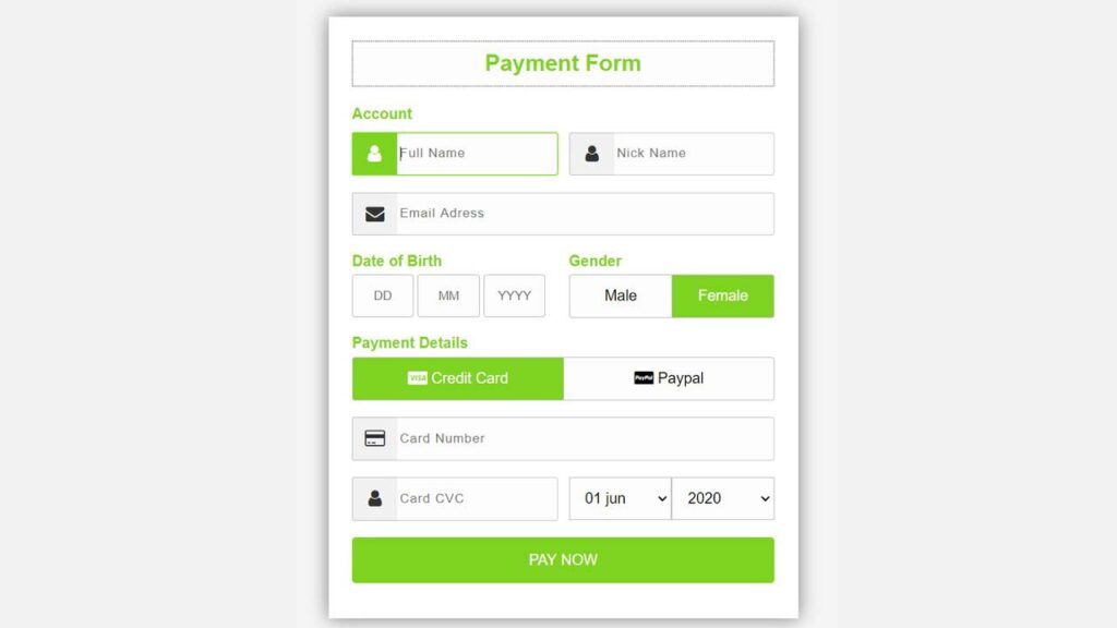
3. Account Details
At the top of the form, we have included user details such as Full Name, Nick Name, and Email Address. These fields are placed in sequence so that users can quickly provide their identity before moving to payment information.
4. Date of Birth and Gender
Instead of using a single text box, the Date of Birth section is divided into three separate input fields — Day (DD), Month (MM), and Year (YYYY). This structured format ensures that users enter valid information and reduces the chances of mistakes. Gender uses radio buttons styled as toggle buttons. Only one option can be selected.
Gender uses radio buttons styled as toggle buttons. Only one option can be selected.
5. Payment Details
Users can choose between Credit Card or PayPal. Adding Font Awesome icons such as fa-cc-visa and fa-cc-paypal brings a more professional and visually engaging look to the payment form, helping users quickly recognize payment options.
6. Card Details
Users must enter Card Number and CVC. Next to the CVC input, there are dropdown menus that let users choose the expiration month and year of the card.
7. Pay Button
The last element is the PAY NOW button, which includes smooth hover animations to enhance interactivity. The green color scheme gives a sense of trust and positivity, encouraging users to proceed with the payment.
How to Make the Form Responsive
Currently, the layout width is fixed at 576px, which works well for desktops but may need adjustments for smaller screens. For responsive behavior across devices, CSS media queries should be applied.
@media (max-width: 576px) {
  .wrapper {
    width: 95%;
    padding: 15px;
  }
  .input-group {
    flex-direction: column;
  }
  .dob {
    width: 100%;
    margin-bottom: 10px;
  }
}
Conclusion
The payment form we created demonstrates how clean design and usability can come together through HTML and CSS. This form structure is flexible and can easily connect with actual payment services such as Stripe, Razorpay, or PayPal.
You learned:
- How to structure a payment form with HTML
- How to style it with CSS
- Responsive and accessibility improvements
With the help of this tutorial, you’ll be able to create attractive checkout forms that enhance both user experience and conversion rates.