How To Create a Responsive Portfolio Website Using HTML, CSS, and JavaScript
In this article, we will learn step by step how to build a responsive portfolio website using HTML, CSS, and JavaScript. The design will be modern, mobile-friendly, and feature an interactive navigation menu, hero section, and social media links.
A portfolio website is one of the best ways to showcase your skills, projects, and professional achievements online. Whether you’re a web developer, designer, or freelancer, having a personal portfolio helps you stand out and attract potential clients or employers.
Watch the Video Tutorial: Responsive Portfolio Website
Why Do You Need a Portfolio Website?
Before jumping into the code, let’s quickly understand why every professional should have a portfolio site:
- Showcase your work – Display your projects, designs, and coding skills.
- Boost credibility – A professional site builds trust with employers and clients.
- Get discovered online – Helps in ranking on Google and reaching a wider audience.
- Freelancing opportunities – A personal portfolio increases chances of landing projects.
- Complete control – Unlike social platforms, you own your website.
In this blog, we are going to build a modern landing page portfolio website template. You can later customize it with your details, resume, images, and client testimonials.
Technologies We’ll Use
To build this responsive portfolio website, we will use:
- HTML5 → for website structure.
- CSS3 → for styling and responsiveness.
- JavaScript (Vanilla JS) → for interactive navigation and animations.
- Boxicons CDN → for free icons.
Project Features:
Our portfolio website will include:
- Responsive navigation bar with toggle menu.
- Hero section with animated typing effect.
- Professional introduction with social media links.
- Download CV button.
- Modern and mobile-friendly design.
This ensures the site looks beautiful on desktops, tablets, and smartphones.
Folder Structure
Before we start coding, let’s create a project folder:
portfolio-website/
│── index.html
│── style.css
│── script.js
│── hero-image.png
HTML Code:
Here’s the complete HTML code for our portfolio website:
<!DOCTYPE html>
<html lang="en">

<head>
  <meta charset="UTF-8">
  <meta name="viewport" content="width=device-width, initial-scale=1.0">
  <title>Responsive Portfolio Website Design | Landing page</title>
  <!-- ====Box Icons CDN==== -->
  <link href='https://unpkg.com/boxicons@2.1.4/css/boxicons.min.css' rel='stylesheet'>
  <!-- ===========CSS Link====== -->
  <link rel="stylesheet" href="style.css">

</head>

<body>
  <div class="header-wrapper">
    <div class="container-wrap">
      <!-- ====Navbar Start==== -->
      <div class="navbar">
        <!-- ===logo Start=== -->
        <div class="logo">
          <a href="#">Ravi <span>Web</span></a>
        </div>
        <!-- ===logo End=== -->

        <!-- ====Nav Menu Start==== -->
        <div class="nav-menu">
          <ul class="menu-items">
            <li class="is-current"><a href="#">Home</a></li>
            <li><a href="#">About</a></li>
            <li><a href="#">Service</a></li>
            <li><a href="#">Contact</a></li>
          </ul>
          <div class="btn-wrap">
            <a href="#">Hire me!</a>
          </div>
        </div>
        <!-- ====Nav Menu ENd==== -->

        <!-- ====Toggle Icon Start===== -->
        <div class="toggleicon">
          <i class="bx bx-menu"></i>
        </div>
        <!-- ====Toggle Icon End===== -->

      </div>
      <!-- ====Navbar End==== -->

      <!-- =====Hero Wrapper Start===== -->
      <div class="hero-wrapper">
        <div class="left-content">
          <div class="welcome-title">Welcome to my World</div>
          <!-- =====Typing Text Start==== -->
          <div class="txts-wrapper">
            <div class="text-static">Hi, I'm Ravi</div>
            <ul class="txts-typing">
              <li><span>JS Developer.</span></li>
              <li><span>UI/UX Designer.</span></li>
              <li><span>Content Writter.</span></li>
              <li><span>Freelancer</span></li>
            </ul>
          </div>
          <!-- =====Typing Text End==== -->

          <p class="para">Lorem ipsum dolor sit, amet consectetur adipisicing elit. Maiores, recusandae doloribus
            voluptatum magni molestiae cupiditate accusamus deleniti similique hic autem repudiandae tempore assumenda.
            Ut exercitationem, minima enim dolores quis cum?</p>
          <!-- =====Socila Media Start==== -->
          <div class="social-wrap">
            <h3>Find Me on</h3>
            <div class="icons-wrap">
              <a href="#"><i class="bx bxl-figma"></i></a>
              <a href="#"><i class="bx bxl-behance"></i></a>
              <a href="#"><i class="bx bxl-instagram"></i></a>
              <a href="#"><i class="bx bxl-linkedin"></i></a>
            </div>
          </div>
          <!-- =====Socila Media End==== -->

          <!-- =====Hero Btn Start=== -->
          <div class="hero-btn">
            <div class="btn-wrap">
              <a href="#">Download CV <i class='bx bx-download'></i></a>
            </div>
          </div>
          <!-- =====Hero Btn End=== -->


        </div>
        <div class="right-content">
          <div class="hero-image-box">
            <img src="hero-image.png" alt="Hero Images">
          </div>
        </div>
      </div>
      <!-- =====Hero Wrapper End===== -->
    </div>
  </div>

  <!-- =======Javascript ====== -->
  <script src="script.js"></script>
</body>

</html>
CSS Code:
Now, let’s style our website using CSS:
* {
  margin: 0;
  padding: 0;
  box-sizing: border-box;
}

body {
  font-family: Arial, sans-serif;
  font-weight: 400;
  line-height: 1.5;
  background: #191919;
  color: #fff;
}

/* Header Wrapper */
.header-wrapper {
  width: 100%;
}

/* Container Wrapper */
.container-wrap {
  max-width: 1320px;
  width: 100%;
  margin: 0 auto;
  padding: 0 15px;
}

/* Navbar Style */

.navbar {
  padding: 15px 0;
  display: flex;
  justify-content: space-between;
  align-items: center;
  position: relative;
}

.navbar .logo a {
  color: #fff;
  font-size: 40px;
  font-weight: 700;
  text-decoration: none;
}

.navbar .logo a span {
  color: #ff4a6e;
}

.navbar .nav-menu {
  display: flex;
  align-items: center;
  gap: 40px;
}

.navbar .menu-items {
  display: flex;
  list-style: none;
}

.navbar .menu-items li {
  margin: 0 25px;
}

.navbar .menu-items li a {
  color: #fff;
  padding: 20px 0;
  text-decoration: none;
  font-size: 20px;
  font-weight: 500;
  text-transform: capitalize;
  transition: color 0.3s ease;
  display: inline-block;
  position: relative;
  letter-spacing: 1px;
}

.navbar .menu-items li a:after {
  position: absolute;
  content: "";
  left: 0;
  width: 0;
  height: 3px;
  background: #f9004d;
  transition: .3s;
  bottom: 0;
}

.navbar .menu-items li.is-current a:after {
  width: 100%;
}

.navbar .menu-items li.is-current a,
.navbar .menu-items li a:hover {
  color: #ff4a6e;
}

/* Button Styles */
.btn-wrap {
  display: flex;
  flex-wrap: wrap;
  align-items: center;
  gap: 40px;
}

.btn-wrap a {
  padding: 10px 25px;
  color: #fff;
  background: transparent;
  font-size: 18px;
  font-weight: 400;
  text-transform: capitalize;
  border-radius: 5px;
  text-decoration: none;
  transition: all 0.3s ease;
  border: 2px solid #ff4a6e;
  letter-spacing: 2px;
}

.btn-wrap a:hover {
  background: #ff4a6e;
  transform: translateY(-2px);
  border: 2px solid #f9004d;
}


.navbar .toggleicon {
  display: none;
}


/* Hero Wraapper */

.hero-wrapper {
  display: flex;
  justify-content: center;
  align-items: center;
  padding: 70px 0;
}

.left-content {
  flex: 1;
  padding-right: 20px;
  display: flex;
  flex-direction: column;
  gap: 20px;
}

.left-content .welcome-title {
  color: #c6c9d8bf;
  font-size: 15px;
  text-transform: uppercase;
  letter-spacing: 4px;
  display: block;
}

.left-content .txts-wrapper {
  display: flex;
  flex-direction: column;
}

.left-content .text-static {
  font-size: 54px;
  line-height: 54px;
  font-weight: 700;
}

.left-content .txts-typing {
  height: 70px;
  line-height: 70px;
  overflow: hidden;
}

.left-content .txts-typing li {
  list-style: none;
  color: #ff4a6e;
  font-size: 60px;
  font-weight: 700;
  position: relative;
  top: 0;
  animation: slide 12s steps(4) infinite;
}

@keyframes slide {
  100% {
    top: -280px;
  }
}

.left-content .txts-typing li span {
  position: relative;
  margin: 15px 0;
  font-size: 54px;
  line-height: 54px;
  text-wrap: nowrap;
}

.left-content .txts-typing li span::after {
  content: "";
  position: absolute;
  left: 0;
  top: 0;
  height: 100%;
  width: 100%;
  background: #191919;
  border-left: 2px solid #ff4a6e;
  animation: typing 3s steps(10) infinite;
}

@keyframes typing {

  40%,
  60% {
    left: calc(100% + 10px);
  }

  100% {
    left: 0;
  }
}

.para {
  color: #c6c9d8bf;
  font-size: 18px;
  font-weight: 300;
  margin-bottom: 15px;
}

/* Social Icons */

.left-content .social-wrap .icons-wrap {
  display: flex;
  gap: 10px;
  margin-top: 10px;
}

.left-content .social-wrap .icons-wrap a {
  font-size: 18px;
  color: #ff4a6e;
  width: 35px;
  height: 35px;
  border: 1px solid #ff4a6e;
  border-radius: 50%;
  display: flex;
  align-items: center;
  justify-content: center;
  position: relative;
  text-decoration: none;
  z-index: 1;
  transition: all 0.5s ease-in;
}

.left-content .social-wrap .icons-wrap a:hover {
  background: #ff4a6e;
  border: 1px solid #ff4a6e;
  color: #ffffff;
}


.left-content .hero-btn .btn-wrap a {
  display: flex;
  align-items: center;
  gap: 8px;
}

.left-content .hero-btn .btn-wrap i {
  font-size: 22px;
}

/* Right Content */
.right-content {
  flex: 1;
  display: flex;
  justify-content: center;
}

.right-content .hero-image-box {
  position: relative;
}

.right-content .hero-image-box:before {
  content: "";
  position: absolute;
  bottom: 0;
  left: 0;
  width: 220px;
  height: 220px;
  border-radius: 50%;
  background: rgba(255, 0, 77, 0.5);
  filter: blur(150px);
  margin-left: -5%;
  margin-bottom: -5%;
}

.right-content .hero-image-box img {
  max-width: 100%;
  border-radius: 40px;
  transform: rotate(4.29deg);
  position: relative;
  border: 2px solid #ff4a6e;
  transition: 0.3s;
}

.right-content .hero-image-box img:hover {
  border: 2px solid #ff4a6e;
  transform: rotate(0);
}

/* Responsive Styles */
@media (max-width: 992px) {
  .navbar .logo a {
    font-size: 30px;
  }

  .navbar .nav-menu {
    position: fixed;
    width: 75vw;
    height: 100vh;
    background-color: #1e2228;
    top: 0;
    bottom: 0;
    left: -250%;
    transition: all .6s;
    overflow-y: scroll;
    flex-direction: column;
    z-index: 99;
  }

  .navbar .nav-menu.active {
    left: 0;
    transition: all 0.6s;
  }

  .navbar .menu-items {
    flex-direction: column;
    width: 100%;
    margin: 0;
    gap: 15px;
  }


  .navbar .toggleicon {
    display: block;
    font-size: 30px;
    color: #fff;
  }

  .navbar .toggleicon {
    display: flex;
    text-decoration: none;
    background-color: #f9004d;
    color: #ffffff;
    font-size: 30px;
    cursor: pointer;
    z-index: 20;
    box-sizing: border-box;
    padding: 4px;
    border-radius: 5px;
  }

  .hero-wrapper {
    flex-direction: column;
  }

  .left-content {
    align-items: center;
    text-align: center;
    margin-bottom: 50px;
  }

}

@media(max-width:476px) {

  .left-content .text-static {
    font-size: 40px;
    line-height: 40px;
  }

  .left-content .txts-typing li span {
    font-size: 40px;
    line-height: 40px;
  }

}
JavaScript Code:
// ====Menu Item Active===
const navItems = document.querySelectorAll(".menu-items li");
navItems.forEach((item) => {
  item.addEventListener("click", function () {
    navItems.forEach((nav) => nav.classList.remove("is-current"));
    this.classList.add("is-current");
  });
});

// ====Menu hide or SHow===
document.addEventListener("DOMContentLoaded", () => {
  const toggleIcon = document.querySelector(".toggleicon");
  const navMenu = document.querySelector(".nav-menu");

  toggleIcon.addEventListener("click", () => {
    navMenu.classList.toggle("active");
    toggleIcon.classList.toggle("active");
  });
});
Adding Images & Icons
- Place your portfolio profile image in the project folder and name it
hero-image.png. - We used Boxicons CDN for icons. You can replace links with your social media profiles.
Make It Responsive
We added media queries to adjust layout for tablets and mobiles. The navigation menu becomes a sidebar with toggle icon, making the website mobile-friendly.
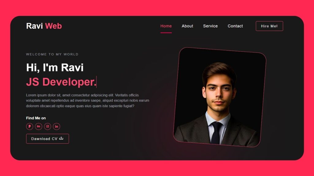
Final Output of Portfolio Website
After completing all steps, you’ll have a fully responsive portfolio website with:
- A modern navigation bar.
- Animated typing text effect.
- Social media links.
- A professional CV download button.
Conclusion
In this tutorial, we built a Responsive Portfolio Website using HTML, CSS, and JavaScript. This website is a perfect starting point for beginners and freelancers who want to showcase their work online.
You can customize the colors, fonts, and layout to match your personal brand. Later, you can also expand it by adding sections like Projects, Testimonials, and Contact Forms.