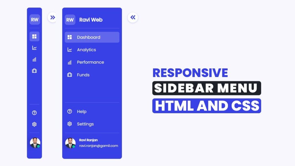
How To Create Responsive Dashboard Sidebar Menu in HTML CSS & JavaScript | Dark/Light Mode
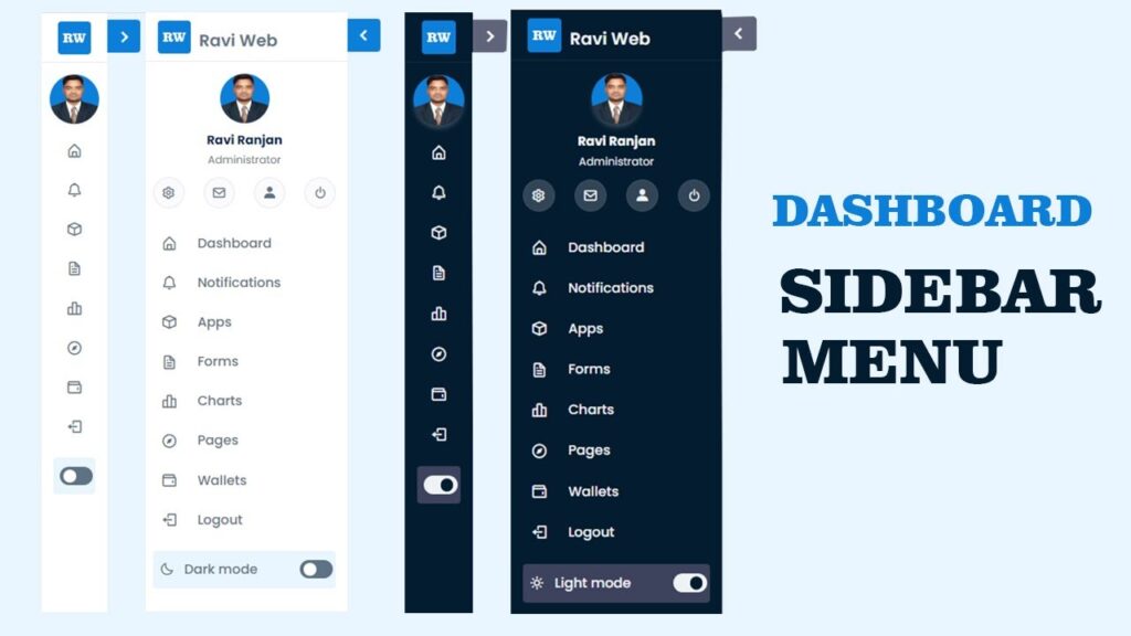
Creating a responsive dashboard sidebar menu is one of the most important UI features in modern web applications. A sidebar menu not only improves navigation but also enhances the user experience. In this tutorial, you will learn step by step how to design a dashboard sidebar with dark and light mode using HTML, CSS, and JavaScript.
Whether you are a beginner in web development or an experienced developer, this project will help you understand how to create a clean and modern UI design for your website or admin panel.
Watch the Video Tutorial: Responsive Dashboard Sidebar Menu
Features of Responsive Dashboard Sidebar
- Mobile-friendly sidebar navigation
- Clean and modern UI design
- Easy dark/light mode toggle with JavaScript
- Beginner-friendly project for HTML, CSS, and JS learners
- Perfect for admin dashboards, portfolio, or web apps
In the first step, we will write the basic HTML structure of the dashboard and sidebar menu.
HTML Code :
<!DOCTYPE html>
<html lang="en">

<head>
    <meta charset="UTF-8">
    <meta http-equiv="X-UA-Compatible" content="IE=edge">
    <meta name="viewport" content="width=device-width, initial-scale=1.0">
    <title>Dashboard Sidebar Menu Design || Ravi Web</title>
     <!----===== Boxicons Link ===== -->
    <link href='https://unpkg.com/boxicons@2.1.4/css/boxicons.min.css' rel='stylesheet'>
    <!----======== CSS Link ======== -->
    <link rel="stylesheet" href="style.css">

</head>

<body>

    <!-- ===============Side Navbar Start======== -->
    <nav class="sidebar">
        <!-- =====logo header start==== -->
        <header>
            <div class="brand">
                <span class="logo-image">
                    <img src="logo.png" alt="">
                </span>
                <div class="logo-text label-text">
                    <span class="brand-name">Ravi Web</span>
                </div>
            </div>
            <i class="bx bx-chevron-left sidebar-toggle"></i>
        </header>
        <!-- =====logo header End==== -->

        <!-- ===========sidebar user profiel======= -->
        <div class="sidebar-user">
            <!-- ===user start=== -->
            <div class="user">
                <img src="ravi.jpg" alt="">
                <div class="user-info label-text">
                    <h6>Ravi Ranjan</h6> <span>Administrator</span>
                </div>
            </div>
            <!-- ===user End=== -->

            <!-- =====user social start=== -->
            <div class="user-social">
                <ul>
                    <li><a href="#"><i class='bx bx-cog'></i></a></li>
                    <li><a href="#"><i class='bx bx-envelope'></i></a></li>
                    <li><a href="#"><i class='bx bxs-user'></i></a></li>
                    <li><a href="#"><i class='bx bx-power-off'></i></a></li>
                </ul>
            </div>
            <!-- =====user social end=== -->
        </div>
        <!-- ===========sidebar user profiel======= -->

        <!-- =========Side menu start======== -->

        <ul class="side-menu">

            <li class="slide-link active">
                <a href="#">
                    <i class='bx bx-home-alt icon'></i>
                    <span class="label-text">Dashboard</span>
                </a>
            </li>

            <li class="slide-link">
                <a href="#">
                    <i class='bx bx-bell icon'></i>
                    <span class="label-text">Notifications</span>
                </a>
            </li>

            <li class="slide-link">
                <a href="#">
                    <i class='bx bx-cube icon'></i>
                    <span class="label-text">Apps</span>
                </a>
            </li>

            <li class="slide-link">
                <a href="#">
                    <i class='bx bx-file icon'></i>
                    <span class="label-text">Forms</span>
                </a>
            </li>


            <li class="slide-link">
                <a href="#">
                    <i class='bx bx-bar-chart-alt-2 icon'></i>
                    <span class="label-text">Charts</span>
                </a>
            </li>


            <li class="slide-link">
                <a href="#">
                    <i class='bx bx-compass icon'></i>
                    <span class="label-text">Pages</span>
                </a>
            </li>


            <li class="slide-link">
                <a href="#">
                    <i class='bx bx-wallet icon'></i>
                    <span class="label-text">Wallets</span>
                </a>
            </li>

            <li class="slide-link">
                <a href="#">
                    <i class='bx bx-log-out icon'></i>
                    <span class="label-text">Logout</span>
                </a>
            </li>


        </ul>
         <!-- =========Side menu start======== -->
        <!-- ============Dark mode button======= -->
        <div class="mode-box">
            <div class="sun-moon-box">
                <i class="bx bx-moon icon moon-icon"></i>
                <i class="bx bx-sun icon sun-icon"></i>
            </div>
            <span class="mode-text label-text">Dark mode</span>

            <div class="toggle-switch">
                <span class="switch"></span>
            </div>
        </div>
        <!-- ============Dark mode button======= -->

    </nav>
    <!-- ===============Side Navbar End======== -->
    <!-- ==========main container======= -->
    <div class="main-container">
        <h1 class="text-heading">Dashboard Sidebar</h1>
    </div>
    <!-- ==========main container end======= -->
    <script src="script.js"></script>
</body>

</html>
Now we will style the sidebar using CSS. We will also add dark and light theme classes.
CSS Code:
/* Google Font Import = Poppins */
@import url('https://fonts.googleapis.com/css2?family=Poppins:wght@300;400;500;600;700;800&display=swap');

* {
    margin: 0;
    padding: 0;
    box-sizing: border-box;
    font-family: 'Poppins', sans-serif;
}

:root {
    /* ===== Colors ===== */
    --body-color: #E9F5FE;
    --sidebar-color: #fff;
    --user-title: #031b4e;
    --gray-color: #5D7285;
    --border-color: #eae8f1;
    --social-icon-bg: #eaebf033;
    --background-color: #0C7FDA;
}

body {
    background-color: var(--body-color);
}

body.dark {
    --body-color: #3d425d;
    --sidebar-color: #031C30;
    --user-title: #fff;
    --gray-color: #EFF2F4;
    --border-color: #dee4ec12;
    --background-color: #eaebf033;
}

/* =====sidebar css start======= */
.sidebar {
    position: relative;
    overflow-y: auto;
    min-height: 100vh;
    width: 250px;
    padding: 10px 14px;
    background-color: var(--sidebar-color);
    transition: all 0.3s;
    z-index: 1024;
}

.sidebar.close {
    width: 80px;
}

.sidebar.close .label-text {
    display: none;
}


.sidebar::-webkit-scrollbar {
    display: none;
}

.sidebar header {
    background-color: var(--sidebar-color);
    position: fixed;
    left: 0;
    top: 0;
    height: 60px;
    padding: 10px 20px;
    width: 250px;
    z-index: 999;
    border-bottom: 1px solid var(--border-color);

}

.sidebar.close header {
    width: 80px;
}

.sidebar header .brand {
    display: flex;
    align-items: center;
    gap: 10px;
}

.sidebar header .logo-image img {
    width: 40px;
    border-radius: 4px;
}

.sidebar header .logo-text .brand-name {
    font-size: 20px;
    font-weight: 600;
    color: var(--gray-color);
}

.sidebar header .sidebar-toggle {
    position: absolute;
    width: 40px;
    height: 40px;
    background-color: var(--background-color);
    right: -40px;
    top: 8px;
    display: flex;
    align-items: center;
    justify-content: center;
    font-size: 28px;
    color: #fff;
    border-radius: 0 4px 4px 0;
    cursor: pointer;
    transition: all 0.5s;
}

.sidebar.close header .sidebar-toggle {
    transform: rotate(180deg);
    border-radius: 4px 0 0 4px;
}

/* ===============sidebar user start========= */
.sidebar .sidebar-user {
    display: flex;
    flex-direction: column;
    flex-shrink: 0;
    border-bottom: 0;
    margin-top: 64px;
}

.sidebar .sidebar-user .user {
    width: 100%;
    display: flex;
    flex-direction: column;
    align-items: center;
}

.sidebar .sidebar-user .user img {
    border-radius: 50%;
    width: 60px;
    height: 60px;
    font-size: 36px;
    box-shadow: 0px 5px 5px 0px var(--social-icon-bg);
}

.sidebar .sidebar-user .user .user-info {
    text-align: center;
}

.sidebar .sidebar-user .user .user-info h6 {
    font-weight: 700;
    font-size: 15px;
    margin-top: 10px;
    color: var(--user-title);
}

.sidebar .sidebar-user .user .user-info span {
    color: var(--gray-color);
    font-size: 13px;
    font-weight: 400;
}

/* ========user social start======= */
.sidebar .sidebar-user .user-social {
    padding: 10px 0;
}

.sidebar.close .user-social {
    display: none;
}

.sidebar .sidebar-user .user-social ul {
    display: flex;
    flex-wrap: wrap;
    justify-content: space-between;
    list-style: none;
}

.sidebar .sidebar-user .user-social ul li a {
    height: 38px;
    width: 38px;
    text-decoration: none;
    display: flex;
    justify-content: center;
    align-items: center;
    color: var(--gray-color);
    font-size: 18px;
    background: var(--social-icon-bg);
    border: 1px solid var(--border-color);
    border-radius: 50%;
    line-height: 1.6;

}

/* ========user social end======= */

.sidebar .side-menu {
    list-style: none;
    margin-top: 10px;
}

.sidebar .side-menu .slide-link a {
    text-decoration: none;
    color: var(--gray-color);
    font-size: 16px;
    font-weight: 500;
    display: flex;
    flex-direction: row;
    align-items: center;
    width: 100%;
    height: 45px;
    margin: 3px 10px 3px 0;
    border-radius: 3.65895px;
    background-color: transparent;
    transition: all 0.3s ease;
}

.sidebar .side-menu .slide-link:hover a {
    background-color: var(--background-color);
    color: var(--sidebar-color);
}

body.dark .sidebar .side-menu .slide-link:hover a {
    color: var(--gray-color);
}

.sidebar .side-menu .slide-link a .icon {
    display: inline-block;
    width: 40px;
    font-size: 20px;
    line-height: 0;
    padding: 4px;
    margin-right: 14px;
    border-radius: 3px;
    text-align: center;
}

.sidebar.close .side-menu .slide-link a .icon {
    width: 100%;
    margin-right: 0;
}

/* ===============sidebar user End========= */
/* ============Dark mode button start======= */
.sidebar .mode-box {
    display: flex;
    flex-direction: row;
    align-items: center;
    background: var(--body-color);
    color: var(--gray-color);
    width: 100%;
    height: 45px;
    margin: 15px 10px 3px 0;
    padding: 0px 8px;
    border-radius: 4px;
    font-size: 16px;
    font-weight: 500;
    position: relative;
    margin-bottom: 20px;
    transition: all 0.5s ease;
}


.sidebar .mode-box .sun-moon-box {
    display: flex;
    align-items: center;
    transition: all 0.3s;
    position: relative;
}

.sidebar .mode-box .sun-moon-box i {
    position: absolute;
    font-size: 18px;
    font-weight: 500;
    transition: all 0.3s ease;
}

.sidebar .mode-box .sun-moon-box .sun-icon {
    opacity: 0;
}

body.dark .sidebar .mode-box .sun-moon-box .sun-icon {
    opacity: 1;
}

body.dark .sidebar .mode-box .sun-moon-box .moon-icon {
    opacity: 0;
}

.sidebar .mode-box .mode-text {
    margin-left: 30px;
}

.sidebar.close .mode-box .mode-text {
    opacity: 0;
}

.toggle-switch {
    position: absolute;
    right: 0;
    height: 100%;
    width: 48px;
    display: flex;
    align-items: center;
    justify-content: center;
    border-radius: 6px;
    cursor: pointer;
    transition: all 0.3s ease;
}

.toggle-switch .switch {
    position: relative;
    height: 22px;
    width: 40px;
    border-radius: 25px;
    background-color: var(--gray-color);
    transition: all 0.3s ease;
}

.switch::before {
    content: '';
    position: absolute;
    height: 15px;
    width: 15px;
    border-radius: 50%;
    top: 50%;
    left: 5px;
    transform: translateY(-50%);
    background-color: var(--sidebar-color);
    transition: all 0.3s ease;
}

body.dark .switch::before {
    left: 20px;
}
/* ============Dark mode button ======= */
/* =====sidebar css End======= */

/* ==========main container======= */
.main-container {
    position: absolute;
    top: 0;
    left: 250px;
    height: 100vh;
    width: calc(100% - 250px);
    background-color: var(--body-color);
    transition: all 0.5s ease;
    display: flex;
    justify-content: center;
    align-items: center;
}

.main-container.close {
    left: 80px;
    height: 100vh;
    width: calc(100% - 80px);
}

.main-container .text-heading {
    font-size: 40px;
    font-weight: 500;
    color: var(--gray-color);
}
Finally, let’s add the JavaScript code to enable dark and light mode.
JavaScript Code:
const body=document.querySelector("body");
const sidebar=document.querySelector(".sidebar");
const toggle=document.querySelector(".sidebar-toggle");
const mainContainer=document.querySelector(".main-container");
const toggleSwitch=document.querySelector(".toggle-switch");
const modeText=document.querySelector(".mode-text");

toggle.addEventListener("click",()=>{
    sidebar.classList.toggle("close");
    mainContainer.classList.toggle("close");
});
toggleSwitch.addEventListener("click",()=>{
    body.classList.toggle("dark");
    if(body.classList.contains("dark")){
        modeText.innerText = "Light mode";
    }else{
        modeText.innerText = "Dark mode";

    }
})
Why Should You Learn Sidebar Menu Design?
Learning how to design a responsive dashboard sidebar menu will improve your frontend development skills. It is one of the most common features in admin dashboards, e-commerce websites, and portfolio projects. With this project, you’ll gain hands-on experience with CSS Flexbox, JavaScript DOM manipulation, and responsive design techniques.
Conclusion
In this tutorial, you have learned how to create a responsive dashboard sidebar menu using HTML, CSS, and JavaScript. You also implemented a dark and light mode toggle button to make the UI modern and user-friendly.
This project is beginner-friendly and can be customized further to match your website or application needs.