How to Create Toast Notifications in HTML CSS JavaScript | Success Error Warning Info
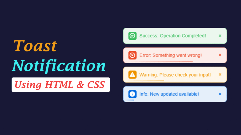
In this article, we’ll build four types of toast notifications—Success, Error, Warning, and Info—using HTML, CSS, and JavaScript. You’ll get icons, a progress bar, slide-in/fade-out animations, accessible markup, and copy‑paste code so you can drop it into any web project in minutes.
Toast notifications provide quick, unobtrusive feedback in web apps. They are small, auto-dismiss messages that slide into view (usually from a corner) and disappear after a few seconds. In this guide, you’ll build a clean, lightweight, and modern toast notification system using HTML, CSS, and JavaScript—no external libraries required.
What We’ll Build
- Four types: Success, Error, Warning, Info
- Slide-in and auto fade-out animations
- Progress bar effect
- Icon support (Font Awesome)
- Accessible structure + mobile-ready design
- Close (×) button
- Reusable showToast(type) function
Video Tutorial: How to Create Toast Notifications in HTML, CSS, and JavaScript (Success, Error, Warning, Info)
Watch this step-by-step tutorial to build a reusable toast notification system with icons, progress bar, slide‑in/fade‑out animations, and accessible markup.
After watching the video, try adding the toast component to your project and trigger each type (Success, Error, Warning, Info) at least once.
HTML Code
<!DOCTYPE html>
<html lang="en">

<head>
    <meta charset="UTF-8">
    <meta name="viewport" content="width=device-width, initial-scale=1.0">
    <title>Toast notifications using HTML and CSS </title>
    <!-- font-awesome -->
    <link rel="stylesheet" href="https://cdnjs.cloudflare.com/ajax/libs/font-awesome/6.2.1/css/all.min.css">
    <!-- CSS -->
    <link rel="stylesheet" href="style.css">

</head>

<body>

    <!-- ----Buttons--- -->
     <div class="btns-wrap">
        <button class="btn success" data-type="success">Success</button>
        <button class="btn error" data-type="error">Error</button>
        <button class="btn warning" data-type="warning">Warning</button>
        <button class="btn info" data-type="info">Info</button>
     </div>

     <!-- Toast Container -->
      <div id="toast-container"></div>

    <!-- Javascript -->
    <script src="script.js"></script>
</body>

</html>
CSS Code
 *{
    margin:0;
    padding: 0;
    box-sizing: border-box;
 }
 body{
    font-family: arial,sans-serif;
    display: flex;
    justify-content: center;
    align-items: center;
    height: 100vh;
    background-color: #181836;
 }

 .btns-wrap{
    display: flex;
    gap: 12px;
    flex-wrap: wrap;
 }

 .btns-wrap .btn{
    font-size: 18px;
    padding: 10px 18px;
    border: none;
    cursor: pointer;
    color: #fff;
    font-weight: 600;
    border-radius: 4px;
    transition: 0.3s;
 }

  .btns-wrap .btn:hover{
    opacity: 0.9;
  }

.success{
    background: #3FBF62;
}
.error{
    background: #EC4E2C;
}
.warning{
    background: #EF9400;
}
.info{
    background: #016BE1;
}

#toast-container{
    position: fixed;
    top: 20px;
    right: 20px;
    display: flex;
    flex-direction: column;
    gap: 12px;
    z-index: 1000;
}

.toast{
    min-width:352px;
    display: flex;
    align-items: center;
    gap: 10px;
    padding: 12px 16px;
    border-radius: 10px;
    color: #fff;
    font-size: 16px;
    box-shadow: 0 4px 8px rgba(0,0,0,0.0.15);
    position: relative;
    overflow: hidden;
    animation: slideIn 0.4s ease, fadeOut 0.5s ease 4.5s forwards;
}

.toast.success{
    color: #3FBF62;
    background: #EBF7EE;
    border: 1.5px solid #3FBF6275;
}
.toast.error{
    color: #EC4E2C;
    background: #FCEDEA;
    border: 1.5px solid #EC4E2C75;
}

.toast.warning{
    color: #EF9400;
    background: #FEF7EA;
    border: 1.5px solid #EF940075;
}

.toast.info{
    color: #016BE1;
    background: #E5EFFA;
    border: 1.5px solid #016BE175;
}

.toast i{
    font-size: 18px;
    height: 28px;
    width: 28px;
    border-radius: 6px;
    display: flex;
    align-items: center;
    justify-content: center;
    color: #fff;
}

.toast .close{
    margin-left: auto;
    cursor: pointer;
    font-size: 20px;
}

.toast::after{
    content: "";
    position: absolute;
    bottom: 4px;
    left: 4px;
    height: 3px;
    width: calc(100% - 16px);
    transform: scaleX(0);
    transform-origin: left;
    border-radius: inherit;
    animation: progress 2.5s 0.3s linear;
}

@keyframes progress{
    to{
        transform: scaleX(1);
    }
}
.toast.success::after{
    background: linear-gradient(to right, #EBF7EE, #3FBF6275);
}
.toast.error::after{
    background: linear-gradient(to right, #FCEDEA, #EC4E2C75);
}
.toast.warning::after{
    background: linear-gradient(to right, #FEF7EA, #EF940075);
}
.toast.info::after{
    background: linear-gradient(to right, #E5EFFA, #016BE175);
}

@keyframes slideIn{
    from{
        transform: translateX(100%);
        opacity: 0;
    }
    to {
        transform: translateX(0);
        opacity: 1;
    }
}

@keyframes fadeOut {
    to{
        opacity: 0;
        transform: translateX(100%);
    }
}
JavaScript Code
// Toast Function
const container= document.getElementById("toast-container");
// set icon
const icons = {
success: "fa-regular fa-circle-check",
error: "fa-regular fa-circle-xmark",
warning: "fa-solid fa-triangle-exclamation",
info: "fa-solid fa-circle-info",
};
const messages ={
success: "Success: Operation Completed!",
error:"Error: Something went wrong!",
warning:"Warning: Please check your input!",
info:"Info: New updated available!",
};
const showToast = (type) => {
const toast= document.createElement("div");
toast.className=`toast ${type}`;
// Toast Content
toast.innerHTML= `
<i class="${icons[type]} ${type}"></i>
<span> ${messages[type]}</span>
<span class="close">×</span>
`;
// Append Toast
container.append(toast);
// close button event
toast.querySelector(".close").onclick = ()=> toast.remove();
// Auto remove after 5s
setTimeout(()=>toast.remove(), 5000);
};
document.querySelectorAll("button[data-type]")
.forEach((btn)=>{
btn.addEventListener("click", ()=> showToast(btn.dataset.type))
});